Convincing musicians to make use of sound is easy. And electronic musicians are even content with stunningly-complex interfaces, in exchange for deep control of sound.
But what about everyone else?
Users on mobile are certainly uploading sounds. Part of the intense interest in SoundCloud even outside music and audio audiences is simple to explain: the site is ridiculously popular. By 2012, it had reached 10 hours of uploads per minute. And once sound is uploaded, it attracts listeners. As of last fall, users had skyrocketed from 200 to 250 million users in just a few months. That’s another reason last week’s ad plans are worth watching.
If SoundCloud facilitates uploading, storage, and sharing, the next frontier may be all about the interface for producing sounds in the first place. App developers have likely already saturated the expert music production market with designs that appeal to that crowd. But just as quick and easy UIs for text and images have popularized those means of communication, sound may require a fresh approach. And a few developers are betting on that possibility in interesting ways.
Make production faster.
Propellerhead, for instance, has built an app called Take that radically reduces interface elements to reimagine production as a mobile experience. That is, instead of taking what ran on your computer and squeezing it into your palm (as the company awkwardly did early on), it starts with the way you use your phone and builds tools around that.
Take is a unique hybrid of voice memo app and music maker. Recording is a one-tap affair – just like a voice memo or snapshot app. But because music making is more demanding than just snapping a photo, there are also built-in instruments, easy access to clicks and beats to get you going, and Instagram-like processing to make the results sound like what you’d expect (and less like a phone). Those effects to me make a lot of sense: what a tiny phone lacks in physical hardware it can (perhaps) make up for in smart computation. It’s got a better CPU than it does a mic, after all.
You can see it in action in the promo video. (It’s very much a promotional video, so if this music sets your teeth on edge, see some other real-world examples below.)
The approach could find some traction. The developer’s Figure app attracted some criticism from more experienced users who didn’t like its minimalist approach – but went on to win over a huge number of users (including many more advanced ones) with that approach.
https://www.propellerheads.se/products/take/
Make the interface understandable to anyone.
Take is certainly a pared-down interface – not only is it aesthetically cleaner (in the flatter, iOS 7-popularized style), it genuinely reduces the number of metaphors.
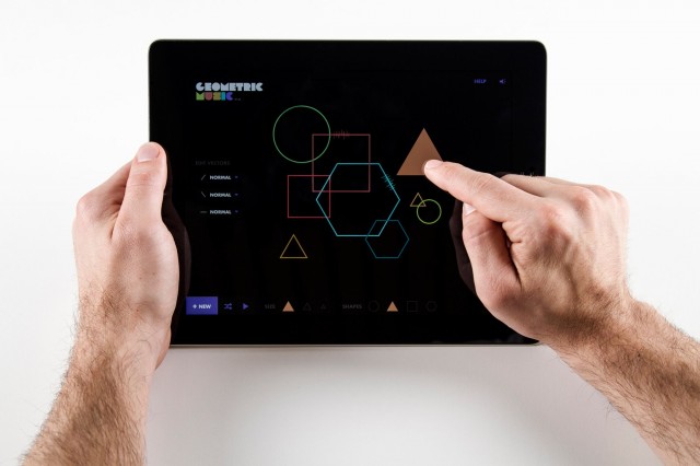
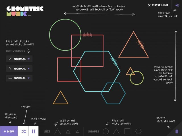
But Geometric Music is even more radical. It completely tosses out metaphors normally used for recording, both conceptually and visually. In their place, you see a set of abstract shapes, and manipulate those shapes to change your sound. The intention is to replace production activities with play, and encourage exploration. The app is the work of Belgian design house Superbe, who showed it off this summer at Sonar Festival in Barcelona – and walked away with the prize in the sound art category of the prestigious Appart Award, organized by the ZKM (Germany’s Zentrum für Kunst und Medientechnologie, Karlsruhe.
Geometric Music from Superbe on Vimeo.
Here’s how it works:
Each vector of the shape can be edited by selecting Normal – Reverse – Down – None. Than the shapes give the base of the rhythm. Circle is a one time sequence, triangle is three, square is four, hexagon six. The size of each shape can be changed to modify the speed.
By moving the shape up and down, you can influence the volume and by moving from left to right you influence the stereo.
The random button hides some surprising patterns.
You can grab the app for free on Android or iOS – or run it in a modern browser on the Web.
Make sound as easy as taking photos or sending texts.
Some apps will go even further to make people use sound.
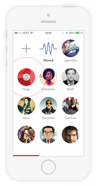
Waved sees phone calls and texts as direct rivals, and makes sending people voice recordings as quick as a single tap. The idea is simple: make a tap to record, and a tap to play, so that you can send voice faster than you can type in a message or make a call.
The San Francisco-based developer is just getting going, and it faces some fierce competition from audio functionality in tools like WhatsApp and Facebook Messenger. But the speed of the interface is impressive (even in this unfortunately amateurish hands-on video):
Waved Teaser from Waved on Vimeo.
If you think of the massive popularity of photos, it’s clear that there’s a link between quick gestures and access to a feature and how much that feature gets used. So Waved is a model worth considering even for music apps.
Watch this space?
My guess is that we will see some hits in this area, and they will in some way touch elements of each of these approaches. Remember, a tool doesn’t have to be complex to be useful to music; it doesn’t really even have to be “professional” per se, or replicate the functionality of a whole studio. Artists like The Beatles recorded demos on little multitrack tape recorders. I remember distinctly growing up with a My First Tape Recorder (like many of my generation).
Sometimes, all you need is that record button. A lot can happen from there – and it doesn’t have to look like a jet plane cockpit just to get the job done.
On the other hand, simplicity alone doesn’t attract users. So the challenge here is whether these are tools people actually want to use.
It’ll be fun to watch what happens next.
For more use cases, here are some more of those videos from Propellerhead. Really clever stuff – and a very different phenomenon than what you get from Reason.


