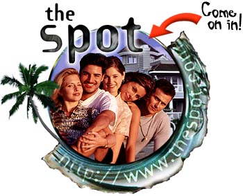
 Ever miss 1995? In 1995, this passed for online entertainment: static web pages, some 20-somethings hanging out in casual- and swim-wear, and the ability to talk back to the “cast.”
Welcome to the Spot. We’re a bunch of friends sharing a beach house in Santa Monica, California.
Everyday we put up this website and tell the world about our lives through our daily journals.
We can also interact with you – but only if you come in!
The Spot, at the Internet Archive
Well, okay, actually, it didn’t really pass; I remember checking out its launch that year as a novelty but think few people really stuck with it. It returned, undead, in 2004. No one cared (wisely). Well, now The Spot is back again. Except it’s on the Rupert Murdoch-owner MySpace, has video, and has actually widened, not narrowed, the gap with trashy reality TV shows like Laguna Beach. (Ha! See, manufacturing Cheez Whiz isn’t as easy as you thought, is it?)
Roommates (Don’t click that. Really. I could believe Roommates could cause gastrointestinal distress even for a die-hard trash TV fan — maybe especially for them.)
But, somewhere out of this hideousness, is there a lesson for how we think about “new media” (as we called it in 1995)?
For the record, I’m not the only one to notice a … connection, a bond forged in lameness between The Spot and Roommates, though The Spot easily comes out on top.
Believe me, you can’t find a third-string cable network that is more watchable over the course of an episode than Roommates is over about 30 seconds. And for that, I blame whoever tried to make this.
Being a fan of occasional junk food, though, it strikes me that over a decade later, we still don’t seem to have a good handle on what the Web medium is about. Video is edited the same way as it is for broadcast. (If people are really dumb, they put in transitions they’d use for broadcast that screw up the compression algorithms needed for Web distribution.) Sure, there’s some thought about length and format, about digestibility. But there’s little ability to navigate video interactively. There’s almost no thought about how to present video effectively in Web design. Most of the innovation with adjustable playlists and fullscreen playback I actually would credit to Microsoft for the early adoption on MSNBC’s TV features. And these are basic design and implementation features, a far cry from really thinking about how you’d build a video experience specifically for the Web.
So, I’d love to hear from you. First, are there any other doomed experiments from the past that we can learn from so they’re not repeated? (Yeah, “The Spot” being the archetypal Web entertainment is depressing. Though I bet there was some character-based soap opera transmitted over Usenet in the early 80s, or a FidoNet reality show, or a couple of scientists exchanging made-up stories about a fictional couple of surfer girls over ARPANET in 1967.)
But more importantly, have you seen examples of people really re-thinking how video is presented? It’s obviously something of importance to visualists thinking about life and art online.