The thing that makes SoundCloud so valuable – that it’s home to vast swaths of listeners and vast populations of producers – also gives it a split personality. As the people making the sounds and music, we want both. We want a big, happy audience – but we also have unique needs for managing our work. And as SoundCloud’s mobile app shifted to make the listeners happy, it took out a whole lot of stuff we need.
Pulse is the app that puts that stuff back on our phone. And now it’s at last available on iOS (Android came first and was also recently updated). I’ve been using it for the past weeks on my account. Here’s a look at what it does – and doesn’t – do.
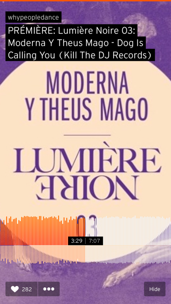
The plain “SoundCloud” app is all about listening. You get access to your stream (who you’ve followed), your Collection (saved tracks and playlists), some pre-defined genres, search, and a player. You can then respond to individual tracks with a “like,” though frustratingly, you can’t comment. To me, the most useful stuff in the app is the ability to quickly navigate your stream, and to manage tracks – repost, share, add to playlists, or make a track station based on a track you like. That last one is most interesting to me for some unexpected music discovery, after SoundCloud tweaked recommendation algorithms last summer.
To me as a “power” listener, this is all far from enough even for listening – I would love some additional tools. It seems SoundCloud, though, has focused on simplicity.
That’s possibly forgivable for listening, but it absolutely crippled the app. Following in the footsteps of app splits (like the controversial Foursquare/Swarm divide), SoundCloud has made two focused apps rather than try to squeeze everything into one.
If “SoundCloud” is for the people you want as listeners, then, “Pulse” is for you. We took a first look when it arrived on Android in November, but now it’s available for iOS.
As the name implies, the central feature of Pulse is really the notifications stream. And here, I think, the app is at its best. If you’re like me, at a certain point you just gave up trying to track notifications on the browser version of SoundCloud.
In Pulse, it becomes less overwhelming again. And that’s a good thing – as in an app like Instagram, this can be a genuinely useful way of discovering new people. You find someone who loves what you’re doing, and maybe you love what they’re doing. (Spammers have targeted this mechanism for the same reason, unfortunately, but I have found real human beings this way.)
Also essential, you can finally respond to comments directly in the app. Of course, there would be more comments if SoundCloud added commenting to mobile (cough), but it remains useful.
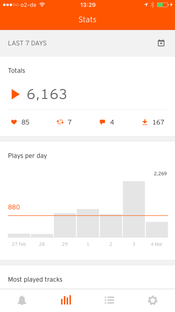
Also true to its name, Pulse lets you monitor stats quickly – most usefully, to take a look at a glance at what’s trending. (For more interesting stats, like where your listeners are, you’ll still want to head to a browser.)
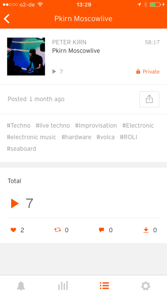
And finally, if you’re on the go and want to send someone your music, that’s the one thing you can do from inside the app in the tracks view. Significantly, that works for private tracks, too. That makes for a really important “exchanging business cards” use case. You meet someone, you want to share an unreleased track, and you can just hop into your iPhone and send them the private link.
Pulse is a good foundation. And it clearly services the “quick in, quick out” app use for these tasks.
There is still some functionality missing, though. Ever uploaded a track and then realized you set the license wrong, or made a mistake in the description? Wouldn’t it be nice to be able to edit track info or enable downloads inside the app? Well… you can’t. That’d be an obvious feature request for what’s now on the Tracks screen.
Also, weirdly for an app called “Pulse,” there are no options for setting up notifications. For instance, I’d love to be able to know when someone writes a comment, specifically. But that’s not an option.
Oh, yeah, and essential for creators – uploading is totally missing. (“Share” means linking to something already there, not adding new content.)
The inability to share new work and edit track info seems at odds with the age of the iPad Pro. On the other hand, we know SoundCloud is just getting started with the app.
Back to the stats question, as it makes a good example, you see a huge contrast between the richness of the desktop browser and the much shallower app. It makes sense that a handheld app would simplify what’s available on desktop. But look at how much more useful the browser interface is. And there’s so much data there (part of why some of us pay for a SoundCloud plan), it’d actually be a joy to navigate it with a touch interface.

SoundCloud stats on the desktop – here inside my account – are way, way more interesting than what’s on mobile. This is even a similar timeframe to the screenshot above.
2016 seems to be the year where, for better or for worse, we learn what SoundCloud’s next chapter will really look like. The company promises to finally unveil subscription plans, and they’ve hired Alison Moore in New York as its “revenue chief.” Moore is an interesting hire, with Daily Candy on her resume and also, tellingly, experience at NBC with their streaming service “TV Everywhere.” Television makes the licensing headaches in the music world look like child’s play, frankly, so she could be a smart hire, indeed.
That still leaves lots of questions; I’ll cover the latest of SoundCloud’s plans later this week.
But even though there’s plenty to criticize about SoundCloud, I think part of the passion of that criticism demonstrates just how deeply producers rely on the service. If SoundCloud weren’t relevant, in other words, you wouldn’t hear this constant stream of gripes from the music world. But it is very relevant – enough so that, for me, having this app actually changes what I do as an artist. I wish it did more, but I’m glad it’s here at last.
SoundCloud Pulse: now on iPhone [SoundCloud Blog]


