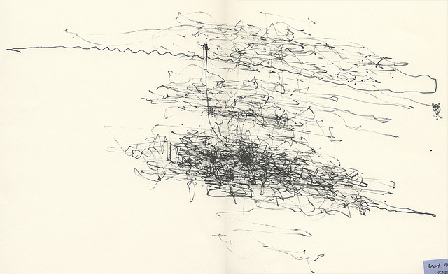
Alexander Chen, he of Kinect hacks and subways turned to strings, is back with another string visualization. Built in the browser (an interactive version is available), this work makes a visual accompaniment to Bach’s First Prelude from the Cello Suites. If you read music notation fluently, you may find the score itself suffices, but even so, the math to make this work – and the dance of circles across strings – is compelling. Alex, whose day job is with Google’s Creative Lab, talks to us a bit about the mathematics and process. First, his description:
baroque.me visualizes the first Prelude from Bach’s Cello Suites. Using the math behind string length and pitch, it came from a simple idea: what if all the notes were drawn as strings? Instead of a stream of classical notation on a page, this interactive project highlights the music’s underlying structure and subtle shifts.
Built in: HTML5 Canvas, Javascript, SoundManager
Made while a resident at Eyebeam
CDM: How did you settle on this particular visualization of this famous work? And how did you work out the maths, that is, why this specific number of dots, the distance from the strings, and the length of the strings themselves?
Alex: When I listened to the opening of the Bach, where it repeats the same bar twice, it made me think of a call and response. So I immediately pictured two wheels that echo each other, instead of just one wheel with four dots.
Figuring out the symbolic string lengths in pixels was a fun research project. I wanted explore the simple math behind string length. I learned that you can derive an entire chromatic scale just by using two fractions: 2/3 and 1/2. These correspond to the fifth and octave intervals. It’s called Pythagorean tuning. I stumbled onto this great little worksheet [PDF link] which seems to be intended for students.
Were there other things you tried, any failed experiments?
There were important learnings. It used to begin playing the piece right away. I started the opening tuning animation as an afterthought while I was preloading the strings. But that sequence became really critical.
What’s your sense of the music now having done this? Did it change your hearing of the piece
A lot of music visualization these days is linear, like reading a score. Logic’s editor, or even games like Guitar Hero, all follow that structure. And there’s a reason for that, as it’s convenient, for both computers and humans, since we can read it (and edit it) like a book. But I wanted to try something different. I think some of the magic of watching a performer is seeing such subtle, intricate finger movements produce such moving sounds. When I watch these strings morph, it feels more like the computer is performing, not just checking off notes one by one.
Seeing the Bach Prelude in groups of 8 notes gives me a bigger picture view of the piece. Instead of focusing on the individual notes, you can see each bar as a group. The strings start shifting very subtly, but as the piece builds, the strings seem to be panicking to me, shifting more rapidly. The computer is not expressive. All notes are played at equal volume. But the notes themselves, the data of the song, is inherently expressive.
http://blog.chenalexander.com/
http://twitter.com/alexanderchen
http://www.baroque.me/ [interactive – grab the … circles (“grab the balls” doesn’t sound quite right)]
