“Gramps, tell us the story again!” Well, young’n, before LLMs and generative AI, we were really excited about making big clouds of dots using statistical techniques for visualization. And actually, it’s still cool — and runs free, locally, in your browser. Lev Manovich and team have brought back ImagePlot, and in a moment, it transforms any folder of images into a visualization.
This dates back to around 2011. But it’s funny having a second go at it. There’s something strangely satisfying about the local analysis, the simple metrics, and actually sorting images by date or color and not a bunch of fuzzy AI searches. Plus, I have a lot of Folders Of Random Stuff. (We have audio tools that do the same, though this makes me curious to try building more.)
ImagePlot 2 updates the classic image analysis tool and gives it a refresh and new features.
- Input: a set of images and a metadata file (which contains filenames and any other info).
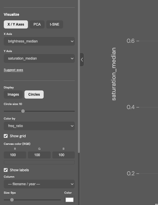
- The tool automatically extracts 48 visual features: brightness, saturation, hue, contrast, entropy, and more.
- Plot images as a scatter chart using computed features and the metadata.
- Compute PCA / t-SNE to visualize feature space structures.
- Quickly create multiple views using the same image set.
- Save any visualization as a .png.
Visit our lab site to see visualizations of many cultural image sets we made with the original ImagePlot to get ideas about what can be visualized and how.
The new ImagePlot 2 runs in a single HTML file — no installation, no server, no account.
Just open it in a browser.
HTML file, user guide, and sample image collections:
https://tinyurl.com/5bdfp976
Back this up a second — terms:
PCA is Principle Component Analysis; here’s a good explanation with visuals if you have the same amount of statistics training as I do (i.e., absolutely none). What’s useful about is it that it can bring certain elements of a dataset to the fore, making them easier to see.
t-SNE is t-distributed stochastic neighbor embedding — TL:DR version of that is, think of datasets with a ton of dimensions, and represent them as points in space so they’re easier for our brains to navigate, since we tend to think in one to three dimensions at a time! (Okay, no humblebragging about that, Mr. Spock!)
Here, the best way is just to download the project and run it. You’ll get a warning about “uploading” files to a server, but the processing all takes place locally. You can drop any random folder on the project, or if you just want to quickly see how this works, try the image set (and optionally the datafile) included on the Google Drive link.
ImagePlot 2 – Visualize image collections
“Cultural analytics,” a term coined by Dr. Lev Manovich in 2005, seems ripe for revival. Unlike the random ramblings of tech bros and their overcaffeinated bulldozer approach to humanities, this suggests incorporating machine learning alongside traditional research studies. The approach is critical and analytical, rather than black-box technosolutionism. The Cultural Analytics Labs, run at California Institute for Telecommunication and Information (Calit2) and my alma mater, CUNY Graduate Center, combine “data visualization, design, machine learning, and statistics with concepts from humanities, social sciences, and media studies.”
And if you read all that and said, “sure, but what I want to see is some neat-looking visualizations of Instagram posts,” you’re in luck:
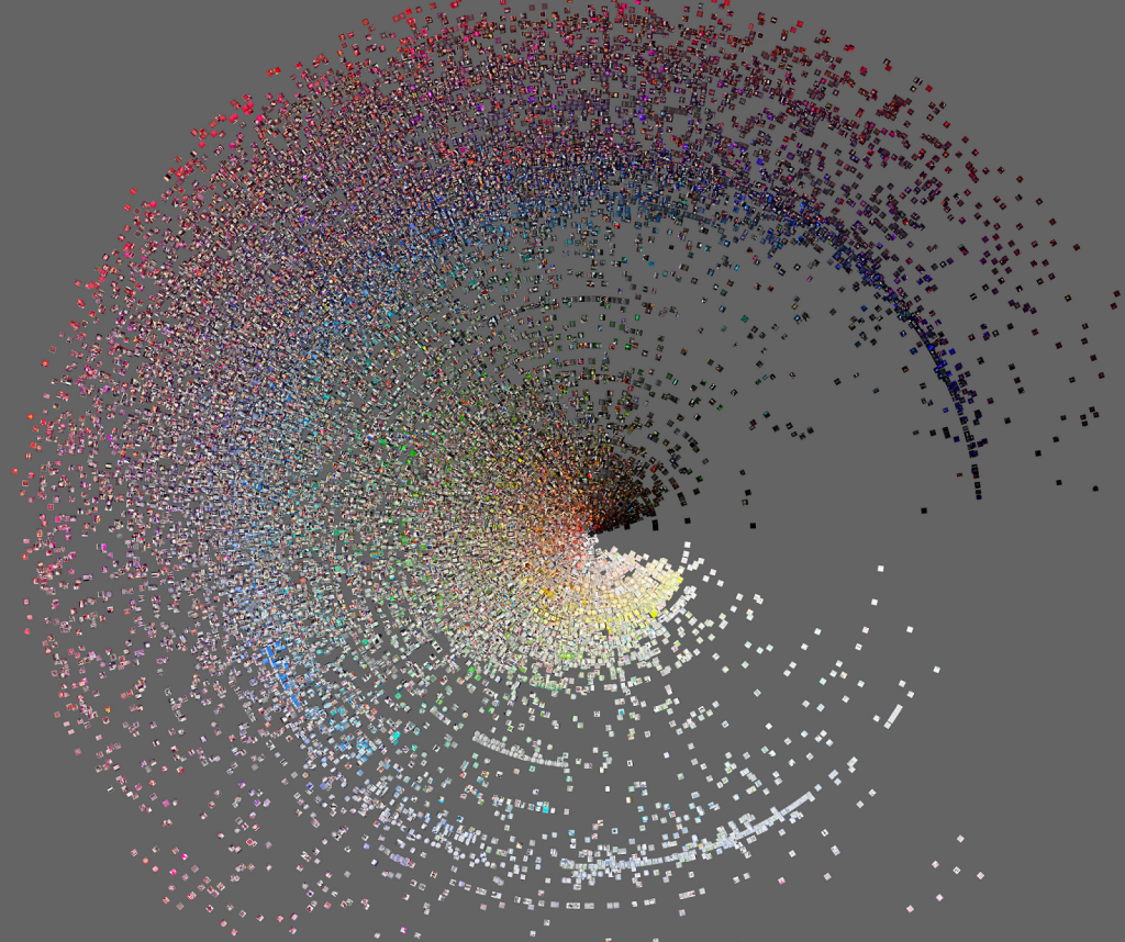
Phototrails: Visualizing 2.3 M Instagram photos from 13 global cities