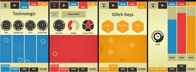
Reinventing music software for a handheld is no minor challenge. Make it too much like desktop software, and you wind up with something crammed with features that feels awkward and overly heavy in a mobile context. Pare down too much, and you’ve got something that behaves more like a toy and can’t hold up to extended usage.
Under the hood, Propellerhead’s Figure is actually Reason. But that’s just the sound engine underneath. And while the Swedish development house was adventurous and creative in imagining an interface for handheld use, the first version wasn’t exactly greeted with thrilled reviews. Users found an app that made it easy to sketch an idea, but hard to share that idea with other apps or desktops. And that created an experience that felt closed off from the outside world – precisely the opposite of the way a music tool should feel.
Two updates, one in July and one this week, have gradually added in some of the features users would want. I’d still like to see Propellerhead deepen integration with their desktop Reason software – particularly since the two tools share an engine. And perhaps more broadly, I’d like to see more of a sense that you can make this app your own, musically speaking. But this quickly moves the needle from an app you might just dismiss – even at a bargain-basement price – to one that merits real consideration.
New in version 1.2:
- AudioCopy support, so you can start something in Figure and finish it elsewhere.
- WIST (Wireless Sync-Start Technology), developed by Korg, lets you sync playback of two iOS gadgets, so you can, say, add your Figure groove to someone’s iMS-20 pattern and play together.
- New atonal / chromatic scale mode.
- Performance pads now have a grid.
From version 1.1, some serious no-brainer features (save? export?):
You can add imagined exclamation points to those features. But that’s why it’s nice to now give a nod to 1.2, which falls more into the “icing” category and less into the “what do you mean, you can’t export?” category. It jumps from “there’s a funny-looking, colorful app I don’t particularly need” straight to “oh, now this is a pretty ridiculously-powerful tool for a dollar, something I can seriously use.”
In fact, there’s probably a lesson here for developers. I would normally not second-guess development decisions, but I think in this case, given the maturity of iOS at this point, it’s better to delay shipping an app rather than ship without some of these 1.1 features. Of course, you can’t complain about a dollar app – but you’re up against other dollar apps with these features, and ultimately, time is the valuable commodity musicians have more than money. That said, I’m giving Figure a second try as I add an iOS handheld to my life later this month, and hope to compare it with some of the other options. I do like the idea of having inspiration from brief moments of experimentation.
99 cents at iTunes:
Figure
The video hasn’t been updated, but it’s still relevant:
And the slate is still wide-open as far as how mobile apps might interact with their desktop counterparts. We saw a little bit of this from FL Studio and Maschine and GarageBand, but it seems the other shoe is waiting to drop from the likes of Steinberg, Apple, Ableton, and the rest.
