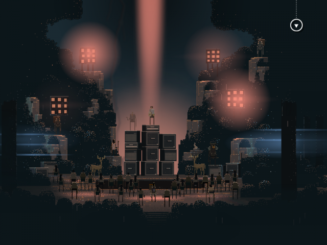
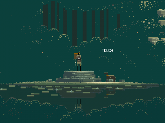
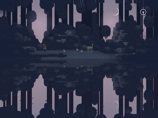
Visualist? VJ? Live cinema? Here’s a new one for you: Input Output Cinema. And while IO Cinema has already found a niche in the indie Toronto scene as “an ambiguously pluralized and irritatingly cryptic audiovisual art and design organization,” it now has its first blockbuster game. Superbrothers: Swords & Sworcery EP on the iPad is big – Angry Birds big, only with, erm, a very different visual sense. That’s before an imminent release for the iPod touch and iPhone has even come to fruition, sure to open it up to even more casual gamers. (I can’t wait to see it pop up on the NYC subway.)
And while it gets dubbed with the “a” word – uh, “art,” not angry or something obscene – Swords & Sworcery is an endlessly-pleasurable immersive concoction that sums up a whole lot of what we wish gaming were about more often.
That means it’s time to look behind the scenes at how this title was produced.
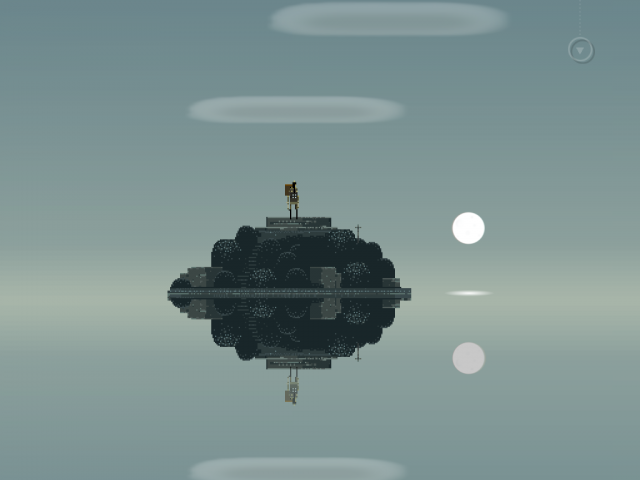
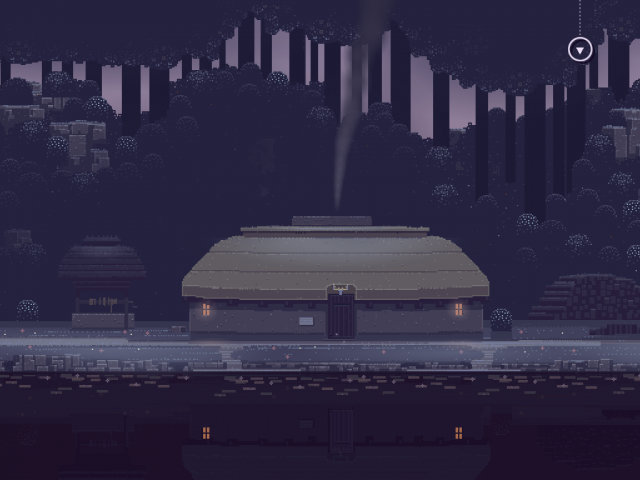
In the hands of artist, illustrator, audiovisual designer, and game creator Craig D. Adams aka Superbrothers, pixels aren’t just a retro nod to gaming nostalgia. Pixel design is a medium, like paint or wood, oversized building blocks of a uniquely personal, intimate aesthetic. (Adams collaborated with Guthrie and the game development house Capy.)
Or, to put it another way, eyes … can’t … stop … looking. Joshue Ott of superDraw fame told me his one complaint about the title was that the finger interface meant that, beneath his digits, he couldn’t see all of the artwork all of the time. That has to count as a compliment.
If this is the vanguard of more rich gaming worlds, artist Craig – having collaborating with the likes of Jonathan Blow (Braid) – would be the one to ask.
Sound and visuals are inextricably linked in Sword & Sworcery. One might say that creating digital music and creating digital motion were both essential to the production process. So, we’ve split this into two stories. One looks at the process of making an audiovisual EP and reveals some of the game design, collaborative elements, and just what toys lurk inside Jim Guthrie’s studio. (Hint: a PlayStation One is involved in the composition.)
Here, we talk to Craig about how the game itself was put together – and get to glimpse some of his visual work beyond S:S&S EP.
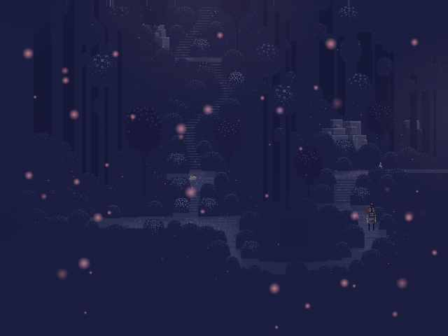
Let’s talk about the visual style itself. What strikes me is, even within this pixel medium, there is a really distinctive art style and personality. We see these expansive landscapes with all this active negative space, some of them just fields of solid color, and there’s a real sense of mystery. And the character designs, too, are not only pixelated but elongated and mysterious. How did you approach the art style? How did it evolve as things developed?
Craig: The visual style is as much an engineering decision as it is an artistic inclination. It’s my answer to the question, how can one person create all the art for a video game in a way that’s expressive and appealing? It all goes back to when I started Superbrothers Inc. in 2003, after I had gotten my feet wet with pixels and I had experimented with painterly colors, sparse patterning & expressive stick figure characters. My idea here is that if you can keep the team size small – one artist, one composer, one designer – you can dramatically increase the intensity of the creative conversation, and you can afford to take more risks. My thought is that I’d prefer to read a book by an author, not by a committee, but when a video game studio scales up, the creative conversation is more diffuse and the organization becomes more risk-averse. So yeah, that was the initial reason I committed to this direction, but along the way I looked at Nintendo’s Wind Waker, Mike Mignola’s Hellboy, Cezanne’s still lifes, Klimt, Hokusai and Hiroshige‘s landscapes… anything that would help me find the kinds of colors, shapes & compositions that’d ‘pop’ in pixels. I have a few other styles outside of the pixels and all of them share similar sensibilities, but of course the Superbrothers style is the most distinct.
What techniques did you use to make the art? What tools?
On the art side, I used Cosmigo’s ProMotion for pixels, a pixel-focused program that apes Deluxe Paint on the Amiga. I’ve been using this program since Superbrothers began – I even used it for the pixel films I made back in the day – so it’s an essential tool for me. Beyond that I used a fair bit of Photoshop & I’m a huge fan of Illustrator. I also had to dig into fMOD a fair bit as I was running the sound project for most of the time, learning the program and fitting in Jim’s tunes, adding sfx. Eventually I handed the sound aspect off to Capy co-founder & sound guy Sean Lohrish, which was a huge relief.
Below: Capy’s first hit, Critter Crunch.
How did you go about programming it? Are you using any existing iOS frameworks, or working largely from custom code? Did you effectively build an engine, then a game, or is this more or less coded from the ground up?
S:S&S EP was created using a mix of homebrew tools, C++, and [programming language] Lua. We used fMOD for sound & music integration. The project was made more-or-less from scratch – we were making it all up as we went along – but I’d have to defer to Jon Maur & Frankie Leung, the heroic coders on S:S&S EP at Capy, for more details.
I’m assuming the visuals are not entirely generative – we’re talking texture maps for pixel effects? Point sprites? Were there any particular challenges in regards to performance?
All of the environments are basically just paintings, 512×512 or 1024×512. Then I add a zillion entities – shrubs, tree trunks, objects, particles, twinkles, sky, clouds. Despite being a total amateur, I animated the people & creatures myself, and then the coders made ’em walk around on nodes & splines.
We choose not to support the older generations of iPhone & iPod Touch for our upcoming release because the load times were a bit long and the frame rate wasn’t great. So, definitely performance was and is an issue, but with the faster machines, it’s smooth as silk. We probably could’ve made a more economical and tightly engineered video game, but our process was messy, collaborative, improvisational and art-driven, so, naturally the project wasn’t super clean behind-the scenes.
So, now we know this is iOS-only. What was the reason for that decision? Had you evaluated other platforms?
For me, this was a straightforward decision: I started Superbrothers Inc. in 2003, shortly after I got a generation-one iPod, and I remember thinking, this is the form factor and this is the company that’s going to create the mobile machine that everyone, not just video game enthusiasts, is going to own. So, right from the start, my goal was to one day create vaguely Nintendo-style video games with interesting ideas, cool music, and a sharp aesthetic for Apple’s machines. When the iPhone and the App Store appeared in 2007, I was in the industry working on a PS3 project, but it was just so clear that the iPhone was ‘the’ machine, the App Store model was ‘the’ distribution system. It was free of the retailer/publisher/licensee noise of the other platforms, so there was a freedom to create & share the likes of which we haven’t seen since the days of the Vic-20 & C-64.
When I met the Capy dudes at GDC 2009 they already had some experience on iOS – Critter Crunch was basically an iPhone launch title – and we knew that we wanted to make something small and weird that we could tackle in-house without getting anyone else involved. We also all really dug the actual Apple machines, so there was a clear creative challenge to make something that would fit them. We kinda pretended we were Shigeru Miyamoto for a moment and looked at the capabilities and characteristics of the machines – the size, the input style, the communication aspect – and we tried to problem-solve ‘the perfect videogame’ to fit. It took us a long while to figure out the nuts ‘n bolts, and, of course, we’re not wizards like the folks at Nintendo, but we tried to ape their approach. When the iPad popped up, we were able to support it without too much effort – mostly thanks to the Superbrothers Inc. style of hard-edged, resolution-independent pixels – but I’m super proud about how the project feels on the iPhone and iPod Touch, where it began.
Because the project was designed so specifically for Apple’s machines, we haven’t really been considering other platforms. Migrating the project anywhere else would be a non-trivial amount of non-creative work, and adapting it to different input styles would probably do more harm than good. We get a lot of requests from Android folks, but with the number of machines, specs, and marketplaces it just looks like it’d be a never-ending headache, so we’re just going to ignore it. We’re a tiny team, and now that we’ve found an audience in the iOS space, we’re much more interested in keeping the project alive, digging deeper, improving our craft & growing our audience on the currently supported platforms.
Moving to Superbrothers for a moment, tell us a bit if you will about your background? How did you come together? It seems like you’ve created a real identity for yourselves, too, which is part of what makes the game work.
I was listening to Royal City [Ontario indie rock band, of which Jim was a member] back in art school, and I was loving a lot of what Three Gut Records was producing. I got into Jim’s solo records with 2003’s Morning Noon Night and then 2004’s amazing Now More Than Ever. I had heard that he’d been using a PSOne with MTV Music Generator to make some of the backing tracks & instrumentation on Morning Noon Night, so even though Jim was a distant rockstar at the time I kinda figured he was a bit of a geek too.
On my last day of art school in 2004, I got a gig with The Walrus magazine to do a two-page pixel illustration, which was basically a miracle. I was so proud to have gotten that gig that I went ahead and printed up a little promo for it. And because this was at a time before art directors were sensitive to this videogame-inspired videogame language, I decided to send it to people I thought might dig it, so I sent one to Jim, care of Three Gut Records. Not only did Jim respond, he went the next step and sent me an entire record’s worth of previously unreleased made-in-Playstation songs. I was totally floored.
I had been fooling around with Superbrothers Inc. videogame prototypes, but I didn’t have a background in programming, so I’d inevitably hit a snag and be unable to problem-solve it. So when I got Jim’s tunes I figured I’d try making an animated music video. I’d never done anything like that before, but I figured it would be easier than learning to program. I ended up with a clip for Jim’s song ‘Children of the Clone’ and I sent it to him. He really dug it, and we’ve been in touch ever since. I feel like what Jim was doing with these songs was more or less on the same wavelength as what I was trying to do with the art. They are clearly inspired by old video games sights and sounds, but they’re not trying to recreate them in any way. It’s more of an alternate audiovisual path with an expressive quality all its own.
Below: more of the pixel art filmmaking of Superbrothers + music of Jim Guthrie.
THE CHILDREN OF THE CLONE
‘you will be incorporated!’An award-winning portrait of corporate culture run amok in which a single executive recruits an army of clones to attack, behead and ‘incorporate’ an old money industrialist into their consumptive system. The film features an aggressive, stellar musical composition by Jim Guthrie. This is the first pixel film by SUPERBROTHERS.
Warnings: Some educational material, blood, violence.
Production notes: Very little is known about the creation process of this film, although recently discovered documents retrieved from the Belarusian State University of Informatics and Radioelectronics suggest that the original reel for the film dated back to the early years of the Stalin era.
DOT MATRIX REVOLUTION v BOW BEFORE THE CLOUD
Following an early morning status check of their vintage electronic equipment, two computer engineers “throw down” in an awkward dance-off that innacurately echoes the development of information technolgy and the internet from 1951 up to the present day. The film features a catchy jingle by pop impresario Jim Guthrie.
*: The point at which a given species cedes planetary control to robots or machines.
Production notes: This film was produced by Superbrothers in 2006 before the establishment of Superbrothers Inc., but it was not until after incorporation that the film was eventually released. Critical reception of the film was positive, although most felt that the aim of the film was less lofty than its acclaimed predecessor THE CHILDREN OF THE CLONE, and that its creators had gone soft, already drifting from their revolutionary roots.
Interestingly, the film caught the attention of a number of internet web logs, leading to criticism by the notoriously tech savvy internet web log users, who responded harshly to home viewings of the film with comments like these: “Lame. Stupid. Fail. The depiction of Computer Systems of each period are so innacurate as to be totally misleading.” or worse, “Lame on SOOOO many levels. Not even deinterlaced properly, which is amazing considering it’s trying to look 8-bit. I was wondering how this crap got voted up, then saw, of course, Mr.BabyMan’s fan army voted it up”.
‘THIS IS A PUBLIC MENTAL HEALTH ISSUE’
A dischevelled weakling in a gloomy basement plays an {REDACTED} videogame for several days consecutively, sustained by {REDACTED} food & motivated by {REDACTED} rewards. The film is intended as an illustration of a portion of the lecture “Design Reboot”, delivered by {REDACTED} videogame creator & outspoken critic Jonathan Blow. In the lecture, Blow identifies what he thinks is the unique expressive power of videogames, and he then describes the ethical dilemnas that occur when this power is misued by a {REDACTED} videogame industry.
The film includes 8-bit elizabethan “chiptune” music by the Super Madrigal Brothers & sound effects by composer Todd Mazierski.
Warnings: The film clip, brief as it is, runs the serious risk of misrepresenting the depth and breadth of Mr. Jonathan Blow’s thoughts on this subject. You are encouraged to listen to the lecture in its entirety, available for absolutely free.
Google it! ‘DESIGN REBOOT LECTURE’.
Production notes: Initially intended as a series of HD sketches to promote one of the most significant lectures of the videogame age, the clip included none of the craft of THE CHILDREN OF THE CLONE, nor did it present even the hollow charm of DOT MATRIX REVOLUTION. Some claimed the clip deliberately misrepresented the lecture, while others simply viewed the film as “unfinished & depressing”.
EDIT: On Monday, November 16th 2009, Superbrothers Inc. did not announce a new videogame project via email & twitter “TIM LANGDELL’S: EDGE & EDGERY EP”, which is thought to be a spiritual successor to DRHD.
Go get the game / connect with the Superbrothers:
http://www.swordandsworcery.com/
Learn about the music, Jim Guthrie, the design process, the collaboration, and get more Craig thoughts:
Game Meets Album: Behind the Music and Design of the iPad Indie Blockbuster Swords & Sworcery [Create Digital Music]
