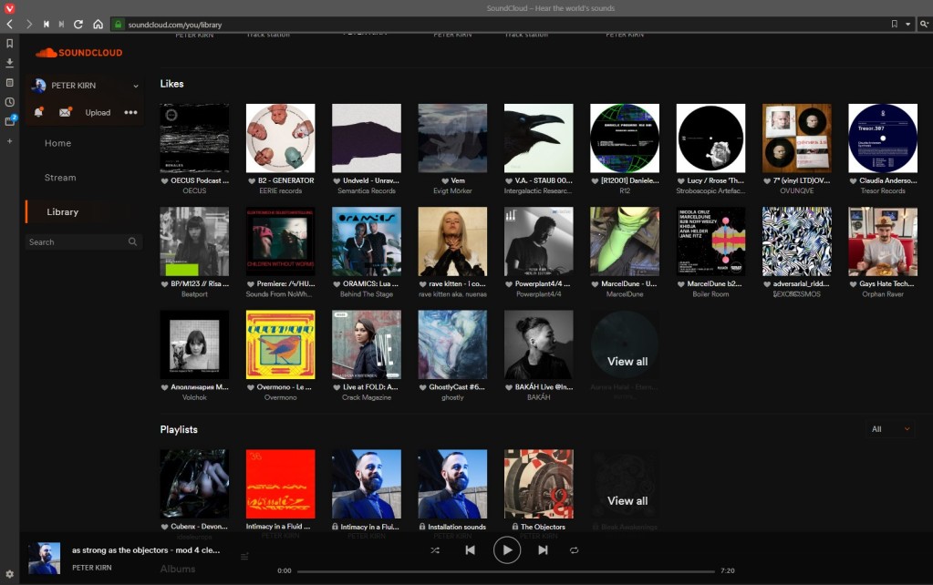
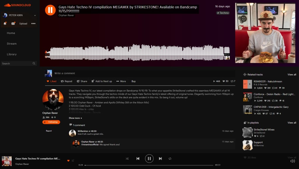
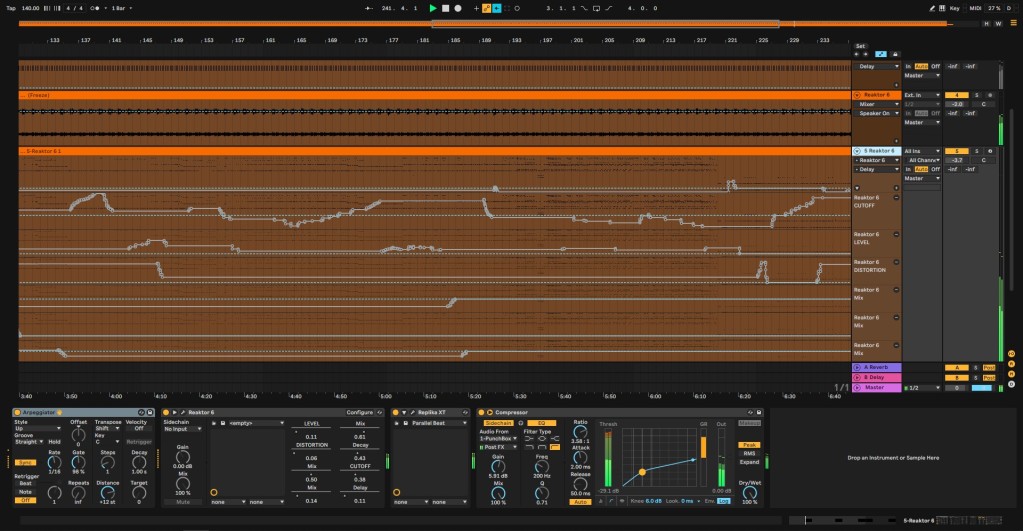
Dark themes are all the rage these days, from phones to desktop OSes. Now it’s time for stuff you use every day to go properly to black, too – hello Ableton Live and SoundCloud.

Okay, dark themes actually have inspired some controversy when it comes to usability and even eye fatigue. But it’s pretty understandable why they’re using in music. Let’s face it – we’re commonly in the dark. Dark themes save battery life, and they’re less disturbing when you’re listening in bed, in darkened studios, onstage – you get the idea.
macOS Mojave added Dark Mode for apps; Windows 10 is (as usual) following piecemeal but has now largely caught up. Recent iOS and Android versions and apps also have added support.
Two apps I use a whole lot – Ableton Live and SoundCloud – weren’t quite there. Live’s dark themes are grayish, but not black (without customization); SoundCloud seems to have adopted its color scheme from the garish white and orange of easyJet. (I swear this was because early on the founders were commuting between Berlin and Stockholm on that airline. I’ve never confirmed this with them because it’s more fun to just make up the story. You know.)
Let’s take these two Berlin-based music tools and drain them of color and light so they’re ready to queue at Berghain. (And probably get rejected, but still, on-message.)

SoundCloud
For websites, Stylish has been a favorite of customization lovers since its debut for Firefox way back in 2005. It’s now graduated from hacker status to something anyone can use, with versions for the new faster Firefox, Chrome (and any Chrome-compatible browser), Safari, Opera, and whatever else you may use. (I’m using it now in Vivaldi, and there’s even a new Android app.)
The official site from developer Jason Barnabe has what you need:
And then you’ll find various options for SoundCloud when you search.
The most popular and up-to-date is Quite Dark:
https://userstyles.org/styles/143738/soundcloud-quite-dark
But I’m partial to “Ultra Dark.” I do find this makes me enjoy using SoundCloud more, recalling black album colors and high-end studio electronics. And in Stylish you can swap themes or disable customization if you find a portion of the admin side when uploading that isn’t skinned.
https://userstyles.org/styles/176264/soundcloud-ultra-dark

Ableton Live
Live for me is more necessity – the wrong theme can be blinding under weird club conditions, and I find equally hard to focus on in the studio.
Wait, I’m writing that, and lately I haven’t been playing with Ableton Live onstage. So, okay – maybe it’s just aesthetics. But let’s do it anyway. Sometimes just varying the scheme can help you get over two decades of using this tool.
We’ve covered Live skins before – the most comprehensive source remains the wonderful Sonic Bloom site, which also handles customization techniques and other information. But I wanted something extreme, which right now means going to long-running fan art gallery Deviant Art. (It’s another holdover from the Beforetimes, when the Internet didn’t totally suck so much.)
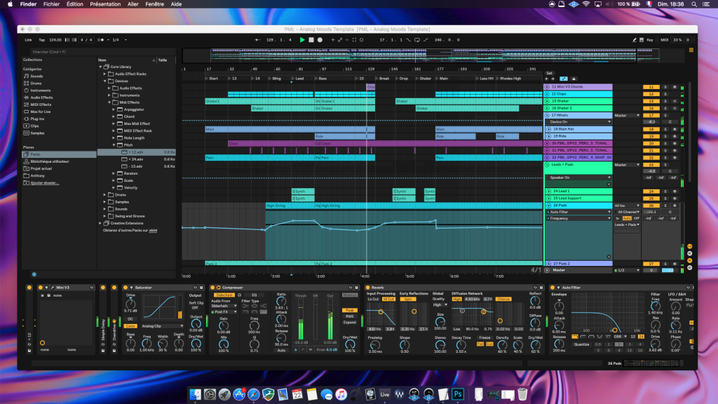
And Dark 2 is totally delicious for those of us who want extreme blackness. (Blackest ever black?)
https://www.deviantart.com/anthonymilano/art/SKIN-Dark-2-for-Ableton-Live-10-735023504
Thanks to creator anthonymilano, whoever you are, for this gem. Image from his page, which also includes install intructions.

More ideas?
What else do you want to go dark?
Bitwig Studio already has a pretty blackened scheme by default; I actually haven’t gotten as far as customizing it yet. (Anyway?) Ditto Renoise.
I was going to add Reaper to the list but they went and overhauled the customization of the themes in Reaper 6, so it’s a little premature.
But I bet our readers have loads of ideas. Fire away.
Now someone really needs to bring back the reverse-lettered “evil” t-shirt for Ableton Live. I love that I even got asked by an airline flight crew about that.