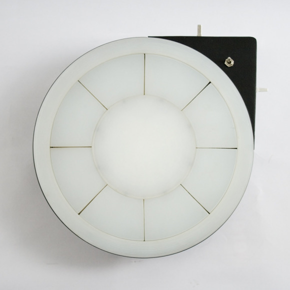
Design in music in a digital world can be about the object as the sound – musical ideas translate from one medium to many others. And just when you think you’ve seen it all, someone comes up with a new visual metaphor, a new creation for manipulating music.
OTTO is a functioning prototype combining interactive hardware and computer software, the invention of Luca De Rosso. He produced the design as a thesis project for his masters’ degree in Visual and Multimedia Communications at IUAV University of Venice. It uses the Arduino open source hardware platform and Cycling ’74’s Max/MSP software, and Luca accordingly is quick to credit the assistance of those two communities. In that sense, two, I think it points to lots of new design in the field of integrated hardware and software – not just standalone hardware or standalone software or generic controllers for anything, but hardware that itself behaves like software.
All photos here courtesy Luca and used by permission; see his Flickr account.
OTTO ~ demo.01 from Luca De Rosso on Vimeo.
Luca sends along some more details of the behind-the-scenes workings just for us. (Thanks, mate!)
Luca actually had assistance from his father working on the case. (I love that – father-son collaboration!) All the electronics are on a single Arduino board, and the patch works in Max. (Max has features that make it well worth using, but it’d be nice to see a Pd port, too, making the whole setup open source – and giving you an easy way to run it on Linux.)
OTTO ~ Getting Started from Luca De Rosso on Vimeo.
Luca sends us a view of the innards of this device – you saw it here first:
The first prototype is done, says Luca, with three more coming in coming days as he heads to a festival in Croatia. Plans for the future: no commercial availability yet, but Luca says he’d be happy to hear from anyone interested in manufacturing. (Capital remains the big challenge, even as fabrication gets easier.)

I also love the way he’s designed the documentation. Music tech industry, please, this is how it should be done – with all due respect and without naming names, we really would love if you just showed us your gear and didn’t have some swarmy dude gushing about lots of hype. In fact, we’d be equally happy to buy your gear if the design spoke for itself rather than having your name and circuit diagrams and random text plastered all over it.
But this is really visually inspiring, creative work. And to top it off, it looks insanely fun to play. Putting the beats in a circle opens up all kinds of other possibilities, and suggests thinking in terms of cycles rather than the grids we see on other hardware. As with the monome, you can imagine other software applications that would hook into this basic, minimal hardware design. I hope we see more of this design and concept.
http://www.lucaderosso.com/otto/otto
More videos:
OTTO ~ demo.02 from Luca De Rosso on Vimeo.
OTTO ~ demo.03 from Luca De Rosso on Vimeo.