
Saturday afternoon in Toronto, I’m giving a talk to the North by Northeast festival on music software and tablets. I’ll explain a bit about what tablets are about, and some of the software that’s out there on the landscape (principally, of course, on the iPad). But I hope to emphasize a deeper issue: how you design software for the tablet, and what’s unique about this convergence of form factor and touch interface. I mean this generically for a reason: on CDM, we covered some of these ideas before even the announcement of the iPhone, and I was an early (and skeptical, I might add) reviewer of the JazzMutant Lemur.
Even looking beyond that, I hope to talk a bit about how representing music graphically has been an essential part of human practice, not only beyond the iPad, but beyond even the current notational system as derived from the Western church. Talk about early tablets: the first known music notation appeared in ancient stone Greek and Byzantine tablets. (On weight and thinness, I don’t think they compete with the iPad.)
That sounds lofty, especially for a potentially-hungover crowd of musicians and designers on a Saturday, so here’s the executive summary: you don’t have to make a bunch of fake knobs.
I’m really mostly curious to start a conversation about design; ideally, I’ll get some designers showing up here in Toronto, but it’s time to make that conversation happen on the Web, too.
With that in mind, I’m curious:
What software designs – iPad or otherwise – have you seen that have most inspired you, in terms of the way the interface was designed?
Fair game: sound toys, music notation (really), art pieces, games, control surfaces … whatever you like.
I’ll post notes from my presentation by early next week, because I’ll probably be assembling it at the last minute it’s already totally done and perfect and rehearsed and I just wouldn’t want to spoil it.
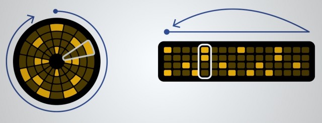
Pictured: Loopseque; previously on CDM
Also, because I’m a huge fanboy of circles in general (as readers of this site know), I love this image and blog post from Loopseque. They didn’t exactly invent the idea of visualizing loops as circles, but let’s join this revolution.
Another step in the evolution of music interface [Loopseque Blog]

Honestly, if tablets are nothing other than an excuse to ask these questions again, all the better – and there’s no reason not to then apply what you’ve learned to computers, embedded hardware, analog hardware, paper notation – anything.
If anyone would like to start a circles versus rectangles fanboy platform war, troll away! I’ll start:
stupd circle &*(&$s you losers got not edges. serious muzos have right angles. go play with your dumba** frisbee shaped toys that dont have even no sides on them and see if you can even figure out PI LOLZ pie like something youd eat its not even a rational number whatevss
real pros use polygonswhaaaa??? ow did someone just hurt on their foursided pointy pointy pointy edge? shoulda used a circle, youd be happier 😛 😛 r4d1us 4 l1f3
Seriously, definitely let me know what new interfaces you’ve found inspiring lately, and I’ll be sure to credit you in my talk!