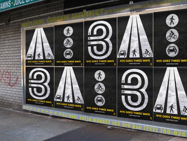
In a great example of video’s power to tell a story and send a message – particularly when embellished visually – design student Ron “RonConCocaCola” (School of Visual Arts) presents documentation of just how chaotic a single New York City intersection can be. There are some especially bad moves by cyclists, though motorists try their best to be a******s, too.
Ron describes his video:
By summer 2010, the expansion of bike lanes in NYC exposed a clash of long-standing bad habits — such as pedestrians jaywalking, cyclists running red lights, and motorists plowing through crosswalks.
By focusing on one intersection as a case study, my video aims to show our interconnection and shared role in improving the safety and usability of our streets.
The video is part of a larger campaign I created called ‘3-Way Street’. Please see blog.ronconcocacola.com for more details.
See also: 3-Way Street Follow Up [Ron Con Coca Cola]
There’s potential to go further with this. The evocative, highway/cloverleaf-style visuals in his poster suggest possibilities to adapt this to a motion piece. I’d love to see a visualization of the paths of all those wrong moves. “3-way” is a reference to the fact that bikes, cars, and people share city streets, but in this case, wrong-way bikes in particular turn road directions upside down.

Whether in live visuals, motion graphics, or installation, though, it’s great to remember the power of the technology to say something. I know I have a different perspective on the streets now after watching this birds-eye view.
It’s actually coincidence, by the way, that we have this string of New York City posts; while I live here, a number of those I find online. I’m guessing maybe summer is inspiring people to do documentation?