Now that digital technology allows rapid creation of new interfaces for music and sound, the question of how to represent those elements visually has new life. But whether digital or not, practitioners of music have long been interested in applying further descriptions to music, from the Baroque Doctrine of Affectations to the involuntary association of color in Synesthesia.
Applying colors to the notes of a musical scale is one particularly common idea, but the late master composer/orchestrator Arthur Lange had a different idea: why not give colors to range? Building on ideas from orchestrators Francois Auguste Geveart and Rimsky-Korsakov, he applied colors to registers of tone across each instrument. This way, it’s possible to see, in livid color, how ranges are applied in orchestrations, even down to unisons and harmonic density.
Lange wasn’t just any composer/orchestrator: he was a four-time Academy Award nominee, head of MGM’s Music Department, a Tin Pan Alley mainstay, a bandstand and studio regular from the 1920s, and an orchestrator on everything from 20s dance band numbers to MGM’s “The Maltese Falcon.” Seeing his creative and more-than-a-bit idiosyncratic approach says a lot about the ingenuity of America’s musical Renaissance at the time.
Here’s the twist: aside from suggesting how color might be represented in digital systems, the Spectrotone Chart could even be applied to audio equalization in music production, as EQ and orchestration are closely coupled. (Tin Pan Alley’s orchestrator with a pen could be today’s mastering engineer on Cubase.)

I know some of this only by coincidence: Alexander Publishing, a major music and educational publishing house, has decided to re-release Lange’s self-titled “Spectrotone Chart” with training materials as a US$20 download. As they are selling it, Alexander doesn’t want to give away all its secrets, but here’s the basic system. Range is divided by adjective and color:
White = Brilliant
Yellow = Bright
Green = Pleasant
Blue = Rich
Orange = Golden
Red = Glowing
Brown = Warm
Purple = Mellow
Grey = Dull
Black = Indefinite
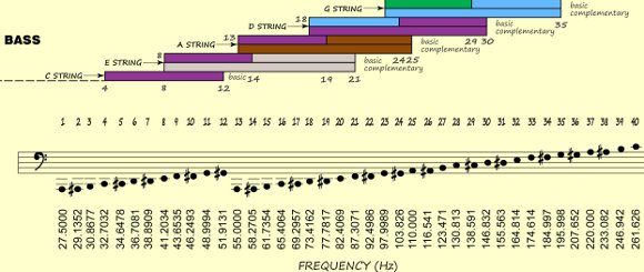
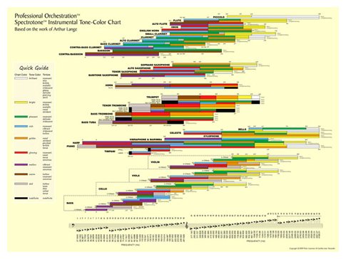
These sections are then, as illustrated in these excerpt images, applied to frequency and instrumental range, with various applications for using the resulting color system to understand orchestration and harmony.
What might this have to do with recording and EQ? From the press materials at Alexander Publishing:
The Spectrotone Chart is organized by the 88 keys of the piano with each key numbered, from the bottom A being 1 to the highest C being 88. Because of its application to mixing and EQ, Alexander Publishing added below each piano key its Hz frequency. Similar to many EQ charts, above the piano keyboard are the colorized tone colors within each instrument’s range.
With the Spectrotone Chart, an engineer sees the range of the EQ’ing along with the tone colors being affected. “For arrangers and composers not trained in recording engineering, the Spectrotone Chart helps them understand EQ from an orchestration perspective,” explained Peter Alexander, author of the Professional Orchestration™ series and How Ravel Orchestrated: Mother Goose Suite.

If you’re interested in exploring Lange’s system, $19.95 buys you a digital download with the chart (as an 18″x24″ poster, scalable to Letter, A4, and the like), plus two detailed “training guides” for how to use it.
But I’m also interested in how color might be applied to new musical interfaces and interface design, and how you use color to think about your music generally. After all, as MGM themselves demonstrated, a world in Technicolor is somehow more vivid, if a bit riskier. Just ask Dorothy.
