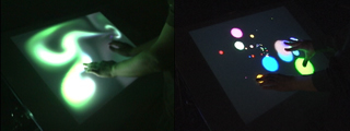
Reflections, indeed, since last week we saw a music/multimedia interface based on a camera tracking system called Frustrated Total Internal Reflection. (Sounds like an apt description of some of our undergraduate college years?)
Futuristic musical interfaces could take a radically different direction from what we’ve seen so far, and that distant future may be close — really. But let’s clear some things up:

Not everything cool comes from Apple. The blogosphere last week latched onto a project headed by Jeff Han, a consultant to NYU. Mac heads were apparently confused because last week also brought revelations of a new Apple patent. “Something cool involving touchscreens? Only Apple is capable of coolness! It must be from Apple!” I won’t touch the underlying wrongness of that statement, much as I love the Apple products I use. Instead, let’s look at a more practical reason why that’s wrong. Han’s magical touchscreen is gorgeous, but not fitting into an iPod enclosure any time soon, as it uses back projection. (Read: you’re carrying around a projector. Unless you have REALLY big pockets . . .)
Not only that, but if you read the Apple patent carefully, you’ll notice, as I said before, it’s a patent on designing UIs for multi-touch interfaces and specifically gestural inputs. Apple cut a lot of hardware R&D in the 90s, and with it the number of tech patents coming out of their labs. That’s a good thing: let someone else spend the money on research, and focus on great design and bringing that research to market. This looks like it’d fit that pattern: someone else designs a great, cheap multi-touch interface, and Apple designs a great interface. But it could also mean that last week’s buzz aside, someone else could very well beat Apple to a gestural, multi-touch computer interface. We’ll see. In the meantime, if you don’t mind carrying a projector around and doing some hard-core programming, you can go build your own. Moving on . . .
Multi-touch interaction roundup: For a better overview of all these multi-touch developments and how they relate, check out the roundup assembled by interaction design expert (and Friend of CDM) Chris O’Shea at Pixelsumo. I endorse what Chris says, and as for the one shipping product for music, the Lemur, you should be seeing more US publications with reviews soon.
Beware of sweeping statements about musical interfaces. Here’s an example: JazzMutant, the makers of Lemur, start out describing their product by suggesting that nothing else can compete with it: “Are you seriously planning to control a 32 band vocoder with a fader box? Have you ever tried to change a realistic reverb made of nearly thirty parameters in real-time? Which input device allows you to take all the benefit of a powerful physical model synthesizer?”
What’s wrong with this statement? Designing a new interface to solve problems like controlling a complex vocoder can be great, but JazzMutant’s assumption that their particular touchscreen is the only way is simply wrong. A 32-fader control surface could work just fine with a vocoder. Tricky to control? Yes. So is the touchscreen, because you’re still limited by having only two hands. Then again, with practice, any number of interfaces could solve this problem. You might discover the Lemur is the best way to control your 32-band vocoder or reverb or whatever it is. Then again, you might not. Sweeping statements open up interface designers to criticism. But the fact that there are alternatives is a good thing, not something to be feared. Speaking of which . . .
Don’t overlook tablets. Then again, that’s another story.