Operating systems aside, the most important “platform” for your music may be the work environment you create for yourself to produce. Seeing that physical environment for someone else can be an inspiration, and certainly a window into their personality. So, as I look through the workspaces submitted by readers, I asked the terrific blog TRASH_AUDIO to select a few of the favorites from their series, “Workspace and Environment.” Rather than ask the usual, bland music journalistic questions of artists, they explore those artists’ creation spaces, and discuss process through that context. (Eat your heart out, MTV Cribs.)
TRASH_AUDIO also has a new site address, so go enjoy:
http://trashaudio.com/
It’s worth checking out the whole site, but here are their top five favorite workspaces and environments, in no particular order. Some are the tangles of wires you might expect, others more unusual, clean digital environments like the images I chose here (if only because I’m more used to seeing the tangles of wires).
1. Finnish-born Sasu Ripatti of Vladislav Delay and Luomo has found an acoustically-wonderful, isolated environment on an island, an environment surrounded by trees and far from people. On the road, it’s just one laptop, one Korg nanoKEY, and an audio interface, to which he adds Faderfox MIDI controllers, small KAOSS pads, and effects pedals for live gigs.
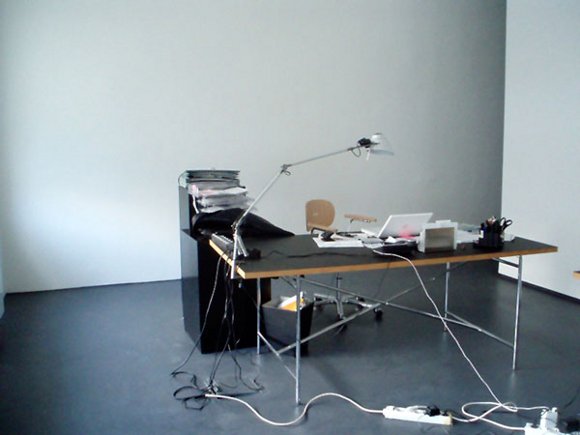
2. Alec Empire stays true to his Berlin roots with an all-white minimal studio. It’s distraction-free – and having a big, dedicated studio space means no neighbors. Think loud. “Actually you wouldn’t really find much colour in there,” he tells TRASH-AUDIO. “And what surprises visitors is that we have no paintings or posters or anything visual up on the walls. I really find this distracting. Somehow my mind would get off path. The great thing is that we can record whenever we want.” On the road, it’s a Mac and Digidesign gear, but most importantly, a big mobile hard drive, so sounds can come along with him for constant revision. Add to that an iPhone as a musical notebook for sketching ideas.
3. Alessandro Cortini, an Italian-born artist living in the US, focuses on Buchla modular gear as the center of his workspace, with the monome and MLR as the software accompaniment. Corners of the space, he says, are dedicated to different working styles – modular, drum machine, computer – but everything is within reach, which to me is also the epitome of the brilliant Buchla design itself. If you can’t afford a modular (and certainly most of us can’t afford a Buchla 200), perhaps the ergonomics is the single most important lesson to learn here.
4. Mavis Concave, Robert Inhuman and Vankmen of Realicide adapt to a variety of environments – the corner of someone’s room, different homes. As Mavis says, the people in your surroundings often matter more than the architecture: “I need to have enough physical space for my gear and be surrounded by people who encourage the work that I am doing. I can’t be surrounded by people who write off my music production as a nuisance to have in the household. That is probably the biggest creativity/productivity block there is for me.” And for fans of hardware (you’re heard in the poll, don’t worry), that means favorite gear that can go in a car trunk, like the Korg ElecTribe ES-1 (called out by both Mavis and Robert).
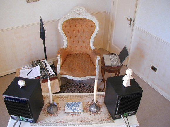
5. Atom TM. I just love this, because seeing look-alike studios is boring, because I feel strongly that aesthetics around you can provide visual stimulation for your sonic creativity centers, and because it defies conventional wisdom. So I have to just run the whole quote – decoration instead of gear. (Next – perhaps decorated gear?) Take that, blank white walls of Berlin!
“Decoration instead of gear” became the motto. All my workspaces had to have big windows and if possible a nice view (even though I tend to close the curtains in summer during daytime). I don’t like “studio” atmosphere. I don’t like cables, gear and the entire tech-look. Environments that make me feel well and relaxed are usually of a different type. I like old furniture, warm colours, ornaments and in general everything that does not look contemporary. The contemporary look usually is contaminated with bad taste and pretentious design. Further, the decoration itself helps to absorb reflections and creates a dryer sound. I can say that the decoration itself, that is, obtaining/installing as well as creating amongst it, gives me more satisfaction than obtaining/installing equipment. I can see why “studios” have to look “tech”, that is because the studio owner needs to impress the entirely clueless cast of customers. There is no reason whatever to follow that look, just because it is somewhat implied in the equipment itself. In general I’m very sensible when it comes to “making music”. I find it hard to focus in other studios that don’t fit my aesthetics and sound. I think that my workspace is a perfect combination of the technical-, creative- and aethetic aspects of my work and it has become what it is through a long development of those three components.
Editorial note: In a blinding error of reading on my part, I read the words “Analog Live” as a misprint of “Ableton Live,” as referenced in the original draft of this story. I’ve been looking at software too long. To be clear, this was my inability to read, not a typo on the part of TRASH_AUDIO. I still like the idea of a parody of Ableton’s site redone in analog gear. I will from now on keep that fantasy to myself and stop applying it to the rest of the world.
Whether or not any of these approaches is meaningful to you may vary. But to me, just hearing people make decisions to reorganize their space is refreshing. I find sometimes even an arbitrary change of scenery can help unstop creative juices. Let us know if the same is true for you.
