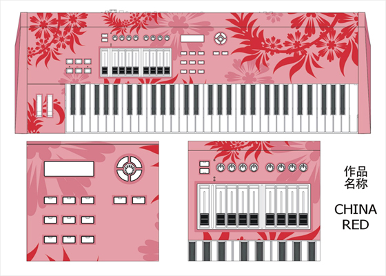
I love CME. This Chinese manufacturer came out of nowhere with a new keyboard so overloaded with features and priced so absurdly low, initially some of the staff at Keyboard who saw it at NAMM thought there was some kind of translation error, like they didn’t understand the currency conversion. They’ve come up with bizarre products, like a keyboard for composing ring tones. (Really.) And now they’re holding a contest to “design a UF keyboard:”


Now, I have to admit, I am a little disappointed, because when I first read the press release from CME I thought they meant we got to design the whole keyboard instead of just the skin. My mind flashed to a musical equivalent of Homer designing a car on The Simpsons. Let’s see, my keyboard will have 9 octaves, cupholders, an espresso maker, and a detachable wireless flexible ribbon controller.
But designing a skin sounds just as good to me. You’d better get in there fast, because so far the entries all look ridiculously ugly. Apparently, the goal was to put as many graphics on a keyboard as possible, even if it means combining images of an Apple Airport with those Nintendo hamster things. Or, at the opposite extreme, turning the monstrous, control-laden CME keyboards into something pink and flowery, as pictured here. I think we need to get our site designer Nat on this one for something with some subtlety. I’ll buy a Natboard.
Now, if we can just get CME to run a contest to redesign their website so we can actually navigate and read it . . .