
The new Ableton Push is here. From a distance, it looks like the same rectangular grid with some color screens. But using it person is an entirely different experience. We’ve gotten to spend an extended time with the new Push, so we can let you know what that’s like.
Here’s the simplest way to put it: Ableton has kept the same basic layout and form factor of the original, yet somehow made every single detail better. From hardware refinement to software integration and functionality, everything feels like 2.0. Ableton repeated that they’ve completely re-engineered Push themselves. But even if they hadn’t told you that, you’d be aware of a different feeling from the moment you see one up close – doubly so once you touch it.


Push is still called “Push,” though Ableton will call it “Push 2” when comparing to the original. That says a lot: this is just what Ableton now considers Push to be.
The weight and size are roughly the same, but each surface feels more detailed and precise – and that’s saying a lot, as the first Push was already reasonably impressive. The new Push simply feels a class above any other hardware in the industry at the moment.
This isn’t just qualitative; it’s quantitatively different. Buttons are lower profile – by a lot; they emerge only slightly from the faceplate. Tolerances at each edge are tighter. The unit itself is thinner. The strange indentation on the first Push, made for a cover that never shipped, is gone. In practice, these many subtle changes mean that indication text is clearer, and tactile feedback is more solid and consistent – in short, the desire to make music with the object is greater. In fact, it’s almost embarrassing to put the two side by side and realize how much the buttons and pads wobble around on the first Push (the triggers in particular), or how much less satisfying the surfaces are to touch.
On the left, the new Push; on the right, the old Push.


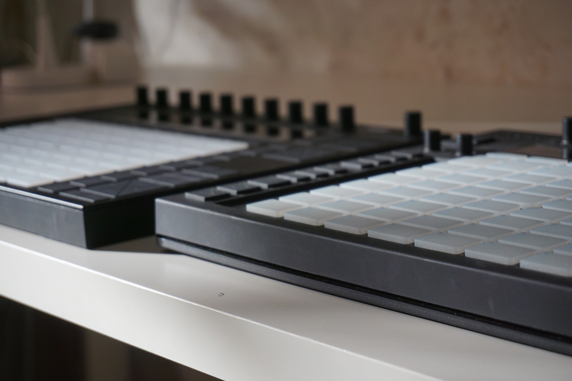
The surface finish is different, as well, and seems free of the scratching and peeling issues on the original (I tried to scratch it and couldn’t). The days of weird dusty-gray or pink LEDs standing in for “white” are gone, too – white looks white, and colors look vibrant without being blinding or garish. Significantly, it’s also easy to read the light-up text on the buttons. Those still elegantly fade to black and disappear when functions aren’t active. But now when they do light up, text looks crisp – almost like looking at a display.

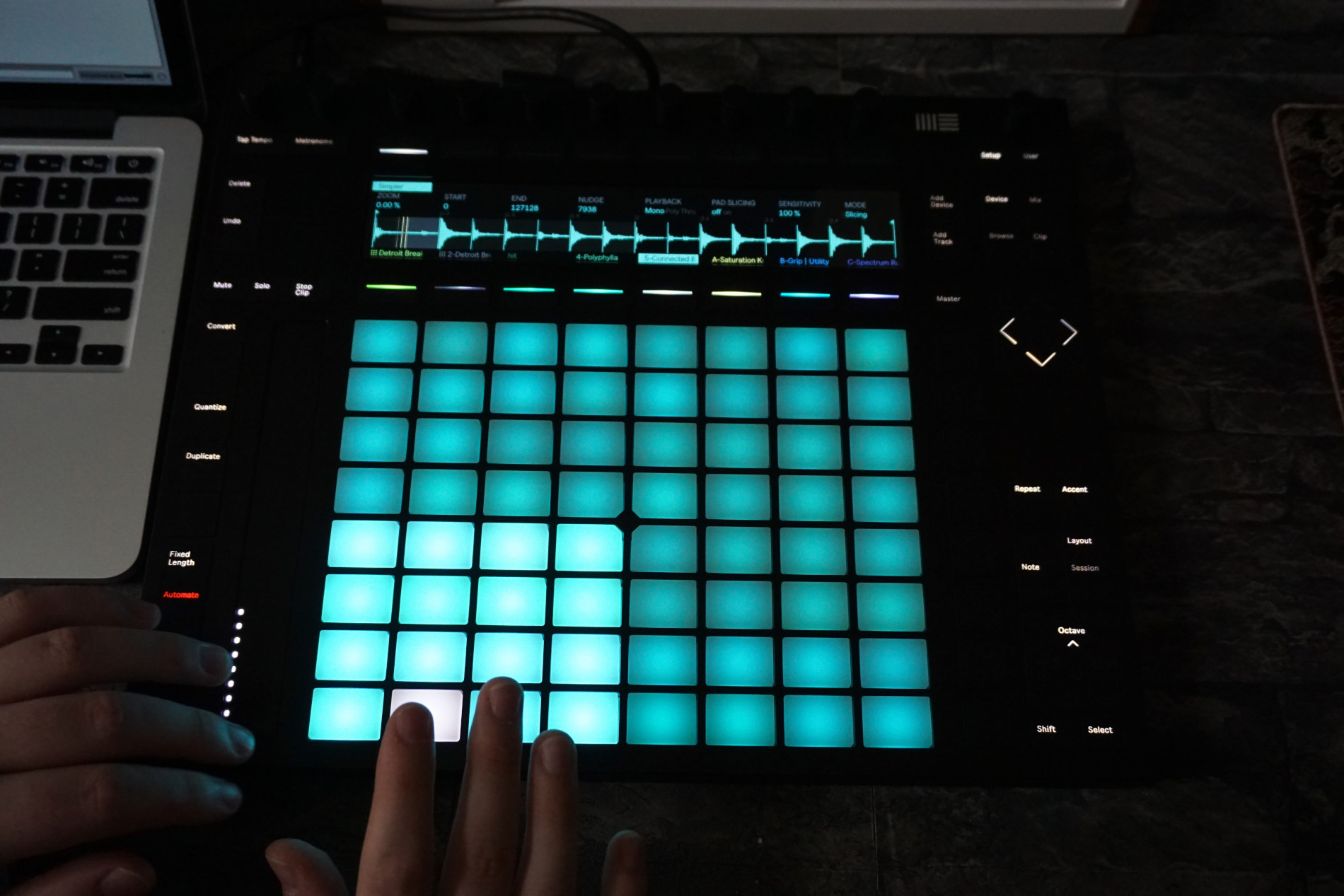
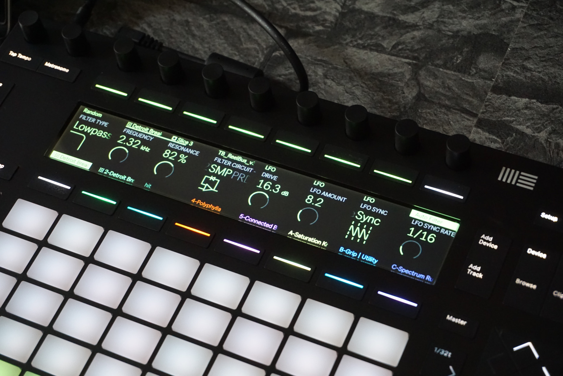
And speaking of displays, yes, the display is gorgeous. Sharp graphics illustrate some concepts (like filters), with text recalling the look of Teenage Engineering’s OP-1. (And that’s definitely a compliment.) It isn’t a touchscreen, but for this generation of hardware in the industry in general, that seems to make sense. People now compare touchscreens to Apple’s iPad and iPhone, and it’s tough for musical manufacturers to live up on a smaller scale – at least, for now. (I’ll be curious to try the new Akai MPC Touch and see if it holds up to those rigorous expectations.) For now, I was perfectly happy to see but not touch the screen, dialing in settings on encoders, and I never once caught myself wanting to swipe the display.
With the new displays and all this color and light, of course, USB bus power doesn’t quite cut it any more. You will need to plug this in to use it. (If someone trips over your power cord, you’re not out of luck – the new Push will keep operating, but it’ll be very dim – not just slightly dim like the old model, but nearly dark.)
The Push 2 also lacks hardware MIDI ports, as found on Novation’s Launchpad Pro. On the other hand, Push doesn’t work standalone, so that omission is a minor one. You do get foot pedal jacks, as before.
The new Push is still a class-compliant MIDI device, so that bi-directional communication is handled via standard MIDI messages – just MIDI over USB only. If you want connections to MIDI hardware, you’ll need the Push to be connected to a computer (or other USB host) and a separate MIDI interface.

None of that matters out of context, though – you’re buying an instrument, not a nice-looking paperweight. So the real test of Push 2 is as the hardware extension of Live.
Combined with software enhancements in Live 9.5 (particularly integration with the new Simpler), Push 2 promises three major areas of innovation.
1. It’s more fun to play.
2. It makes sampling an integrated workflow.
3. It promises to give you more time working with the hardware, less time going back to your computer screen and mouse.
Let’s look at those in turn.


More fun to play
I think the biggest deal in Push 2 is that the grid feels so fantastic. The first Push was reasonably sensitive, but not always equally so across pads. And it was a bit too stiff for my taste – making it feel like work to play.
Push 2 is another story. The pads are soft to the touch, but firm as you hit them. They respond to the slightest changes in force, from feather-y gentle to finger-drumming-hard. They keep an incredibly low profile, close to the faceplate. That may seem odd at first to old-school MPC lovers, but the tight clearance means there’s not the slightest sensation of wiggle as you play. This accommodates a wide variety of playing styles, from running your fingers along the pads to forceful tapping.
Here’s another good indication: I didn’t once want to change the pad sensitivity or turn it off. And I suspect the positive reviews I’ve heard from other testers are a good sign, too.
As far as this kind of pad design, this is absolutely the new benchmark. The only device that comes close is the Roger Linn Linnstrument – and that’s a high-end, boutique device from the man who invented the concept of making pads like this in the first place. I still enjoy playing 4×4 grids, but while Akai’s Renaissance, NI’s Maschine, and the Novation Launchpad Pro are good, I think most people will prefer Push 2.


Sampling is now part of the workflow
Push was always reasonably good as a controller for Ableton Live, but users of drum machines – whether dedicated hardware or integrated software like Maschine and the new MPCs – have other expectations. You want to be able to have complete hands-on control of your samples right on the hardware.
Of course, Ableton Live itself has been a bit restricted in this regard.
The new Push resolves this with both enhanced sample operation in the software (via an overhauled Simpler) and a big color display that lets you see what you’re doing with samples on the Push hardware. The combination is irresistible.
First, recall the painful old way of doing things: find a clip, warp it, slice to MIDI, open up the Drum Rack … ugh. Actually, the fact that we put up with this at all says something about how useful it is to have sampling integrated with Live’s Session View – even poorly integrated.
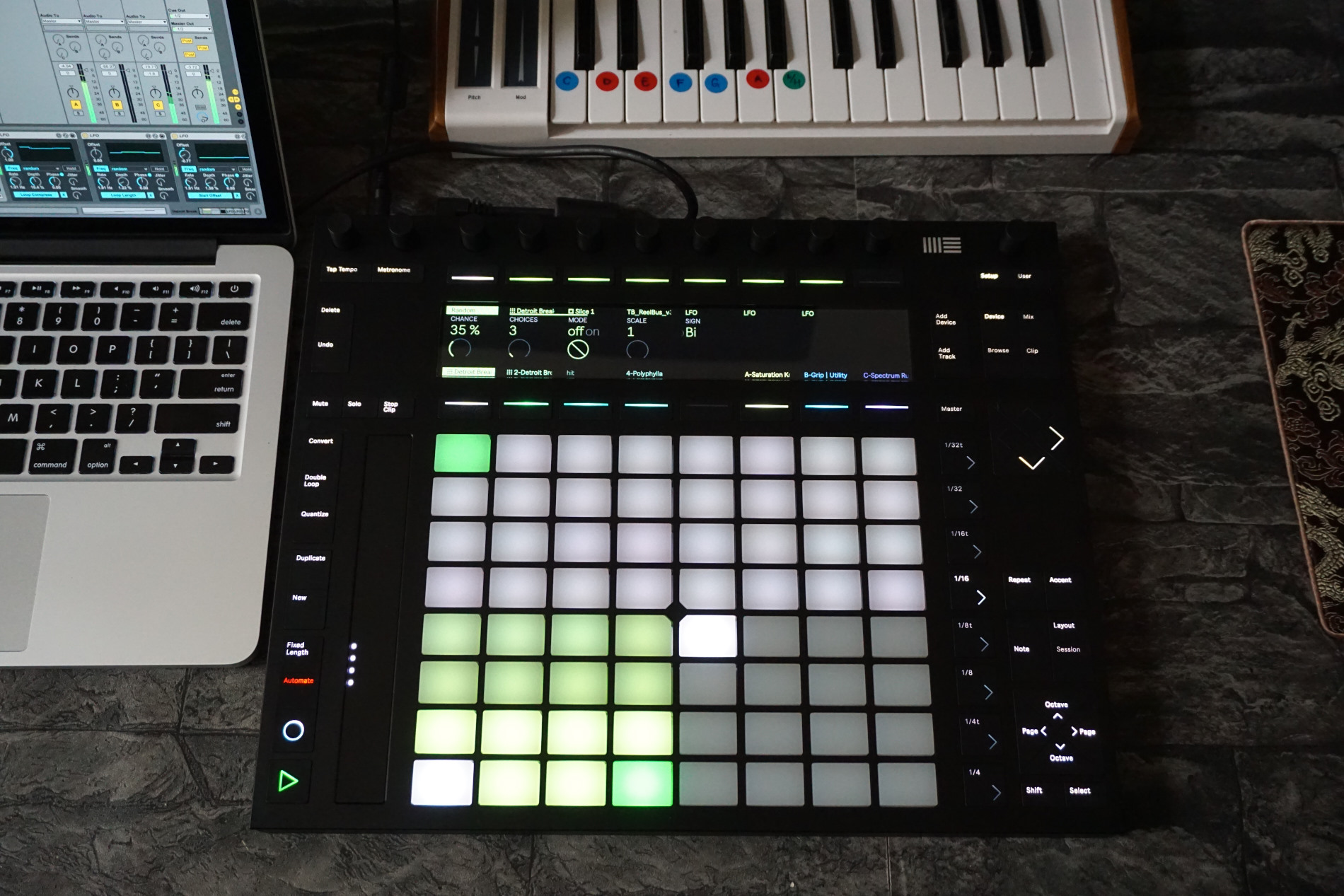
Now, 9.5 changes all of that. You can instantly manipulate samples via Simpler as a looped sample (“Classic”), a 1-shot, or slices. The Live Warp Mode settings you already know determine how the file is stretched and played back, and for slicing, you can now adjust sensitivity in real-time with a single control.
Adding Push 2 makes this a lot more fun. You really never have to look at the screen or touch the mouse. Load sounds via the browser – including, at last, sensibly from your user library. Then select the mode you one (Classic, One-Shot, or Slicing). And suddenly, the 8×8 grid of Loop makes loads of sense: you can dance around the sample from the controls, or step sequence, or dial in particular parts of the sound. This is the promise from years ago on the original monome/mlr combination, and now it feels as though that idea has expanded and matured.
In Ableton’s Loop presentation, the demos focused on sampling classic records, but you really don’t have to do that. (And … well, you really should avoid that, anyway, unless you like worrying about clearing samples in order to release your music.) For instrumentalists or singers, for people making field recordings or anyone who likes collecting sounds, Push is a wonderful way to explore, whether you’re hip hop or experimental.
The key to this immediacy is the way the grid relates to the sound. In One-Shot and Slicing mode, the grid spans pitch. In One-Shot, you can either let the sound play to the end when you release a pad, or halt playback with the Gate setting.
In Slicing mode, of course, each pad is a different slice. (Dial in the number of slices using Sensitivity – again, no need to even look at the computer.) You can also use the pads to determine where you want slices to go. (We’ll have videos showing that soon.)
In all the modes, you can also change pitch as a sample plays, for still more melodic manipulation of a sound.
You’ve seen functionality like this before, but Ableton’s implementation of the display is I think the most refined I’ve seen anywhere. The display is dynamic, adding useful parameters for each mode. And the waveform view is clear and easy to see, with zooming scaling to just where you need.
Melodic parts are improved, too. Apart from the control layout in general being far more logical (more on that in the next section), and the pads being far more musical to play, scales are finally saved with sets. I’m not giving up piano-style keyboards yet, but I am at last warming to the idea of playing grids, too.
Will this eliminate the need for dedicated drum machines altogether? Well, the appeal of hardware still remains, of course. And I’ll be happy to keep some kits in Maschine loaded alongside Push, especially as Maschine can lock to its own groups and sounds. I would view those as compliments rather than competitors. Actually, oddly, I think Push makes Ableton behave more nicely along those hardware. Your ever-shrinking laptop (or Surface Book, or whatever) may increasingly be cheerily hanging out in a corner of your desk untouched while you focus on these more satisfying hardware interfaces.
The integration of these kinds of tools in the DAW, on the other hand, is really unlike anything we’ve had before. It’s what the first Push was missing, and now that picture is complete.


Less computer
The other use of the display, of course, is parameter control. Having subtle color indications, and a more consistent layout of parameter mappings for internal devices, and simply a bigger, brighter, clearer display with icon feedback all add up to more intuitive control via encoders.
So, naturally, the display is a boost – and seems to owe something in its aesthetic to the pioneering work done by Teenage Engineering on the OP-1.
That might seem like the biggest improvement, but it isn’t. The real difference on Push is all to do with the layout of the controls.
Now, I have a confession to make: my brain just gets kind of dumb when I’m in the musical flow. Maybe you’re like me. So, I had to be jealous of people who were really fast on the first Push. Maybe you’re one of those people. And maybe it’s because I’ve been using Live primarily on a laptop since, literally, version 1.0. But if you’re like me, sometimes (not always, but sometimes), this happened:
1. You were thinking about a musical idea.
2. You looked down at Push, and for a split second, got lost trying to find a particular parameter or navigate the browser.
3. In that split second, you said, ah, shove it, and reached for your mouse.
This, of course, means that the Push designers failed. (Ha! Bow down to my stupid brain and feel ashamed!)
So, on Push 2, I’m told there was an extraordinary amount of user testing where Ableton designers had to watch and analyze the way people were using the hardware. I don’t know exactly what happened, but I do know this: magically, buttons on Push 2 seem to pop up where I expected them to be before I knew they were there. (That would be more or less the opposite experience I had on the original Push.) It’s a little like that moment when Amazon seems to know what you want to buy before you’ve decided yourself, only for hardware.
Now, I don’t think this is just a triumph of user testing and the data that collects, because Ableton had to find solutions. The changes actually aren’t that big, but they have a huge impact.
Along the top and bottom of the screen are color-coded selection buttons. These vastly improve the experience of selecting tracks (along the bottom) and devices (along the top). On the first Push, the same task was performer by a set of additional pads and triggers. These were visually oriented to the grid of pads rather than the display, which was counter-intuitive.
Now, it’s very easy to find which track and device you want, even in the heat of the moment – I’m curious to see if this holds up even in live performance.
The other major decision was reorganizing what had been a muddle of buttons on the right-hand side of the unit. Those are now grouped spatially on the right and left, so that it’s easier to discover and remember shortcuts. There are also, at last, two directional keypads (one for page and octave, one for navigation).

So, that solves the “user” failures. The other fix was to solve the cases where the hardware/software integration would fail the user. And that solves the other pain points that would potentially send you scurrying back to your MacBook.
1. Controls are dynamic. Parameters previously were mapped to the encoders more or less by brute force. That created weird situations where, for instance, you’d see an LFO knob for both Hz and beats; those now change dynamically when you change LFO modes. Ableton also tell me they went through an extensive “audit” of every single Device to ensure the mappings were refined. The beauty of this is, you probably won’t notice it; you’ll just notice yourself using the encoders more.
2. Plug-ins work. So you know Ableton’s own Devices work; now VST and AU plug-ins do, too. The integration is still limited by the plug-in formats. Native Instruments’ approach of having developers specify where they want controls, on Komplete Kontrol, may well prove better for heavy use. But it’s something.
3. The browser is actually useful. This is a big one: the Push hardware was constantly reminding you to press the Browse button to add stuff, but once you got there, you couldn’t get access to a neatly-organized user library of stuff. That’s now fixed, as well.
Also, mixing is finally a pleasure with the new display. There’s a big color overview of everything, very much like what Native Instruments offered with Maschine Studio, but even more essential in a DAW. Now, that hardly eliminates the need for faders. Even in Ableton’s own demo, I noticed they had a Novation LaunchControl XL so that dedicated faders were at arm’s length. But it is certainly welcome.


Conclusions
The new Push isn’t cheap – 699€, US$799, GBP499. And to fully take advantage of what it can do, you probably also want the full Ableton Live Suite – sold separately. So, you may be wondering if this is worth the investment if you’re new, or worth the upgrade if you have an existing Push.
If I sound like I think Push is the perfect controller, I don’t. Grids are still grids; I was playing a piano from the time I was nearly a baby (literally), and there are lots of other instrumental controllers that are useful. Also, Push still doesn’t do much for you when you’re looking at Ableton’s Arrange view, which is largely still about the mouse. (If the Surface line catches on, I hope we see better touch support in Live.) And this still isn’t a mixing surface – Ableton Fade isn’t here yet. (I made that up. If that ever happens, it just means I guessed right.)
If you have the first Push, I have terrible news for your bank account: the moment you touch a new Push, you’re going to want to trade yours in. The only good news is, if you can’t afford that even with the 30% buy-back, the original Push does get a whole lot of the functional improvements. (Which improvements? Ableton today released a technical document explaining what 9.5 does for the original Push.) And that should actually make would-be Push 2 purchasers and Push owners alike feel better: it means Ableton isn’t in a rush to abandon existing users just to sell the new shiny. But make no mistake: the build and feel of playing the new unit will justify its purchase the moment you’ve got the budget.
Push is also clearly the winner if you want a playable grid, or if you care about sampling.
Push might not be for you if you want a controller that works well with software other than Ableton Live. It is actually a MIDI controller, meaning you can use it with other software – Tim Exile actually had an amazing Reaktor-based setup with the first Push. But that’s an edge case, because it’ll require a fair amount of configuration work.
And if you don’t care about sampling or playing melodic grids, this isn’t really for you, either.
But Push is really good at being Push.
It actually hasn’t been so long since the first Push came out, and back then we weren’t really sure what this hardware was. Ableton (and the wider electronic music community) spent a lot of time bending over backwards to work out whether it was an “instrument.” And the original pitch for Push focused on being a way to get tracks started.
In reality, neither of those things mattered. The first Push already proved that people would embrace the Push grid for controlling Live, working with samples, and playing instruments and drums.
What’s special about Push 2 is that it seems to anticipate how it will be used. It’s finally a real sampler. It’s a far better instrument to play. And if you care about sampling and playing grids, it’s simply the best integrated hardware/software yet.
It’ll be fun in the coming months and years seeing how musicians work with it.
Ableton Push [Product Page]