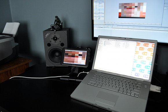
Ed. For this guest review, we welcome artist and musician christian.ryan. What started as a simple review of the Mimo UM-710 7″ USB LCD monitor becomes a reflection on deeper issues of how the design of objects can impact workflow. By the end of his usage journal, I come away with a sense that user interface designers may want to be more agnostic about the kinds of displays on which their UIs may be used. Unfortunately, I was safe from any craving for these interfaces until I saw the pictures. Once Mimo adds touch, these could be huge for music and visuals.
You can check out Christian’s lovely work at his blog, stardotstudio. -PK
Whenever I start a new creative project, I often think to myself: “Man, all I have to do to make this project completely awesome is just buy a (vintage video synth, obscure MIDI controller, whatever-cool-new-gadget-I-can-find-on-eBay-this-week)” I’ll then waste precious studio hours trolling the back alleys of the Internet, comparing technical specs, calculating the best price (including shipping), and all the while rationalizing the purchase by repeating to myself, “I will totally use this again in every project I do from now on.”
Yeah… you should see how much e-waste is littering my studio because of this poor impulse control.
However, I’ll bet you an entire box of 5.25″ floppies that I’m not the only artist with this condition. Obviously, part of the problem is that we work in a field where a constant flow of innovation means we have to stay current or risk sliding into material obsolescence. We always have to upgrade our tech to whatever’s harder, better, faster, and stronger – and that’s completely legitimate. It only becomes a problem when we accumulate all this neat stuff but it completely fails to transparently integrate into our everyday digital studio practice. That’s why I wanted to take a broader look at some new 7″ USB monitors that are just now coming to market – not only reviewing the typical pro’s and con’s of these displays, but also begin to ask how digital musicians and visual artists might find these useful for long-term creative work. The results diminished my initial optimism, but I found that under the right conditions, these monitors open up some exciting possibilities.
Getting Started With A Mimo
Right now, I’m working on project where Max/MSP Jitter updates two small video displays based on various environmental triggers. My first impulse was to pick up a few cheap 3″ NTSC screens mentioned on CDM back in October, but then I began wondering how was going to send multiple signals out from my laptop. I could always kludge together a couple of USB video cards with some US$50 VGA-to-NTSC boxes and hope for the best, but it seemed absurd to spend $100+ on supporting hardware just to send signal to a $42 monitor. After a frustrating afternoon of searching for different options, I stumbled across something that seemed so obvious that I couldn’t help but wonder why I didn’t think of it before, especially after CDM’s post on DisplayLink technology.
The Samsung U70 and the Nanovision Mimo 710 are USB monitors with near-identical specs. They both have a 7″ diagonal viewing area with 800×480 resolution (in either portrait or landscape orientation), and both use DisplayLink drivers to function as a virtual graphics card. It’s been noted that DisplayLink has some performance issues, especially with 3D and high FPS material, but since I really wasn’t planning on a heavy-duty frag session, I decided this was a great chance to test how well these new USB monitors would integrate into a digital artist’s studio practice. I ended up getting a pair of Mimo 710’s. Mac drivers weren’t officially available for the Samsung U70 (though you can find hacks and beta drivers), and for the purposes of testing, I wanted to see how things worked right out of the box. Both monitors are also in the same price range; I spent around $120US on each 710. Mimo also has North American distribution and support – and in case I ran into trouble, I didn’t want to deal with the gray market issues that can arise when ordering from overseas. Aside from these issues, the Samsung would make an equally strong choice.
Physical Impressions
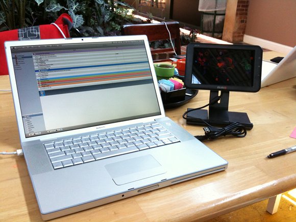
Right out of the box, I had some fairly positive impressions of the monitors. The Mimo comes with an independent stand that screws into the back of the display, while the Samsung U70 appears to have an attached picture frame-style stand. With the Mimo stand, both height and viewing angle can be adjusted (within limits – tilted too far back, and the display loses balance). The Samsung stand doesn’t appear to offer that much flexibility. The Mimo attaches to the stand via a simple nut-and-bolt; five minutes at the hardware store and you can build your own wall-mount. The plastic case and build quality is actually pretty solid; while not cheap or flimsy, you’ll definitely want to get a padded bag if you’re bringing it on the road. The only real physical issue I ran into is how the included dual-head USB cable (for use if your USB ports don’t supply enough power to the monitor) doesn’t fit through the slot at the rear of the stand, leaving a messy routing depending where you place the monitor on your workspace. Thankfully, if your ports supply enough power, any standard mini-USB cable will fit through the stand’s slot, leaving a cleaner look.
Creative Uses
After installing drivers on my Windows tower and Mac laptop, I spent a solid ten days testing the Mimo’s viability as both studio tool and creative platform, with some interesting and mixed results.
First, as a content-delivery solution, these monitors look extremely promising. Since every creative project doesn’t need a huge projection wall, it’ll be great to add a small output device to your arsenal. For my original project, I’m going for a standard wall-mounted option – but because of their size, weight, and extreme portability, there’s the exciting possibility that artists install these monitors in unexpected spaces that normal flat-paneled displays just wouldn’t work. Another large benefit to using a USB solution is that non-tech-savy people can set up an installation or live rig with minimal instruction, even if you’re not on-site. This is going to be helpful in a variety of situations, including if you ship smaller pieces to galleries, or need last-minute help at a live gig. Imagine trying to explain to a roadie or gallery intern how to patch different signals through a video mixer, for example; by contrast, anyone can plug in a USB cable in a pinch.
For Live Performance
A lot of visualists are probably wondering how well these work as a preview monitor for live applications. In my limited testing, it looks like these could be viable option. With a 720p MKV file, playback in both VLC and Quicktime was fairly smooth with no noticable lag, and when I used Resolume Avenue, things only became real sticky once I added a few layers and effects. When Jitter sent full screen 800×480 29.97fps video to both of the monitors, there was some definite lag. It mostly cleared up after reducing the resolution of both the source video file and jit.qt.movie object to 400×240 – but I haven’t had enough time to find the optimum resolution and frame rate without sacrificing quality.
Because the DisplayLink drivers are software-based, your mileage may vary, depending on your setup and content. On the other hand, if your graphics card is sending your main stream to a projector, a little stickiness on the preview monitor might be acceptable for some folks. Because this tech is so new, I think there’s going to be a lot of road-testing in the near future, and the display needs will absolutely vary for every project.
In the Studio
As excited as I am about the creative and live performance possibilities of these monitors, I’m less optimistic about integrating them in my studio. There are potentially some real benefits to these guys, but right now, I’m concerned with how well they fit into the creative workflow. More on that later…
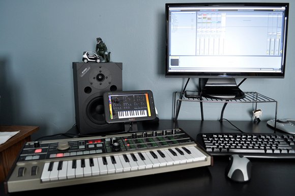
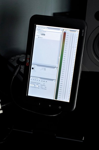
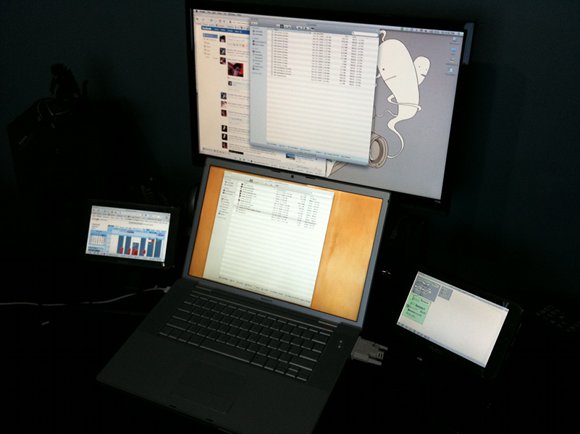
I think the single place where these monitors are the most useful is when you need to access auxiliary information, but don’t have the real-estate for a ton of windows cluttering up your screen. Toolbars, effects palettes, external VST instruments .. any window that you don’t always need as your primary focus, but still frequently access is perfect to drag onto these monitors. I’ve had Max sub-patches, a few VST synths, and After Effects and Final Cut browsers all on my Mimo, giving me a better perspective on my main window.
The one caveat – text can be extremely small on these. I gave up trying to write some ActionScript code on the Mimo; it might be fine for some quick debugging, but I can’t see myself trying to do any substantial writing on the 7″ screen. I wished I could actually lower the resolution and increase the text size, but both the Mac and Windows DisplayLink drivers are locked to 800×480. Ed.: Well, of course, if you have a dedicated window over there you can change, you could scale that!
As novel as it was to delegate a second mini-monitor for toolbars and palettes, I’m not entirely sure that I’ll continue to do so – at least on my laptop. I’m accustomed to the trackpad/mouse relationship with the screen, and I don’t know if I care to throw that out of out balance just to gain a few extra pixels. However, on my tower, it was nice to have more available space for auxiliary dashboard-type applications. For those of you working on a dual-monitor setup though, I doubt you’ll need to add another display for just creative applications.
Potential Problems
This brings me to my main problem when using these displays in the studio – they lack what I call “usage transparency.” For a lack of a better term, usage transparency is when you don’t have to actively think about using technology; you develop such a fluency with the workspace that the interface disappears and your mind is free to focus on the abstract creative flow of your art. Think about what happens when using your favorite production software or hardware synth – you don’t have to actively think about every decision you make because over time and through practice, you’ve developed such an intuitive “muscle memory” relationship with your creative instruments that using them becomes second nature. Well-designed tools like Ableton Live allow you to develop that relationship much quicker and with less frustration. Unfortunately, it’s hard to see how the addition of 7″ monitor to the studio will make a beneficial difference in your workflow. In fact, during the breaking-in phase, the Mimo can actually disrupt the creative process. More than once, I had to stop my train of thought and actively think about where I placed a Max patch or VST effect. I might see how someone’s creative workflow becomes more effective with a 7″ display, but only after a long adjustment period. It would take me more than a month of full-time use and practice to get a natural feel for the new workspace, and I’d lose a lot of creative thinking in the process; I don’t know many artists willing to give up that much creative time when it’s already hard enough for most of us to get a few good hours in the studio as it is
.
There is the potential to resolve some these issues when Nanovision begins shipping the touchscreen Mimo 740, but since I couldn’t find detailed specs on the 740, it’s hard to make a totally informed prediction on the usefulness of the added touchscreen. Ed.: This is a single-touch display, although given that its’ easier to do small multi-touch displays than big ones, I could imagine someone shipping a solution like that in the near term.
Now for certain applications, a small multi-touch display could be extremely useful (anyone who uses TouchOSC on iPhone already knows this) – but for widespread usage to really gain traction, there must be integrated application support by software developers. I want to snap an application’s native interface directly onto the 740 (like an Adobe pallette) without having to run supporting background applications like OSCulator or MIDI-Yoke. Right now, the best example of current apps with this capability would be external VST/AU instruments and effects, but even those would have to go through some considerable UI tweaking in order to make them useful as a touchscreen instrument. In my tests, knobs and faders on VST/AU’s were so tiny I couldn’t imagine attempting any sort of musical performance – and my fingers aren’t even that big. I’m sure someone will develop a third-party workaround once the 740’s and similar monitors hit the market (who’ll be first with a Max for Live patch?), but I’m really hoping developers begin to consider integrated support for emerging interfaces.
So, in short, these monitors are definitely still infants. Right now, I think there’s a lot of interesting work that can be made once artists begin to experiment with the platform, but until there’s significantly broader support for their use as a creative instrument and production tool, I think most of us should wait to see what the next few generations of smaller monitors bring.
All photos courtesy the author.