Nosaj Thing Visual Show Compilation Test Shoot from Adam Guzman on Vimeo.
Designing visualist work is often a baroque process of iterating through more and more layers, ornaments, and complexity. But it’s stunning, sometimes, how people respond to simple, elegant ideas. Adam Guzman‘s collaboration with Taiwanese-born, LA-based designer Julia Tsao yields this beautiful sequence of geometric motion, choreographed perfectly to music. (My favorite comment? “killing us softly, with graceful simplicity.”)
Now, I’ve found myself getting more interesting in doing this kind of work with generative software, so it’s possible to have complete control over the animation, but this piece proves it’s not strictly necessary to do that. It’s actually just video clips, in just-updated Modul8:
“The live show for Nosaj Thing, a collaboration with Julia Tsao. Video clips are the formatted for mixing in Modul8. Each clip belongs to a certain part of a song. We triggered and manipulated each clip live with 2 midi controllers. Our performance is focused around disorientation and using the projector as a light source. The first half of the show is dedicated to slowly building a visual style. The images are black and white lines and squares. The positive/negative space is used to create rhythm that is synced with the audio. As the set progresses, the imagery becomes less abstract and focused less on light. Patterns begin to form and space begins to open as if the two dimensions exploded into a third. The relationship the graphics create with the performer is interesting. As the graphics become more spatial, the performer flattens, becoming a 2-D cutout version of himself.”
But, then, it’s not the software or even the performance technique that matters; it’s the clarity of the design system, and the way in which that design transforms the flatness of projection from a liability into an asset.
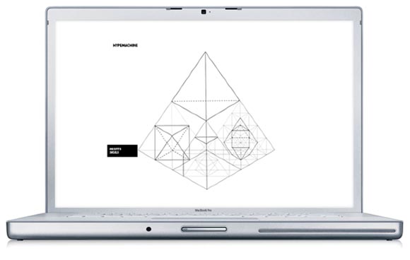
This is not minimalism for the sake of minimalism. It’s a commitment to the artists’ ideas. I quite like Adam’s work as I see it on the website – added to the badly-needed “inspirational” portion of my RSS feeds. And there is a common theme of finding these kind of elegant geometries to apply to music (something I’m covering in a very different light on Create Digital Music in the form of the game Osmos). Have a look at Adam’s redesign of the sprawling Hype Machine music aggregator. The relative chaos of the musical content on that website is rationalized into orderly patterns that would please any Freemasons.

Each line in the pyramid is a track, and the connections between them represent the blog, track, and artist relationships within the network.
All of this is a reminder that what can bring focus to a visualist project is a commitment to the system you wish to make.
Found on Saturn Never Sleeps, for whom I’m doing visuals in Philadelphia with King Britt, Rucyl Mills, Sun-Ra, Shabazz Palaces, and Flying Lotus on Saturday.