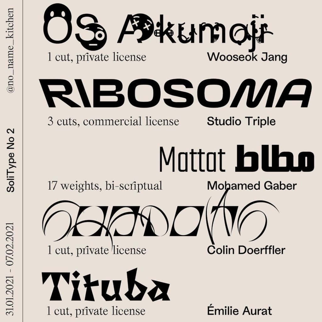
Your next design project or album cover can pick up trendy letters from independent designers – all while helping get meals to those in need.
SoliType is a temporary online platform, collecting typefaces in exchange for donations. 100% of your donation goes to the charity – you just screenshot it, and you get an email with the font of your choice. They’re also doing limited editions, with rotating selections of fonts available in a particular time window.

One of the type choices, Ribosoma, is even licensed for commercial use. Otherwise, of course, you could simply evaluate type privately and then use it with commercial clients or public use by buying a license.
But it’s great to see activism interwoven with supply you use for creative labor – even when used on commercial projects, too. (And it hasn’t stopped these designers from continuing to do paid work.)
The charity they’re supporting is a worthy one – No Name Kitchen supports migrants in Serbia, Bosnia, and Greece along the Mediterranean migrant routes, where people are urgently looking for safety in Europe. They’re providing much-needed meals, along with other services (like clothes, showers, and gloves). They also report on violence against refugees where it’s needed. There are even side projects like music lessons and language lessons, plus essentials for survival. With the pandemic crisis and all its rippling side effects, this need is especially acute now.

See: http://www.nonamekitchen.org/que-hacemos/
I saw this via a friend, but the connection was also great – one of the designers is Mohamed Gaber, whose font for this run is bi-scriptual (perfect if you also need to support Arabic). Mohamed took place in our MusicMakers Hacklab here in Berlin in 2020, where he applied his experimental typography skills to live performance. The great part is, I actually saw the word from Myka, a designer in Cebu, Philippines who took part in our hacklab in Manila so – without having met, there are networks forming on their own.
Speaking of networks and openness – you should absolutely check out Mohamed’s typography. Not only does it apply new and experimental techniques to type design, but it also is using open source connections to allow these designs to extend across languages and alphabets. That’s a theme that came up again in this year’s hacklab, and it does have literal implications – for instance, most fonts are very limited in which scripts and alphabets they incorporate, with the privilege of certain localities over others literally encoded in our machines. Well, plus it’s just cool visually to watch these things transform:
https://www.instagram.com/kieftype/
If you know of other work like this, of course I’m sure readers would be glad to know about it.
Follow their Instagram account to spread the word and for instructions and details (as for series 2, which runs through Sunday):
https://www.instagram.com/solitype/