I spoke last night to Robb Mason, Director of Consumer Sales for M-Audio, at the DigitalLife press reception in midtown Manhattan. He was able to confirm some additional details about M-Audio’s new entry-level software product for Windows:
GarageBand for Windows? That’s really how M-Audio sees this product. Their argument is that other entry-level software, like Cakewalk Home Studio, mimics the workflows of higher-end products, minus some features. (I actually don’t agree, personally, based on the variety of lightweight sequencer/host apps on the platform, and the fact that even GarageBand still behaves basically like a traditional sequencer, but I see where they’re coming from.)
Shipping status: Session is shipping now with the Fast Track hardware interface. Eventually, you’ll see it show up on other interfaces like the Jam Pack and possibly the Fast Track Pro, and it sounded as though (unconfirmed) it may supplant Ableton Live Lite on the consumer-level interfaces. Live Lite will still appear on pro interfaces; that much is confirmed.
Standalone version: Rob says M-Audio is planning a standalone software version. They’ll still include a simple USB audio interface. Why? Because otherwise consumers might try to use their built-in hardware with WDM drivers or worse, and on Windows, you really want an ASIO driver for low-latency performance. The easiest way to make sure that happens is just to stick an interface in the box. (Okay, I hear you Linux and Mac users snickering, but at least once you’re running ASIO drivers, Windows audio works just fine.)
Plug-in, ReWire support: None, though Rob said they weren’t ruling that possibility out for a future release.
Hardware integration: This is the one part of the software that seems like a good idea. Not only does the interface self-configure in the software (something that’s welcome on Windows), but if you create a guitar track, the software automatically selects the right input port and level for plugging in a guitar. This sounded like what Apple had in mind for their ill-fated, leaked Asteroid audio interface, and we’ll never know what happened to that. Of course, the problem here is, if users don’t ever learn how to configure interfaces and inputs, they can’t graduate to a more capable product, and I’m not convinced this is the hardest part of using music software.
A new software division: That’s what M-Audio created to produce this product. The rest of the software M-Audio distributes is generally not developed in-house. So they did acheive a success here in convincing their parent Digidesign that they can do software without threatening the crown jewels, Pro Tools. M-Audio has proven to be fairly independent after the buyout, which is good news for the whole music technology ecosystem.
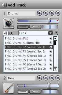
Now the bad news: from what I could see, the software experience looks as weak as I feared. Creating a track invokes a “wizard” dialog (fortunately looked like it had only one step). Loops are nearly impossible to navigate because they’re crammed into the track view, a far cry from Apple’s clever Loop Browser. There are mysterious icons underneath each track listing that even I could barely figure out. (See the image.) And the complete package lacks polish. I can’t be too critical, because the whole thing is a freebie, and there’s some pretty significant soundware included in the way of loops and instrumental presets. Not bad, given they’re giving this away with a $60 audio interface. But, then again, isn’t it worth a little bit of cash or investment of time to get something you’ll really enjoy using in the long term, that will grow with you?
This is not about feature-for-feature comparison, either. It’d be all to easy for M-Audio to say to someone who’s critical that we didn’t get the “beginner” aspect, that we’re comparing to more advanced software. My problem has more to do with interface design, as you can see in the screen grab shown here. Interface design isn’t just about making things look good; it’s about readability. M-Audio actually puts some thought into this in the way their hardware designs are labeled and shaped. I don’t think they put enough thought into the software interface design.
We will be looking at some simple/lightweight programs over the coming weeks, for Windows and other operating systems, because I believe beginners are important, and I believe advanced users can benefit just as much from a quick-and-dirty app for sketches. I have to say, though, I plan to leave Session off my list on this release. It just looks like too many “beginner” Windows apps I’ve seen in the past. And that’s too bad, because I think M-Audio had an opportunity here to make something different.
Previously: Initial Impressions