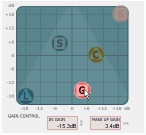
We’re all for interface innovation and TC Electronic does fantastic audio processors. But their new “MINT” interface technology not only wins for silliest meaningless acronym since synth maker Kurzweil’s “V.A.S.T.”, it also looks like the interface panels from a Klingon warship in Star Trek III. What’s going on here? (Hint: it might actually be cool and, unlike Klingon user interfaces, usable.)

Once you get past all the silly product names, what you find is actually a reverb and a compressor with a very efficient and clever interface. Now, whether this actually makes compressors and reverbs any more “meta-intuitive” than the current design, I don’t know — I won’t knock it ’till I’ve tried it. My strong feeling is that you need to know a little about how compressors and reverbs work to use them effectively, and a new interface won’t necessarily eliminate that need.
That said, I think this has great potential. Notice that it combines a lot of separate parameters into one control, meaning if you do know how compressors and reverbs work, you might find this very powerful. “Intuitive” doesn’t have to mean “just for newbies.” This kind of thinking could be fantastic as touchscreens and X-Y controllers. (CDM2 site designer Jaymis is on IM as I write this, and he agrees, so there you go.) I can’t wait to give this a go and see how it works in practice, to find out if it delivers or not. Could just be reinventing the wheel, or it could be smart thinking; it’ll be fun to try, either way.
In other news: I’ll never work in marketing. I use the letter “C” for the letter “C” rather than replacing it compulsively with the letter “K.” I also use whole words instead of single letters. So, in place of Fabrik C and Fabrik R, I’d say, like, reverb and compressor. Then again, BMW auto names didn’t make sense to me either.
Mmmm, MINT-y [TC Electronic Fabrik Product Page]