For centuries, music has had scores as visual representation. Now it has visual interfaces in software, too. I know from our in-progress platform survey that most of you don’t own an iPad. (At the moment, I’m with you.) But that makes me doubly hopeful that what we get in music software design in general is a renewed interest in visual culture and interface design.
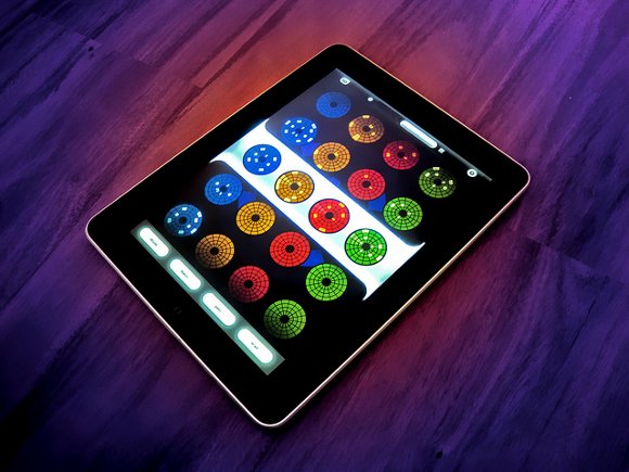
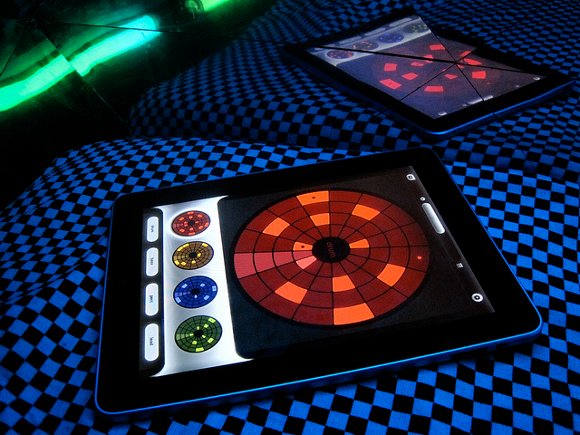
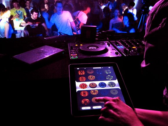
Loopseque is a new, US$4.99 circular-sequencing music app, and it conveys what happens when you really build an interface entirely around touch. It’s also a gorgeous example of why doing a good job of documenting your software can help convey its significance. (The photos this crew has assembled are beautiful. And why not? We have plenty of photos fetishizing analog gear. It’s about time software got its turn. Ask a photography stylist why it’s important some time.)
Even in its first release, Loopseque looks like a usable app. It’s a 32-step circle sequencer at its heart (note how efficient the circle is versus the rectangle). In the demo video seen here, this is kept pretty simple, but each of the four “channels” can have 9 wheels. (There’s an expandable “matrix” of wheels in which you can swap between them, in addition to the simple 4-channel swapping you see in the video.) The first release comes with a variety of sound sets for different genres.

The developers are a group of musicians and artists whose past work goes well beyond apps, into, they say, everything from events to ceramics to Yorkshire terrier breeding.
It’s actually the coming versions that I think may be most useful musically; an upcoming release promises user sample sets and track recording, so you can really make this your own. (They also tease something called “master classes.”)
For now, you can save and manage projects, mute and enable channels, and play around with the variety of included sample sets. And… does anyone else hear the words “Death Star Approaching” when you look at this interface, or is that just me?
I have a fascination with circles; I’ve personally even played around with various circular sequencer prototypes as Processing sketches, including a couple that looked a bit like this. So I was very interested to see how this team solved some of those design problems, and how they felt about circular sequencing in general. Loopseque replies to CDM:

Many genres of electronic music are based on loops, repeating sequences of sounds. The basic idea behind Loopseque is to visualize loops with circles, because a circle perfectly reflects the repeating structure of loop music. After we realized this simple thing, we spent many months experimenting with form and code.
Soon we realized that this visualization opens up really powerful perception of music patterns, and enables immensely deep connection between the musician and the structure of the music. In fact, this simple interface makes it so easy to create rhythm patterns that you can do real-time while music plays and that gives you many abilities for improvisation.
Another concept behind Loopseque is the ability to quickly change between patterns, which is implemented with innovative interface that we call “Wheel Matrix”. It’s also easy: First you prepare several patterns for each instrument and then, in Wheel Matrix mode, you can switch quickly between them.
Wheel Matrix opens up another new dimension for improvisation, because patterns are changed immediately, and that gives you an ability to combine different parts of patterns in many ways. And of course, you can change patterns on different channels simultaneously, since Loopseque is a very multi-touch friendly app!

I will say – back to the fact that this isn’t just about the iPad – there are a couple of lessons here. With more touch platforms approaching from various vendors, designing around touch is essential. And if you are creating new software, going to the time to document it is more than good PR. It’s a way to reflect on the aesthetic of the object you’ve created. For the same reason that a piano or violin is a beautiful object, sometimes in ways that aren’t directly acoustical, why shouldn’t we make the visual representation of our music evocative?
http://loopseque.com/
iTunes link
All images courtesy Casual Underground.