“MIDI” the word has become almost part of culture at large. But with MIDI 2.0 arriving, the MIDI Association decided it needs a new look – and sound.
The new look is the refreshed brand for The MIDI Association, and it seems you’ll see it all over their materials. (It’s already showing up on videos.) But the other location I’ve confirmed you’ll see this is on certified gear. It’ll be the mark indicating support for bi-directional MIDI (2.0), which will be certified by The MIDI Association TMA and its Japanese counterpart, AMEI.
Yuri Suzuki and Sascha Lobe were partners on reimagining MIDI’s identity, leading a team at the legendary design house Pentagram. (Yeah – MIDI cleans up good!) If Yuri’s name is familiar, that’s because he’s been a major innovator in digital design, often crossing paths with music. That includes making a very-cool browser rendition of the 303 and 808 back in October.
Since there’s no physical NAMM this year, we don’t have to spoil svelte upmarket design by putting it against the Marriott lobby, chintzy typography announcing open bars from distributors, and a sea of mullets, all while shouting above a din of guitarists. (Yeah, okay, I do miss … people.) Instead, I invite you to pour yourself a nice glass of wine, sit back, and meditate to this brand identity video (which also includes the sonic identity they’ve created):
And balls. Literally.
There’s some pretty intensive thinking behind this, including some very visually appealing animations of modulation:
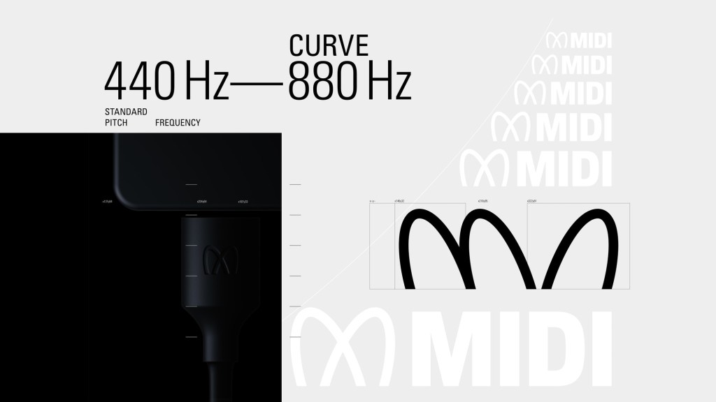
The wordmarque design references the shape of Lissajous curves, which are graphs of a system of parametric equations used to describe complex harmonic motion. The finalised design represents a modulation shape between 440 Hz – 880 Hz globally recognised as a tone for tuning instruments.
That mention of “440-880” is a bit of a misnomer; the logo is basically an abstraction of frequency, so it’s more like a 2x frequency relationship to something, which might or might not be 440 Hz. But tuning is always a good topic – MIDI Tuning Standard under the existing MIDI spec, or some new possibilities for direct pitch control in MIDI 2.0. (That’s important; despite their mention of “scales,” intonation in virtually all music calls for more nuance and different tuning details in different movements and so on. Watch this space for more on that topic.)
And so the result of all of this is this very handsome logo.
It might look like you took acid under the Gateway Arch in St. Louis and saw it swaying back and forth through crossed eyes, or possibly McDowell’s in Coming to America.

I also spent some time pleasantly diverted by remembering which metro systems use a big curvy M. Shanghai, St. Petersburg RU, yes, but theirs don’t look as much like this. That’ll be Tokyo I was thinking of:

But you do see patch cords – which makes some sense, even if MIDI is digital. MIDI 2.0’s higher resolution control signal and other features allow it more signal patching powers.

Full details:
https://www.pentagram.com/work/midi/story
The MIDI Association is the organization formerly known as The MIDI Manufacturers Association; it got its new name in 2016 to emphasize a free online community that extends to artists as well as instrument and equipment makers.
Their plans for today as part of virtual NAMM – aka Believe in Music Week – include covering those new MIDI 2.0 features, MIDI Polyphonic Expression, and mobile Bluetooth powers of MIDI.
https://www.midi.org/midi-articles/the-midi-association-at-namm-s-believe-in-music-week-2021
MIDI 2.0 say what now? They’ve got a short intro video for that:
Endnote:
Given that this logo is tied to MIDI 2.0 bi-directional certification, it is not replacing the vintage MIDI logo by definition. For reference, that’s this – a logo that thanks to retro-80s futurism actually has aged well, just like the synths from Dave Smith/Sequential and Roland that came around the same time:
And if you are interested in using either logo, I’ll try to find out more about the certification process.