As the iPad hits Europe and the world generally gets more time with the tablet, it continues to play host to new music software. I still have to wonder when some of its software design patterns – touch interfaces, big displays, and simplified, task-specific user experiences – will begin to influence other platforms. That is, it’s never been clear why arrays of tiny knobs were the best solution for conventional computers, either. But for those of you who have picked up an iPad and are curious what you can do with it, here are some ideas, all now “natively” optimized for the iPad’s screen resolution.
This week’s latest rash of developments includes the brilliant, generative Brian Eno / Peter Chilvers software Bloom, a new creation intended to help manage live setlists, software for displaying (though not editing) music notation, and for those of you who still prefer your more-powerful Mac soft synths and workflow, a demonstration of the iPad as a touch controller for the Mac.
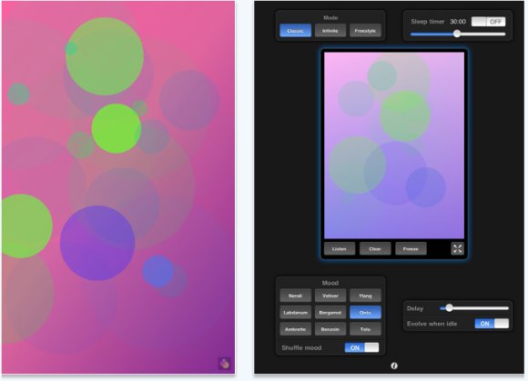
Bloom is an immersive musical experience as much as a musical tool, using touches to allow the user to compose musical patterns visually, then optionally generating its own textures and tunes if left alone. Its release in 2008 heralded some of what the new generation of mobile music software would hold. On the iPad, it’s basically the same app on a bigger screen, though that alloaws for a nice solution for displaying parameters (top). Bloom HD is US$3.99. (Thanks, Peter!)

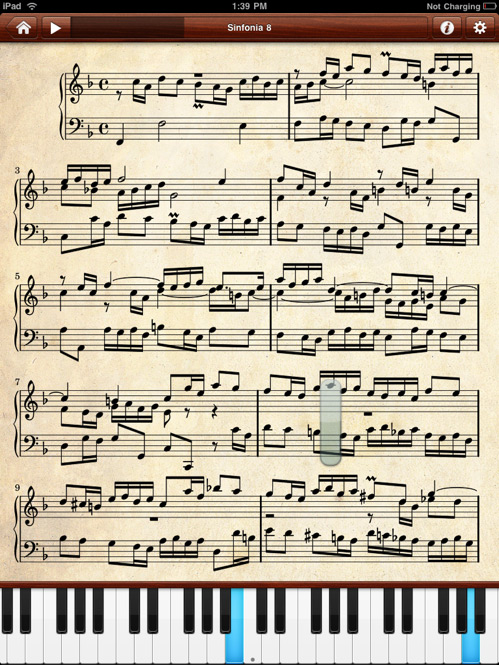
Etude is another app that’s made the leap from iPhone to iPad; the software displays a selection of pre-made scores on the device, with support for audio playback, display, and even visual feedback for those learning notation. (Image above from the iPhone; no iPad image yet.) The rendering looks lovely, but it is pre-rendered – you can’t edit notation with Etude, and you’re limited to viewing one of a few hundred free scores available. At US$4.99, it’s still well worth a look, but that leaves a big gap open for a more fully-featured tool. I’m curious to hear if anyone tries one of the browser notation tools mentioned here previously in Mobile Safari, which would enable editing and sharing. Check out Etude and scores available for it on the developer site.

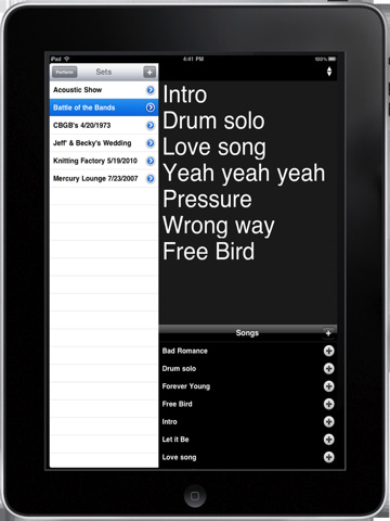
Setlists is a free application for organizing sets, lyrics, and the likes for a gig – a feature previously seen in tools like the Mac app Rax, but welcome on the iPad, and a compelling bridge to non-electronic bands, too. Creator Jeff tells us:
It’s a Setlist app that lets musicians manage their sets and songs. You can even email the setlists to your bandmates. I have plans to soon include the ability to record the audio from the set, organize recordings, and do some other clever stuff. Most importantly it’s totally free 🙂
Full details on the developer site; Jeff tells us there’s more to come.
Audio Palette by interactive audio whiz Kent Jolly (EA’s game Spore, with Brian Eno) is a fantastic, visual loop app which is now available for botouh iPhone and iPad. If you love Brian Eno’s sounds in Bloom, you get even more custom Eno samples in this tool, among others, but with greater interactive control. Via a graphical array of circles, you can trigger loop playback and perform a live mix. The new release now allows you to upload samples wirelessly via the Web, and the iPad brings greater sample capacity along with the greater UI real estate. This tool actually deserves some separate time on its own; check out the demo above, visit the developer’s site, and let us know if you create some interesting mixes of your own.
Lastly, in an example that’s only really practical on the iPad, watch what happens when familiar soft synths get touch-enabled using the iPad’s screen. It stilwel makes me long for more competent touch laptops and full-blown tablets, but in the meantime, the solution works pretty well. Not only does it mean the iPad does touc shh for the UI, but you can easily place the interface of a soft synth atop a music stand by your keyboard, instead of having to hunch over your computer. And the one takeaway above all others should be: developers, design UIs that are scalable and that can support touch.
That’s all for now, but let us know if you’ve found applications that make you productive. I’m also interested to hear reactions on the design of software for iPad versus iPhone. To me, just as there are certain clear examples that work better on larger screen real estate, there’s also a particular pleasure to something you can hold in the palm of your hand, which is not the case with iPad. Whatever your platform of choice, though, scale and interaction design matter – the iPad ought to be an excellent reminder of that.