Looks can be a powerful agent for changing how we think about sound. Pairing liquid, organic speakers with equally fluid and dynamic visualizations, the launch of Muon last month in Italy made this principle readily apparent. I’m all about lo-fi, cheap gear here on CDM, but if you absolutely must launch luxurious aluminum speakers with spectacular animated visuals at a posh party in an Italian salon, I sure won’t complain. Pass the prosecco, please?
Muon Project Page, documentation videos at chrisoshea.org
See coverage at ze | d | esign, toxi’s project blog, MoCo Loco, elsewhere. (Yeah, CDM’s motto is: cover things last. Was a bit busy with Maker Faire!)
Created by Moving Brands
Details on the installation and how it was done:
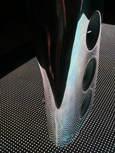
Liquid-y Speakers: The speakers themselves were beautiful enough. Designed by UK speaker research center KEF Audio and Ross Lovegrove, a champion of organic, 21st Century design and one of the most respected designers on the planet, the key to the design is super-formed aluminum. The process does for metal something like what vacuum forming does for plastic: you heat sheets of aluminum so they can be molded into unique forms. The speakers themselves are formed out of single, 6-foot pieces of metal, into an acoustically-conceived, flowing form. I haven’t heard them, but we’ve already discussed (at a radically lower price point) why speakers really don’t have to be — or even shouldn’t be — rectangular.
Liquid-y Visualization: And that’s just the speakers. Part of the beauty of digital media is that they can make the invisible and the impossible visible in a dynamic way. So Muon creators employed London’s responsive media firm Moving Brands, who in turn brought in two of our favorite people — responsive media guru Chris O’Shea (see his blog Pixelsumo, and artist and Processing ninja Toxi (aka Karsten Schmidt). Working with creative director David Eveleigh-Evans, the team created a dynamic animation on a huge LED screen that could visualize the sound coming from the speakers and reflect in motion what the speakers do in product design.
How They Did It
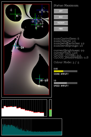
The animation isn’t just a pretty visualization; it organically reflects what’s happening with the sound. Performing a spectral analysis of the sound (via a Fast Fourier Transform or FFT), the software uses amplitude levels in different zones of frequencies to produce particle objects, which spring and bob based on polarity, turning the peaks in amplitude in sound into a pulsating pool of fluid. The model itself is actually 3D, but it’s squashed into 2D space (or you can imagine looking at the 3D space from above). The other essential element is that the software looks at a history of amplitudes over time, so that overall changes can be adjusted (a bit like the simple “peak” meter on a consumer stereo EQ).
If you imagine an EQ meter using a pool of mercury instead of simple bars, that’s the basic idea.
The implementation is, as I’d expect from this team, simple and elegant — a few basic elements are tweaked to produce a maximal effect. Here’s the gear (software and hardware) used to pull it off:
Processing, the open-source, Java-based, simple coding environment for graphics and multimedia. (Trust me. You can code in it. Even a 10-line sketch can often be interesting, though sound-related stuff tends to get a lot more involved fast.)
Ess, which is one of a few competing sound libraries for Processing based on the Java sound API. (See also the JSyn-based Sonia, though there seem to be some compatibility issues with that one, and the newer, tongue-twisting Mimin.)
traer.physics, a wonderful and easy-to-use physics library. (I’ve used it in a few projects — a must-download.)
ControlP5 for debugging, a library that places on-screen controls in your sketch. (I imagine it’d also be hugely useful for performance, and can’t believe I haven’t tried it before!)
And don’t forget the ginormous LED screen from Creative Technology, “containing 73,728 full colour LEDs over a 10 x 5 metre floor, using the Barco MiTrix system.” Yum. 73,000 LEDs.

More stuff from Chris on the way. If you’ve got a Processing project for sound, we’d love to hear about it. It’s better-known on the visual side (and a regular subject on Create Digital Motion), but there are still MIDI and audio tasks at which it excels, even if you have access to tools like Max/MSP/Jitter. Right tool for the right job, and whatnot.

