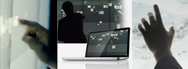
15,360 x 3240 resolution on 24 interconnected touch displays: this is no iPad. Toronto-based freelancer Amanda Connon-Unda headed to Toronto’s hottest interactive conference for CDM to catch Obscura’s Steve Mason, revealing what it’s like to design a massively-multiplayer “spatial” OS. It’s been a long journey as the SF firm went from thinking big with projection mapping to rethinking touch interaction. Here’s what Amanda learned. -PK
Steve Mason is brimming with enthusiasm. The VP of innovation at San Francisco’s Obscura Digital is describing the new design of their spatial operating system, before a crowd gathered at the North by Northeast Interactive Conference (NXNEi) in Toronto. Obscura and furniture giant Haworth have partnered to form Bluescape, launching a new multi-user touchscreen platform designed for “collaboration without borders.”
Obscura is no stranger to challenging assignments in interactive design. They’re widely known for creating complex architectural projection mappings — beaming sacred Islamic geometry on the exterior of the Sheikh Zayed Mosque in Abu Dhabi, creating a 360-degree mapping on the interior of the Guggenheim, and producing a touchscreen artifact viewer at the Hard Rock Café. But this project was different. Obscura had to tackle how to design for a more corporate user, Steve explains, and learn how to create an entirely new operating system for true collaboration (rather than one-user-at-a-time interaction).
Bluescape from Bluescape on Vimeo.
In order to design functionally, Steve says they needed to think about “not just transposing something from a desktop to a wall. Like a cell phone versus a smartphone, we need it to actually work differently.”
“We built a framework of key elements, he says. “[It’s] a large format with [an] infinite workspace – not like a whiteboard that you have to erase and reuse again. It had to enable real-time collaboration, be visible immediately remotely, and include natural handwriting, for either drawing or writing. It had to be open and extensible and not monolithic, but a platform with an ecosystem of developers who can work on apps suitable for the technology, so we get a critical mass of adoption. And finally, it needed a broad appeal, so that it wasn’t too technical, and it didn’t require specialized knowledge to use it.”
And there was no margin for error, either, Steve says: “We had to be sure that the system was fault-intolerant. The apps couldn’t crash.”
The Bluescape system is running at 60 frames per second, with a resolution of 15,360 x 3240, and uses a single-node configuration so that there’s one computer that outputs to 24 displays, connected together to make the large touchscreen.
The first screens cost Obscura US$15,000 to build in parts alone. “The reason the screens are so expensive is that they’re handmade. They’re actually Samsung monitors with an camera array behind them, and a small computer inside.” They had to build their own system to configure synchronized rendering across the multiple displays, creating the illusion of a single, massive touch surface.
Once they got the display technology working, Steve says, it was on to the interaction design in the software. “We wanted to design the system to support and enhance collaborative behaviors around the capture of expression and synthesis of thoughts. We had to think a lot about the behaviors people exhibit when they collaborate, in order to design our ecosystem.”
“When people collaborate, they’re capturing and gathering (referencing imagery and concept art), sharing, facilitating (framing challenges, moderating conversation, clustering notes and synthesizing content),” explains Steve.
Skeuomorphism (the attribution of physical characteristics to non-physical things) figures heavily in the solution. The team landed on the idea of creating a virtual black wall and Post-It notes as an understandable metaphor for people sharing ideas. (There are some guardrails imposed on color choices: users get five colors of notes, with a secondary color pack of ten.) Steve explained the writing software simulates the behaviors of real writing implement: it’s responsive to velocity and can employ variation of pigmentation as you write.
The icons, too, are intended to be recognizable. These appear as a row of application icons that can be dragged into the workspace, and a base menu that pops up on the screen when you press down for two seconds. Steve says they wanted the aesthetics of the system to appear clean, friendly, modern, and simple.
The result isn’t just a pricey Post-It wall. It’s a new shared computing environment — one that does the things you’d expect a personal computer to do, but with more than one user at a time. You can embed a website on the wall for collaborators to see. You can run applications, or show up to six HD videos, or share screens from your own PC. Future plans include the ability to display PDFs and office documents, and even produce custom apps via Obscura’s proprietary tools, to be distributed via an app store. But Steve concedes this will require lots more work.
Don’t expect to see this in the hands of mortals – yet. You’ll need deep pockets to afford what for now is a sophisticated combination of technology and services. There’s a six-month sales cycle, and not at a trivial cost. “You want to train people too,” explained Steve. “They have to understand that this is not for PowerPoint presentations. It’s more advanced than that, and it’s a complicated education process.”
But Obscura has provided a glimpse of how touch computing could become more collaborative – and how interactive designers who think big can adapt to those challenges.
Amanda Connon-Unda is a freelance writer based in Toronto. Find out more on her blog Sampling Culture and follow her on Facebook or on Twitter at @samplingculture.