What’s this new Max about, and why was it such a big deal at the AES trade show? To really understand, let’s turn to gaming for a moment. When Nintendo described their vision for the Wii, they talked about appealing to three groups of customers:
- The “hard-core” gamer; that is, their existing audience, of course
- “Lapsed” gamers: people who had done some gaming at some point but lost interest
- Entirely new gamers, across a variety of demographics
History will have to be the judge of Nintendo’s slim white box and controller-wagging interface, but I heard some similar development goals at the AES audio show this weekend. Nowhere was this more apparent than Cycling ’74’s upcoming Max 5. Substitute the word “patcher” for the word “gamer”, and you’ve got a snapshot of the new Max.
After all, whether you’ve touched Max before or not, you’ve likely got some needs in at least one of these categories. Beginners are easily intimidated by the “visual programming” metaphors of a blank-slate, modular tool like Max. Many others get through a couple of patches, often in a school course, but wind up having difficulty getting beyond that first work later on. And even advanced users (maybe especially advanced users) are always looking for ways of working faster.
The build I saw of Max wasn’t entirely complete, but I will say it’s tremendously promising. I talked to many for whom the chance to see Max 5 was the highlight of the entire AES show. It’s a tool you really need to see in action, so be sure to check out Cycling’s just-posted videos of the program:
A First Look at Max 5 [Cycling ’74]
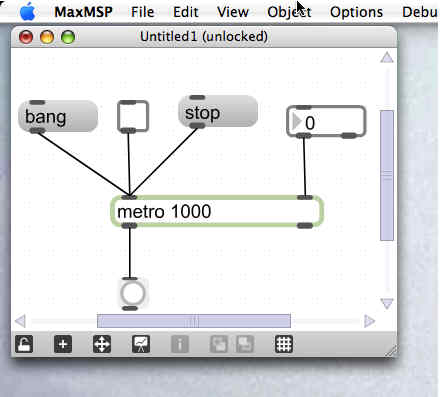
This is not the all-words, no-pictures manifesto we saw recently: now you actually get to see the tool in action. Highlights:

- The interface zooms, scales, and snaps: I knew this was coming, but I was really pleased at how Max-like this is. It still looks like Max, but it’s more usable.
- There’s a patcher inspector: The inspector lets you easily adjust attributes without mucking about with typing things into an object box or sending messages to an object, which was always very confusing. You don’t see much of this in the video, but trust me, this is huge, especially for more-complex Jitter objects. And while this is shades of Quartz Composer, it works much better than the clunky UI implementation in that tool.
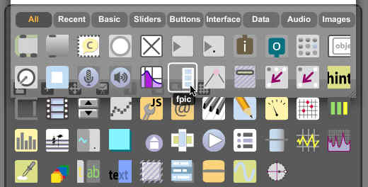
- Finding the object you need is much easier: There’s a pretty visual browser which will be a lot of fun, but there’s also auto-complete when you type in a name. (Programmers will recognize that functionality from IDEs like Eclipse; Mac users, think QuickSilver fast-typing goodness.)
- There’s a nifty new file browser: Drawing from iTunes and Ableton Live, this makes it really easy to get access to files in the file system — no more manually entering paths. The bad news is, it sounds as though this may not initially be usable in your own patches, for, say, making a video navigator for a VJ app or sample loader for an instrument; hopefully, that’ll either sneak into the final build or be available soon after. (The Cycling page does mention integration of the database that powers this browser with JavaScript, though, so advanced users may have some new options.)
- Debugging and feedback and help everywhere: The old way of working with Max was pretty slow. Add an object. Click the object’s help to figure out what it does. Look up its help page. Go find the tutorial reference in which it’s introduced. Add a print object to watch what data is coming out of it. Go back and try to see why it’s not working. Now, there’s feedback everywhere: pop-up hints for each inlet and outlet, integrated help, the ability to mouse over objects and see what data is moving through them (including Jitter matrices, apparently), and even better-organized data feedback in the Max window. The integrated help is much richer, too, though it wasn’t quite ready for demo when I saw it; I expect we’ll find out more about this soon.
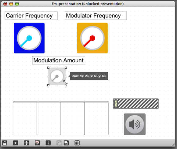
- Presentation mode for performance, and the end to messy patches: This is really the feature that could make you jump for the new Max. Presentation mode lets you select elements in your patch and add them to a performance interface, so that in addition to locking a patch, you can build a custom interface as an additional layer. Let me translate that: you’ll never have to stare at a giant, messy patch while you’re trying to perform again. Now, Reaktor has had something like that for years, but again, the implementation is really Max-like and unique. When you go to presentation mode, you can drag objects where you want them. Switch back to editing mode, and they remain connected to the rest of your patch and automatically move back to their edited locations. (If that didn’t make sense, go watch the video, and expect to see more examples of this soon!)


There are still lots of questions, of course: there’s no solid release date or pricing plan, and we haven’t yet heard what Cycling is cooking up with its new partner Ableton, or how that fits into Max 5. Jitter will be supported with this new release, though, like the internals in Max/MSP, it doesn’t sound like there will be any earth-shaking changes immediately. (I.e., it won’t be Jitter 2.0.) Then again, Jitter patchers should benefit just as much as MSP heads from all these other features, so I wouldn’t underestimate the potential there.
I think there’s no question this will step up the game for custom-patched music and multimedia software. Max isn’t the only game in town by any means, though it is arguably the most extensive tool (especially if you’re counting number of objects). I can’t wait to get my hands on the new Max and share the patching experience, and I’m equally interested to see what happens with the next version of a more specialized tool like Reaktor. As always, stay tuned.