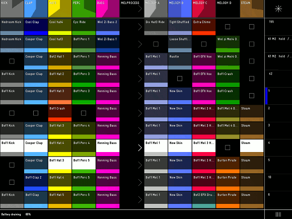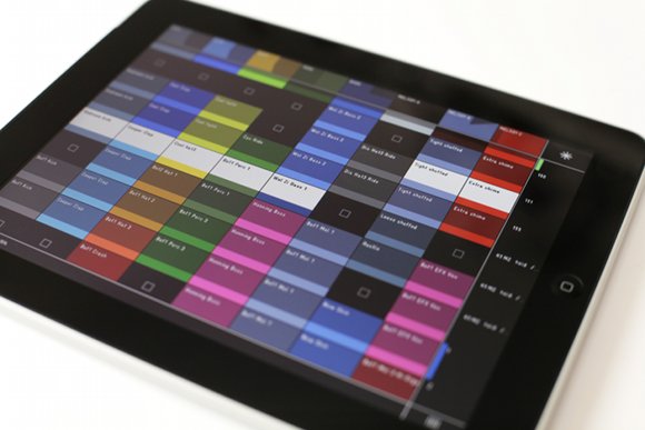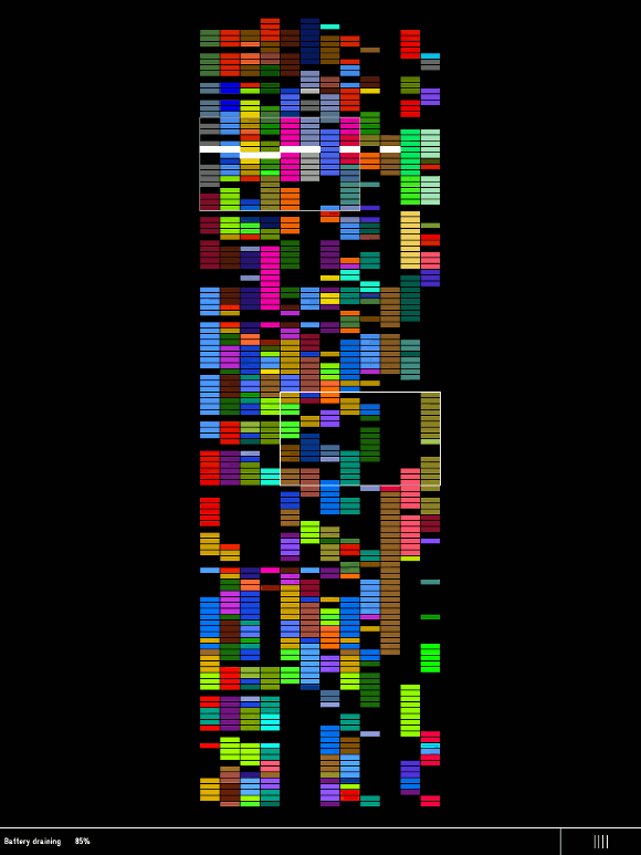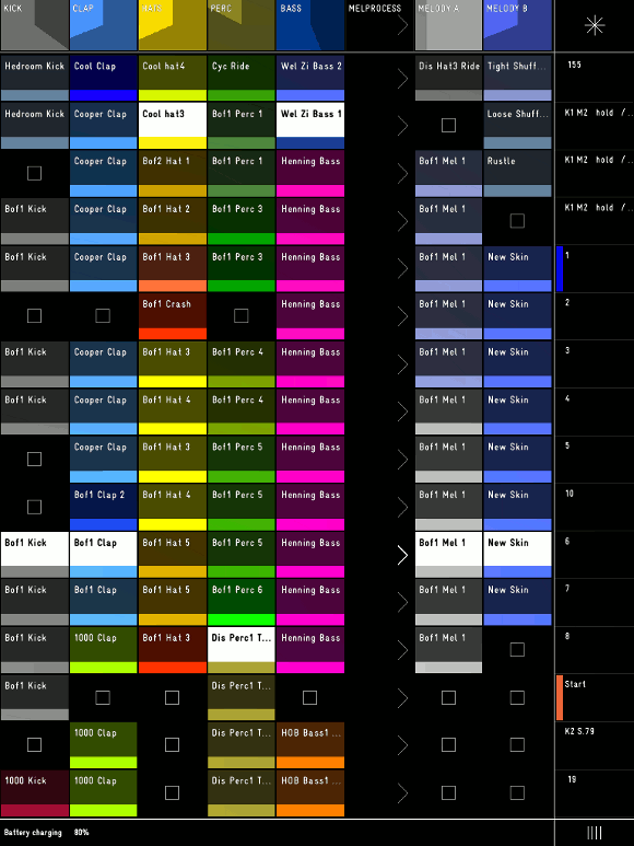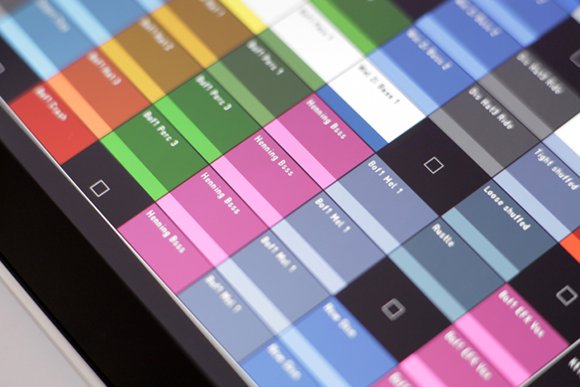
The developers of Griid, the Ableton Live controller on iPad created in association with Richie Hawtin, have shared photos and screen captures early with CDM to give us a look at the upcoming app. Just over a decade after its original inception, Ableton Live itself remains a ground-breaking user interface design. Love it or hate it, it’s a benchmark in thinking about how music apps might look. Griid is compelling in part because it re-imagines how that central Session View and clip launching might work, now in the context of a touch tablet. Personally, I like the results. As on the Lemur, bold, saturated colors and contrast on a black background are central, of course. It’s also nice to see extraneous visual information removed. And for anyone with epic-sized sets of clips in Live, you’ll like the massive overview.
This also makes me wonder what may be possible with Renoise’s pattern editor, which also uses colored blocks to show off units of patterns and the like (and could similarly be controlled from new input devices thanks to its API). All in all, I think we could see an explosion of thinking about control in performance. If that leads to better performances – or if we just have more fun – I’m for it.
Let us know what you think of the shots, and if it gives you any insights into what’s happening with the app or how you might play your own live sets. For that matter, is touch something you’d consider in the first place, or would you prefer tactile control?
