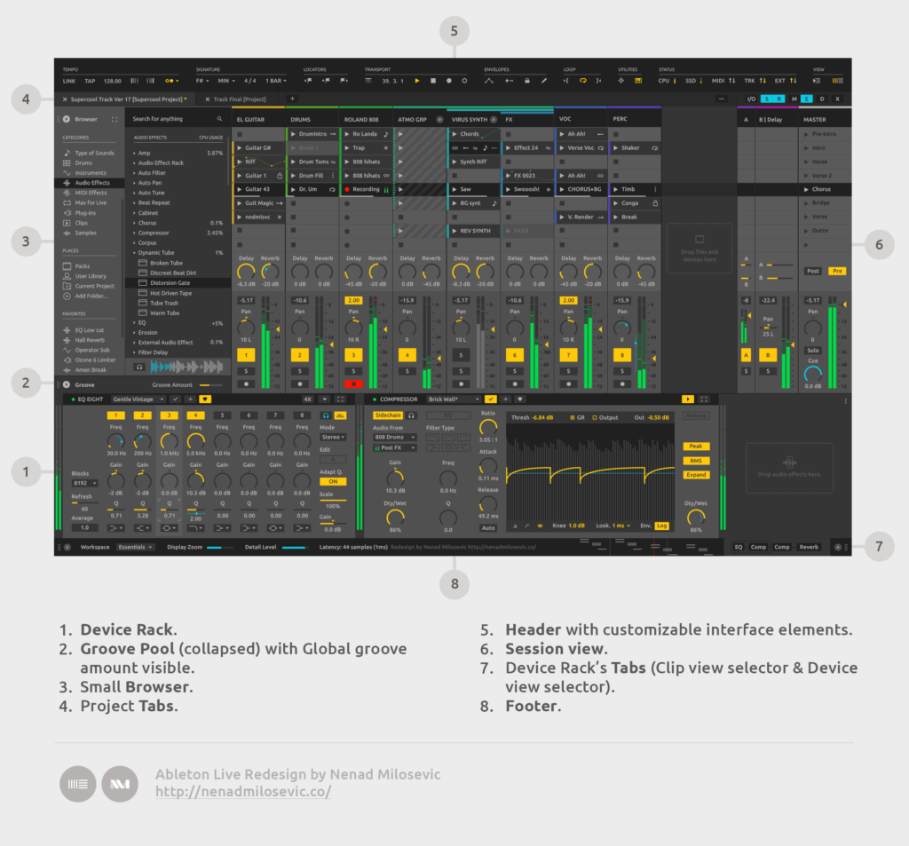
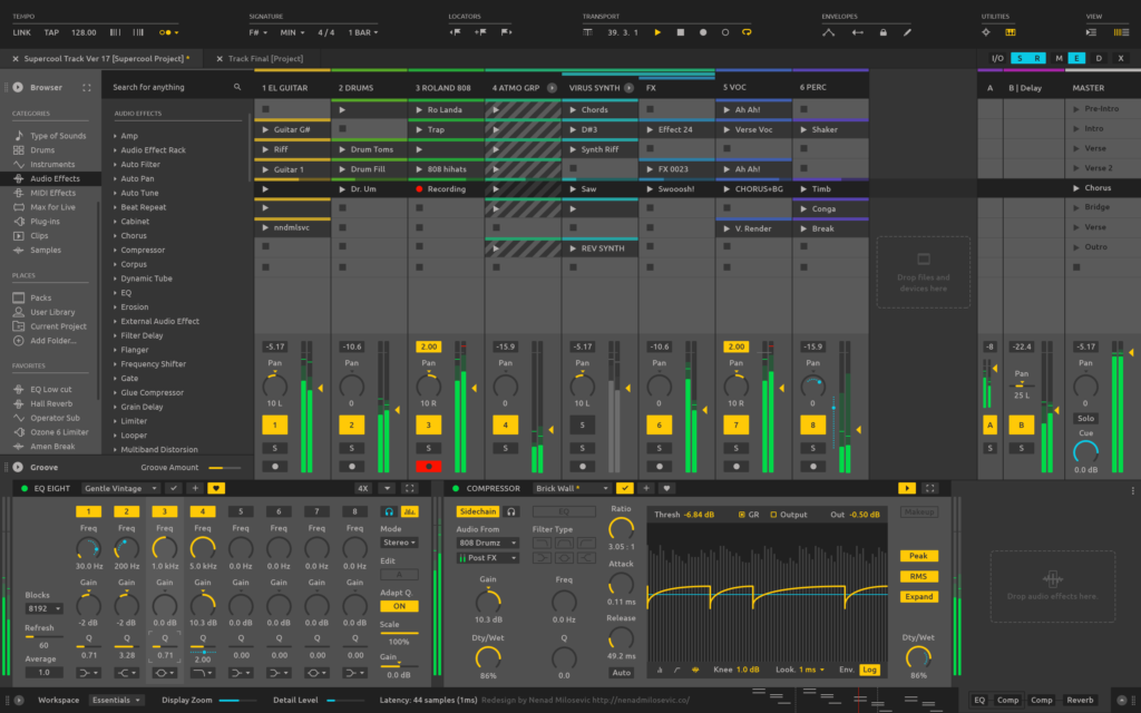
Ableton Live’s dominance over a lot of workflows is unparalleled. But the software itself is looking long in the tooth. There are clearly some features long in coming, and despite some updates, the UI is still largely unchanged since the software’s debut over a decade and a half ago. That’s good in some ways, but it means the software can be clunky on modern displays and in certain use cases.
It says something about the love for the software that UI/UX designer Nenad Milosevic would create a deep redesign project, spec, just for the heck of it.
If Nenad’s redesign demonstrates anything, it may be to prove just how hard a redesign is. But the results are nothing if not interesting, even if you wouldn’t necessarily want to replace Ableton Live with this UI. Especially compelling, Nenad did extensive polling to determine what features mattered and how they would look. So the results have some ideas in them, and reflect a bit of what the Ableton user base imagines they’d like a future version of the software to look like.

Personally, I really like the colors, and would love someone to implement a skin of this. (It’s not a skin yet. Anyone?)
And yeah, the similarity to Bitwig Studio is unmistakable.
This is a telling line, too: “I didn’t blindly follow what Live users said in surveys I conducted. Because 1. what users assume they need do not necessarily align with what they really need. 2. I didn’t conduct usability testing to see what actually needs fixing and how users behave.”
But even if it’s not practical to expect anything of this project, I think UI buffs will find it entertaining, and Nenad did a lot of lovely work. It also speaks to the appetite for a new generation of Ableton Live software that this story has been all over the Web.
Check it out, along with other design goodies:
http://nenadmilosevic.co/ableton-live-redesign/

I will meanwhile wait for the real thing, as I don’t necessarily see anything here I’d want to use, personally. A new skin would be cool, though.