Two decks, or more decks? Horizontal, or vertical waveforms? Which controls?
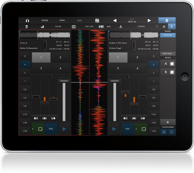
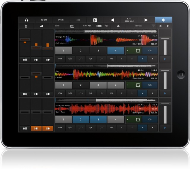
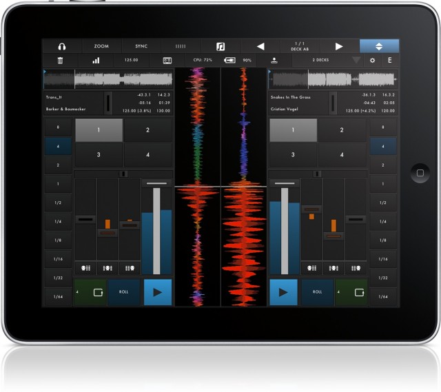
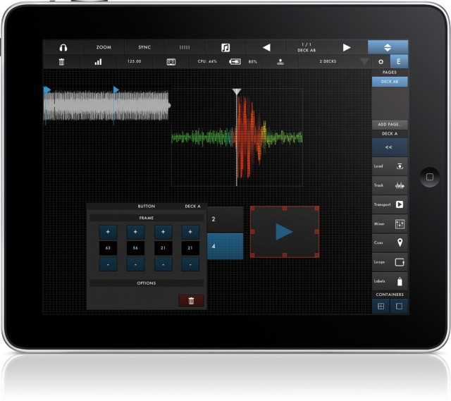
DJ app designers normally have to make such decisions for their users – and users must, more or less, take what they’re given. Not so with the odly-named, just-released d(- -)b iPad DJ app. Using a grid to neatly-align elements, it lets you choose what you want on-screen, and whether two decks or up to six. (With six decks, in fact, it almost becomes a looping machine as much as a DJ app.) The app is the work of Zerodebug, the Berlin-based development team who coincidentally also created a favorite Ableton Live controller, touchAble. That app is distinguished for providing no-compromise advanced features and control of everything, which could be the appeal here, too.
Those customization features give d(- -)b a fighting chance against apps like djay and Native Instruments’ Traktor. Traktor for iPad certainly has some advantages, including a powerful library that integrates with Traktor on desktop. And I expect many people will be happy with the two decks. But for those who aren’t, d(- -)b offers a compelling alternative. For now, its features look quite a lot like Traktor’s, apart from sync: you lose NI’s nice live audio effects, as you gain additional decks and custom layouts.
The real test may be if d(- -)b can deliver quickly on the developers’ proposed roadmap, which includes Audiobus support (for routing between apps), MIDI mappings and external control (for those who want iPad’s portability but don’t relish DJing through glass), and MIDI Clock.
I’m particularly eager to see MIDI Clock, as sync capabilities would make a couple of iPads into an ideal back-to-back DJ rig for a couple of friends. But just one of those features could make this a must-have – and because the iPad makes touching waveforms such a delight, a real reason to DJ without a laptop. Watch:
Feature set:
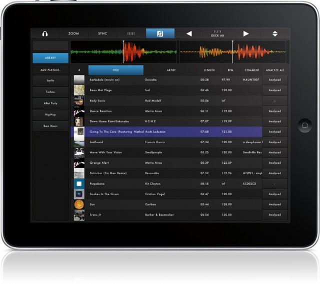
▪ Custom browser with access to the iTunes library.
▪ Ultra low-latency touchable waveform with spectrum color-coding.
▪ Comprehensive in-app editor lets you create your own interfaces with up to 6 decks – on one or several pages.
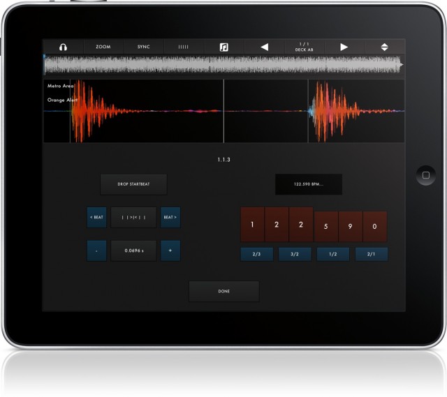
▪ Track analysis with automatic tempo and grid detection.
▪ Manually grid tracks if the detection is off.
▪ Stereo-Pre-Cueing:
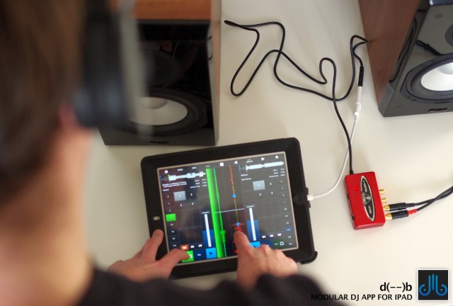
-> multi-route audio to precue tracks in stereo. Works with any class-compliant audio device via USB and the iPad Camera
Connection Kit.
-> split output audio to do mono monitoring.
▪ 4 cue points per deck.
▪ 3 band EQ with kill switches.
▪ optional limiter with variable headroom
▪ EQ Snap and EQ “Magic Triangle”.
▪ Pitch coarse & fine faders for 10% / 1% pitch control.
▪ Loops from 1/64th to 8 bars.
▪ Loop roll while track keeps playing.
▪ Listen to the dry/wet monitor signal on headphones while recording the main stereo mix – without multi-route or split-audio!
▪ Wide range of settings make the app less restrictive, more customizable.
That’s already plenty to justify a few bucks. In fact, it’s hard to imagine DJ apps will be a zero sum game. At these low app prices, I think many DJs will simply buy all the rivals, toying around to see which fits best. (They might even more regularly swap apps, since they all share integrated libraries via iTunes.) That’s quite different from the desktop situation, where each choice can run you hundreds of dollars.

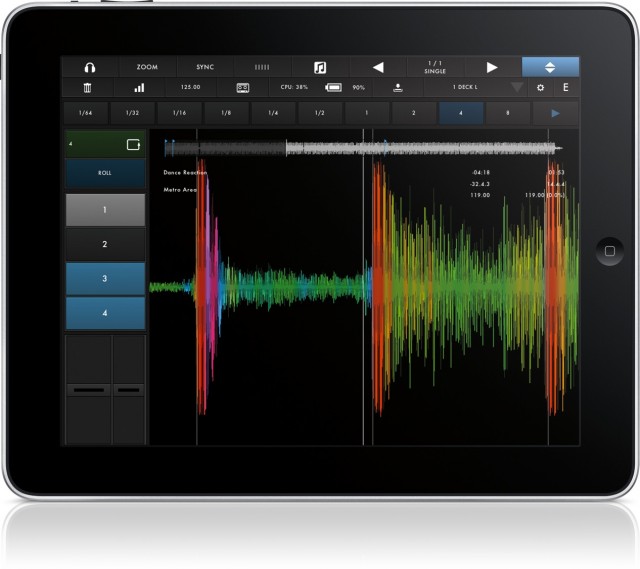
One advantage of the custom layout? If you decide you want to use two iPads, each as a separate deck, you can set them to a single deck and maximize screen real estate.

Alternatively, go nuts and add six decks. All images courtesy the developers.
If you do adopt early, you get a price break: the intro price is US$9.99 for now, before it goes up to $16.99.
You need an iPad 2 or better (including mini) and iOS 6. (Sadly, first-gen iPads seem relegated to older synths and acting as controllers.)
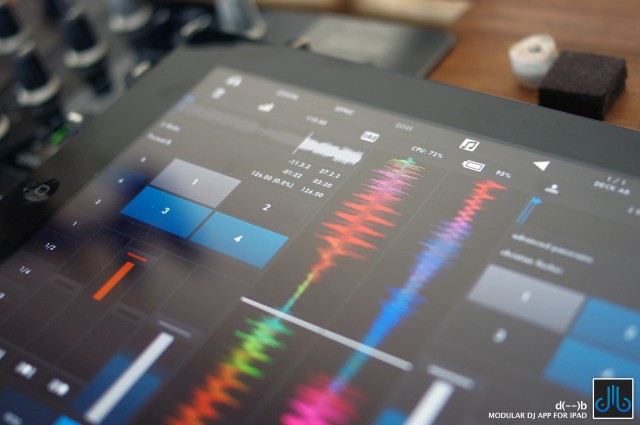
I really have only one criticism: this logo. It’s… actually, I’m not sure which NSFW image it reminds me of. I could choose at least a couple. Okay, they’re two turntables. Or, like, eyes. Unicorn eyes, with a big horn in between. Going to keep telling myself that. (I don’t know why I complain; I’ve seen some fairly provocative images of 1/4″ jack cables.)
![]()
More images:
