Let’s face it: Reason has started to look a little bit crowded lately. What began as a small rack of virtual effects and instruments has grown to add an enormous mixing console. Sequencing features have, since the beginning, been squeezed to tiny lanes at the bottom of the UI. And a browser floated around in a window.
Reason 8’s individual parts aren’t so different from Reason versions you’ve seen before. But it’s the way they fit together that has changed – rather radically.
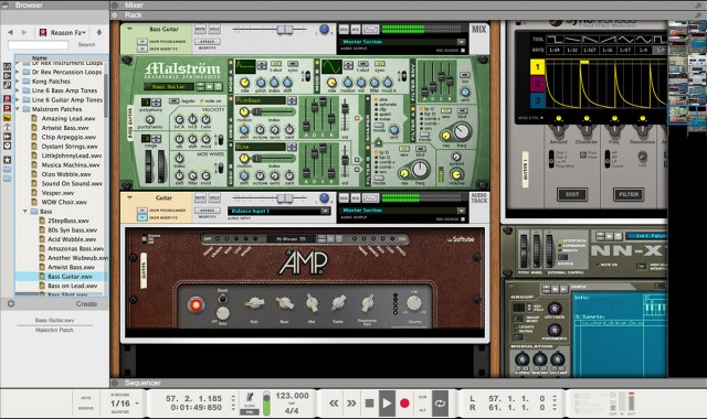
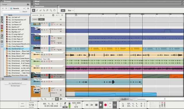
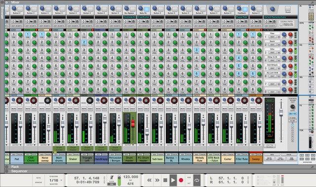
1. There’s a new look and feel, new panes. New flat title bars for each pane promise to make it easier to navigate your Rack, Mixer, arrangements, and so on. And everything of those elements is flattened out, a bit in keeping with the iOS 7 zeitgeist we’re now experiencing. Don’t worry – this isn’t so radical. Individual modules are the same as they ever were.
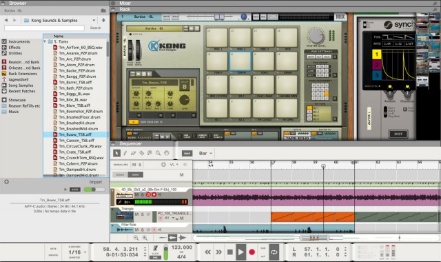
2. There’s a new Browser/Search. Bearing more than a passing resemblance to the Ableton Live browser (and the look of browsing in a number of other DAWs), the browser and search are now expanded and visible any time on the left-hand side of the screen. You can drag-and-drop all your content (from samples to patches). You can type and find, Spotlight-style. And you can easily see ReFills – obviously an ideal match for Reason. Once you get into it, it’s very Reason-like and graphical.
3. There’s a new transport bar, toolbar. These elements also keep with the new look, flattened out, ever-present, and better organized.
4. Amped up with Softube. Amp models are nothing new, but in place of the earlier Line 6 partnership, you get an all-new range of emulated amps for bass and guitar from Softube. Those Softube models sound exceptional, so this seems good news to me, even if it isn’t a new feature, strictly speaking. (As it happens, Props say you’ll have the Line 6 amps through October 2016 – though once you approach that date, you’ll want to render to audio or swap to Softube in case they go away.)
5. What, logical sequence note editing? Double-click to add, double-click to take away. That sounds like… other DAWs. But it’s good news. Propellerhead also promise “numerous workflow enhancements.” That’s, I realize, an utterly meaningless phrase, so I’m curious to hear more – particularly as regards the sequencer.
Propellerhead are known for being a bit conservative and iterative with their upgrades, and this is no exception. Then again, that’s part of what keeps some Reason users loyal, and now you can add instruments and effects with their Rack Extensions. (One of these days, I really will get around to writing a guide to the best of those. It’s an overwhelming quantity and quality, and a really great ecosystem. There’s more to say on the developer side, too, which I hope to share; we spoke a bit about this when I was last in Stockholm.)
The big question I think is whether this UI change will make Reason users more productive, or whether they’ll stick with Reason 7 for the time being. An upgrade from any previous version is EUR €129 / USD $129. That means those amp models had better sound good, because that’ll help existing users make the leap.
Retroactively from the beginning of July, upgrades from the present version of Reason are free. (so if you just bought it, you’re in the grace period). You do need OS X 10.7 on the Mac side, but Windows requirements are much milder. (Boot Camp is starting to look like a viable option for older Mac hardware.)
Reason has also gone completely electronic, if you like. From the 30th of September, you’ll be able to buy it electronically online as well as in shops.
If you want it earlier, there’s a beta:
https://www.propellerheads.se/betatest/sign-up/


