Collage is a vast collection of effects based on some 43 processors you can quickly turn into your own custom effects, complete with a colorful interface maker. It’s creative and unique enough that you might just miss how much is there. Here’s a complete walkthrough of what’s inside and how to get started.
This article and videos were produced with support from Kalide.
Collage is the launch product of new software developer Kalide. It’s something really unique – way more playful than you’d expect from something that lets you create your own effects, but way deeper in its full effects library than that arty, fun UI might suggest. You could think of it like a rapid prototyping environment for custom effects – or like a scrapbooking-style, playful way of building entirely original processors from a huge multi-effects engine. It’s lots of fun just to pull up presets (even at random) and experiment, but its build workflow is now quick enough to easily whip up a new effect without losing your flow as you produce or play.
Here’s a tour of the tool from its first launch. Pull up some presets, turn the knobs, and instantly make a UI customization. Add some instant modulation from four built-in LFOs. Hit randomize to roll the dice and find a preset quickly.
Old-timers who remember Cycling ’74’s Pluggo, this is an unintentional spiritual successor. It has that same dump-the-LEGO-bucket-out feeling, harkening back to that endless effects toybox – though with way more consistency. And while you can get this sort of build-your-own effects in various modular or patching environments, I’ve never seen anything that lets you make your own UI and create macro controls and LFOs – all while feeling like you’re playing with kids’ painting software.
macOS Universal AU/VST3/AAX, Windows VST3 (AAX coming soon). Available now for a discount price of US$129 (off the usual list $179).
https://www.kalidemusic.com/collage
This guide is for version 2.0, which represents an overhaul of the software:
- Macro and LFO assignments
- Quicker custom effects construction workflow
- 8 more effects processors
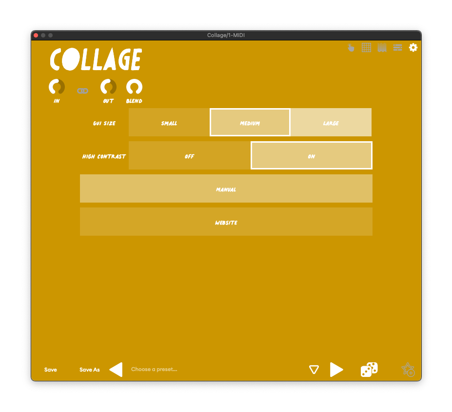
There’s also a new high contrast mode, which I asked about – head to settings and switch that on and/or zoom to assist in making the UI easier to see:
Get started playing
You navigate Collage’s modes using the toolbar on the upper right-hand corner. The basic workflow:
- use Interaction to play and tweak,
- Editor to choose effects modules and adjust settings (the more conventional effects UI),
- Design to customize controls and background or create your own original UI canvas, and
- Assign to bind the controls to parameters and add modulation.
To get started and get some quick inspiration, you can add the Collage plug-in and pull up presets from the Interaction screen. You also get separate in and out level (with a link option), plus wet/dry blend.
Notice the presets are organized by application, instrument type, and category.
Try hitting the randomize button; more than once I found something that way instead of going through the presets.
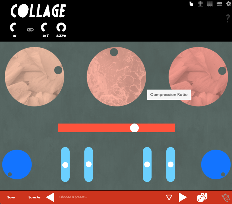
You’ll only see conventional parameter labels and whatnot in the Editor, but part of the creative flow here is just messing with knobs visually and not thinking about what they do. Labels do pop-up as you use the UI, though, in addition to using your ears:
Inside Collage
Collage is really a suite of effects engines, each with multiple effects inside – think of this as a complete collection rather than just one tool with some custom UIs. You’ll find all of those inside the Editor. You’ll find eleven categories of processors, each with multiple processors inside – and that’s just as I write this; Kalide promises more are coming, and all will be free.
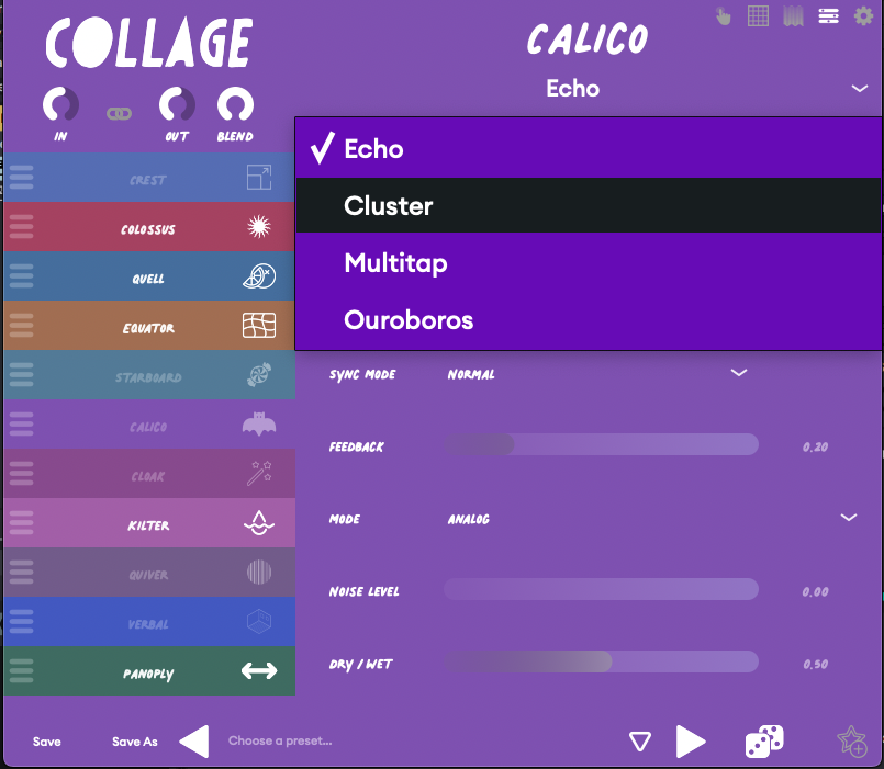
You can discover these just by navigating the presets, or head to the Editor to pull up and combine individual processors, and tweak their parameters. Inside:
CREST = Gates and expanders
EQUATOR = Equalizers
QUELL = Compressors and dynamics processors
COLOSSUS = Saturation
STARBOARD = Modulation
CALICO = Echoes and delays
CLOAK = Convolution reverbs
KILTER = Filter designs
QUIVER = Rhythmic gating
VERBAL = Algorithmic reverbs
PANOPLY = Stereo field processors
So KILTER filters, for instance, gives you not one but two Chebyshev filters. CALICO, the delay engine, has a standard echo, cluster delay (halving repetitions), multitap (with bandpass filters), and a reverse echo (Ouroboros). You’ll notice CREST and QUELL each hint at dynamics processing; there are even expanders in each. PANOPLY has a brickwall limiter.
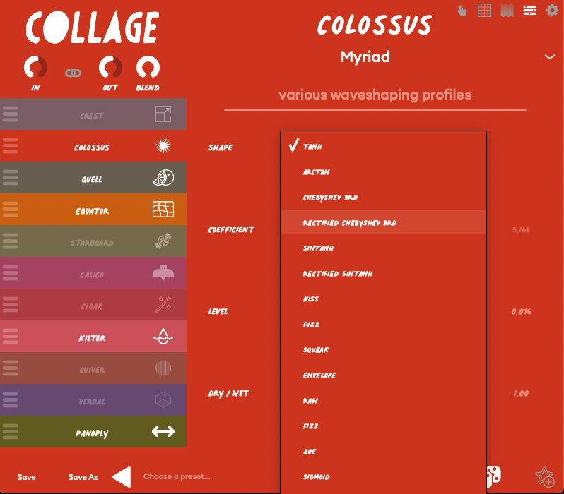
In COLOSSUS > Myriad, you’ll find a couple dozen waveshapes for the distortion alone:
It’s too much to hope to discover in one go, but that’s not the point. It’s better to explore one module at a time, pull up presets, or hit randomize and see what you find to stay in that state of play.
Build your own effects
Having a customizable UI means you can always change a backdrop or color you don’t like, or add a parameter the developer left out.
Or go one step further, and make your own custom effects from scratch, with a UI of your own creation. You’ll want to start with the Blank Canvas default for a clean slate. Here’s a walkthrough – and this is fast enough that I made these all live with only a couple small edits:
It’s dizzying to do this in a matter of seconds, especially coming from other environments. Here’s the workflow / order I recommend to get started:
EDITOR – Choose the effects and parameters. Along the left-hand side, you’ll see all the categories. Click the icon of each (on the right) to enable/disable. Drag the hamburger menu icon to change effects routing order (all in serial).
You can then adjust each parameter, which is a good way to find out which parameters you want to add to the UI for live control.
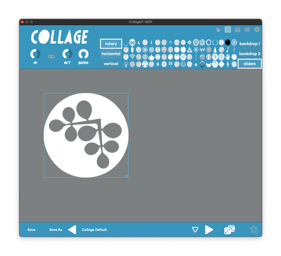
DESIGN – Add your control(s). You have the option of horizontal, vertical, or rotary controls. Drag an icon to the canvas to add the control, then resize and reposition it as you’d like. If you want to delete an element, right-click it.
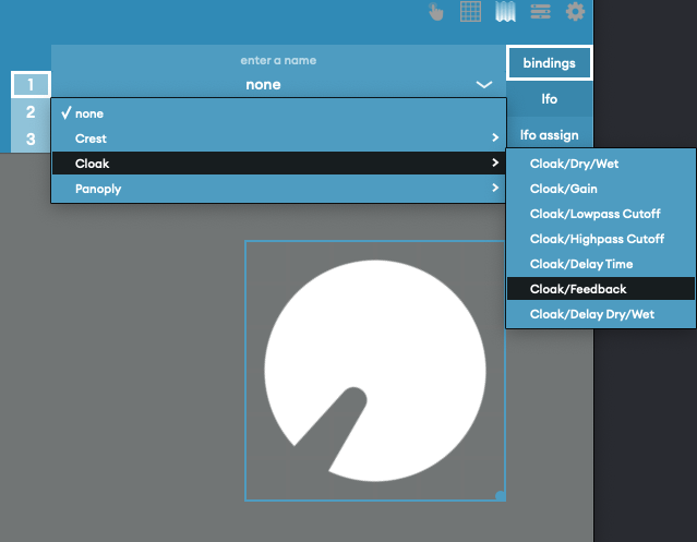
ASSIGN – Bind a parameter. Click a control, then bindings, and select a parameter from the effect you want to assign. Each control in v2 can be a macro for up to three parameters (that’s the 1-3 on the left). You can also choose minimum and maximum range.
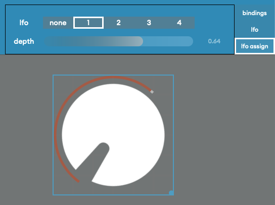
Assign LFO. You assign modulation in a similar way. Click the parameter, select lfo assign, choose LFO 1-4, and set depth. You’ll see an indicator next to or around the control that animates with the modulation.
Set LFO parameters. For each of the four LFOs, you can set shape (sin, saw, square, tri), sync on/off, and then either free rate (sync off), or time division from 1/64 note to 4 bars (normal, dotted, triplet), synced to the host.

And that’s it! Build up multiple macros, make a layout of controls, add modulation. It’s oddly fun to spark your own musical creativity by making silly UI layouts and experimenting. And you can always head back to the presets if you get stuck – then purposely mess them up.
More video tutorials and examples
There’s a bunch more to explore on Kalide’s YouTube channel (a serious underrated gem). Suffice to say, this is a playful creative block cure and an absolute ambient music godsend.
But here are a few highlights…
The effects are no slouch – some seriously great audio quality behind that playful UI:
How to make a preset (not as purposely dumb as my example – yeah, you can make some fancy UI effects!):
Full walkthrough:
Where from here? There’s some room for improvement, no doubt. It’d be great to have some alignment tools. I agree with a commenter that restoring a contextual menu with the right-click (which could still include a delete option) would be more consistent, and would open up some other UI editing options. (Maybe you could even bind in the editor with that menu, on the fly!) And overall, while the handwritten font is cute, I’d prefer an easier-to-read typeface and some general UI cleanup. 2.0 is a big leap forward, so I’m excited where they take this next, especially if we got more UI building goodies and not just more presets. It’s already a joy.
Thanks to Kalide for the support on this. This was genuinely fun, so if folks want to see more with it – more questions, more presets, ideas for where to take this – let us know.