Podcast Twenty Thousand Hertz is already must-listen material, covering the stories behind sound design and branding. Now clear some headphone time for the story behind HBO’s goosebump-inducing 80s theme and iconic 90s angelic TV-switching-on opener, and beyond.
The story begins, of course, with what has to be the most epic opening branding for anything, ever:
The unforgettable music serves as jumping-off point for the episode, with the full story of the composer, how the intro was developed, and what it has meant to people over the years. (I’m particularly struck by people standing, cheering, and singing along in Central Park.)
It’s Not TV. It’s HBO. [Twenty Thousand Hertz]
And don’t miss part two, as well – tons more interesting material in terms of production and sound design, and going still deeper into some of the topics from the first.
But that opening intro.
Interestingly, the visuals led the music, including the elaborate model construction. And yeah, of course, real-for-real VFX in the early 80s meant they had to make giant H, B, and O letters, too. Enjoy:
There’s a whole rabbit hole of the various openers that didn’t last, like this quirky one from 1980 (jump to about 1’12”):
If the long
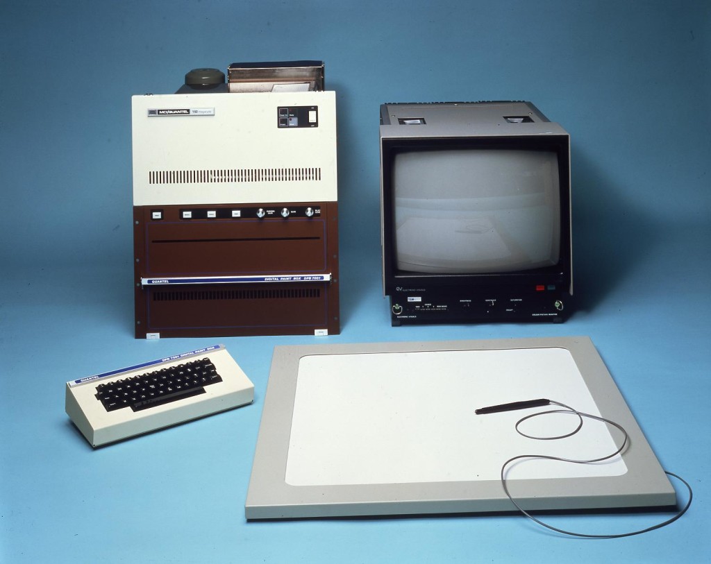
It gets only a brief mention here, but one of the most interesting side trips in this whole story is the visuals from that static logo. It represents three days of work on a machine called the Quantel Paintbox, a visual machine dating back to 1981. You’ll likely recognize the aesthetics right away. I’ll have to go down this tangent separately, as it’s absolutely Create Digital Motion fodder, but here’s a teaser:

The podcast stays out of peak-90s HBO. But here you go with that, down to random bouncing neon 3D geometries that apparently we all thought were so futuristic at the time, and synthesized (Roland?) guitars. And those drums. Oh, those drums:
Rabbit hole? For sure, you can go as deep as you like, like 20 minutes of logos deep:
The second episode gets more into the updated branding and logo. It’s fascinating from a sound design standpoint, but it’s hard not to be a little wistful that so much culture depends on iconic creations of the past. I won’t dwell on that. The composer of the 80s theme wrote a cringe-worthy “we are family” theme for his family reunion, so I’d say – just get composing. As far as distillation, though, it works really well.
(You know, musically, part of what I think makes this theme so strong is that it starts out emphasizing minor but then pounds the major harmony of the IV of that key. It gets at all the minor-major heartstrings of classic cinema scores, and it’s ambiguous enough that harmonically you get the sense of some unknown key change. Since it’s an overture to the film, it’s exactly what you want. When you listen to the distillations for the modern rebrand, you hear them pick up on that elements – there is this melancholy stepwise melody and then a big, brash, all circle-of-fourths bit at the end as contrast.)
Here are the two side by side with still more updated behind-the-scenes info:
More:
Lets Talk About that Epic HBO Feature Presentation Intro from the 80s [brandedinthe80s.com]
And you’ll of course want to subscribe to this one: