If you’re staring at Ableton Live for extended periods of time, why not dress it up so it has all the panache of a high-end 90s UNIX workstation? DeafMan’s retro-chic theme collections have now been rebooted for Live 12, where they look better than ever.
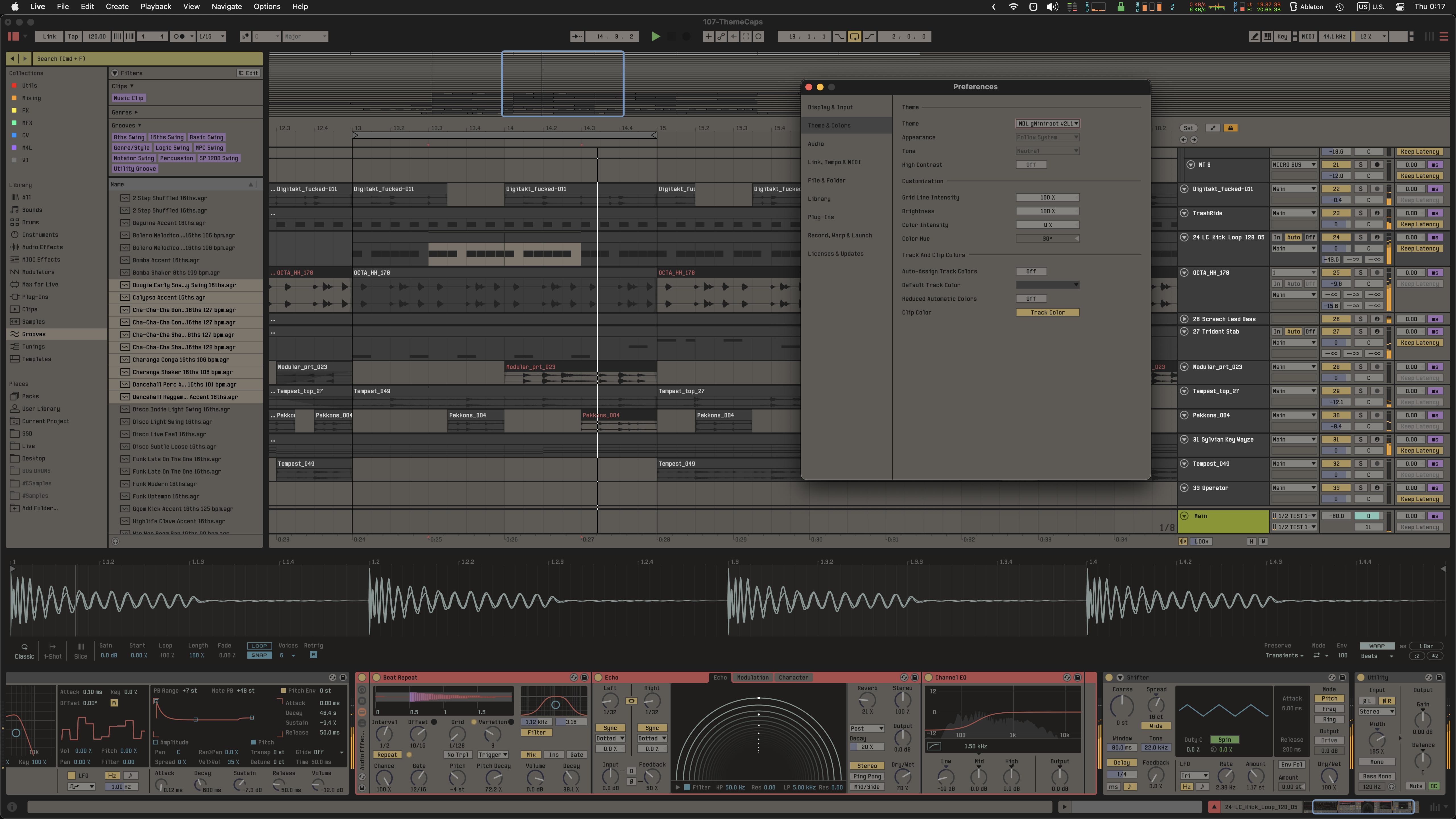
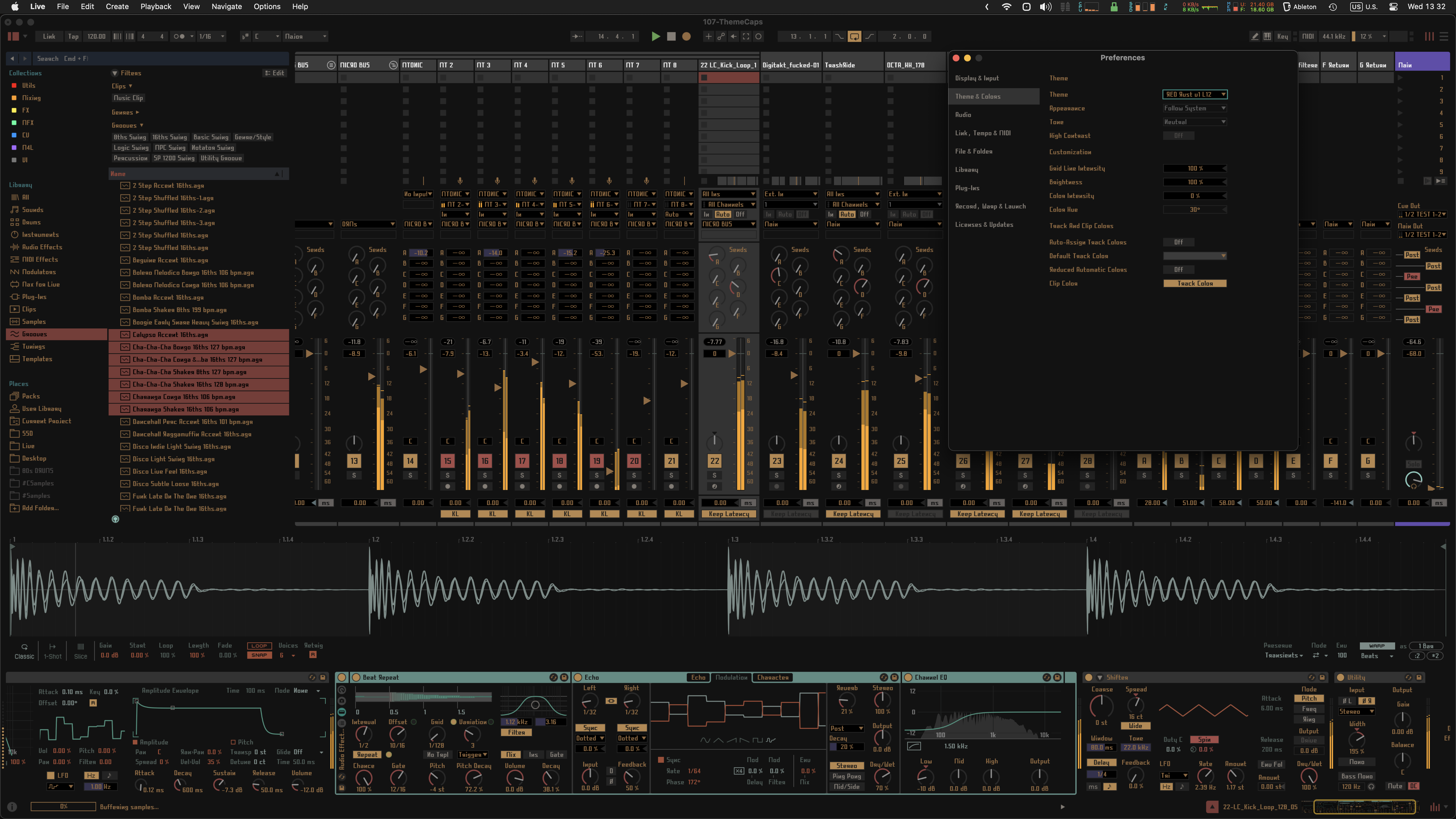
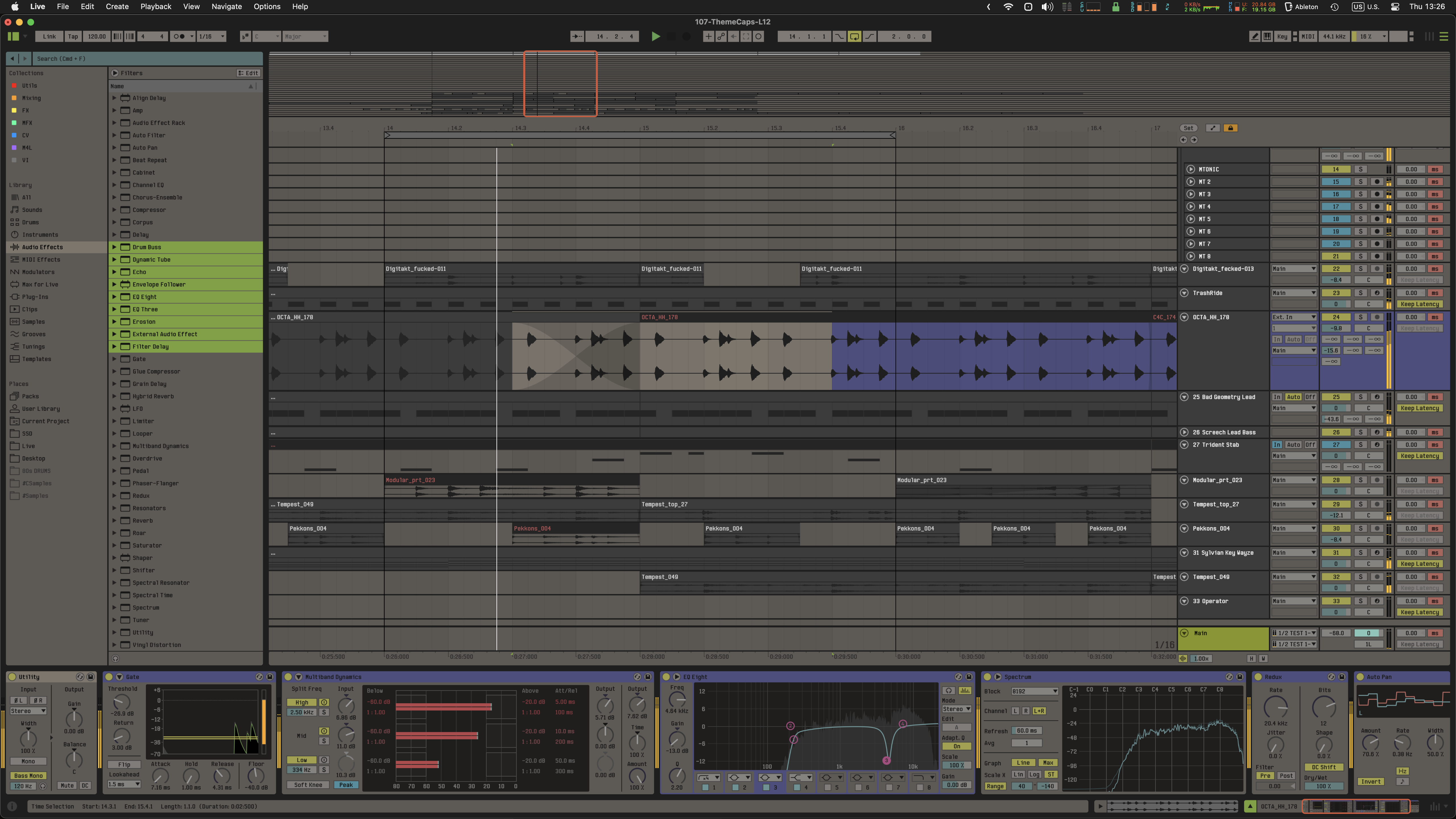
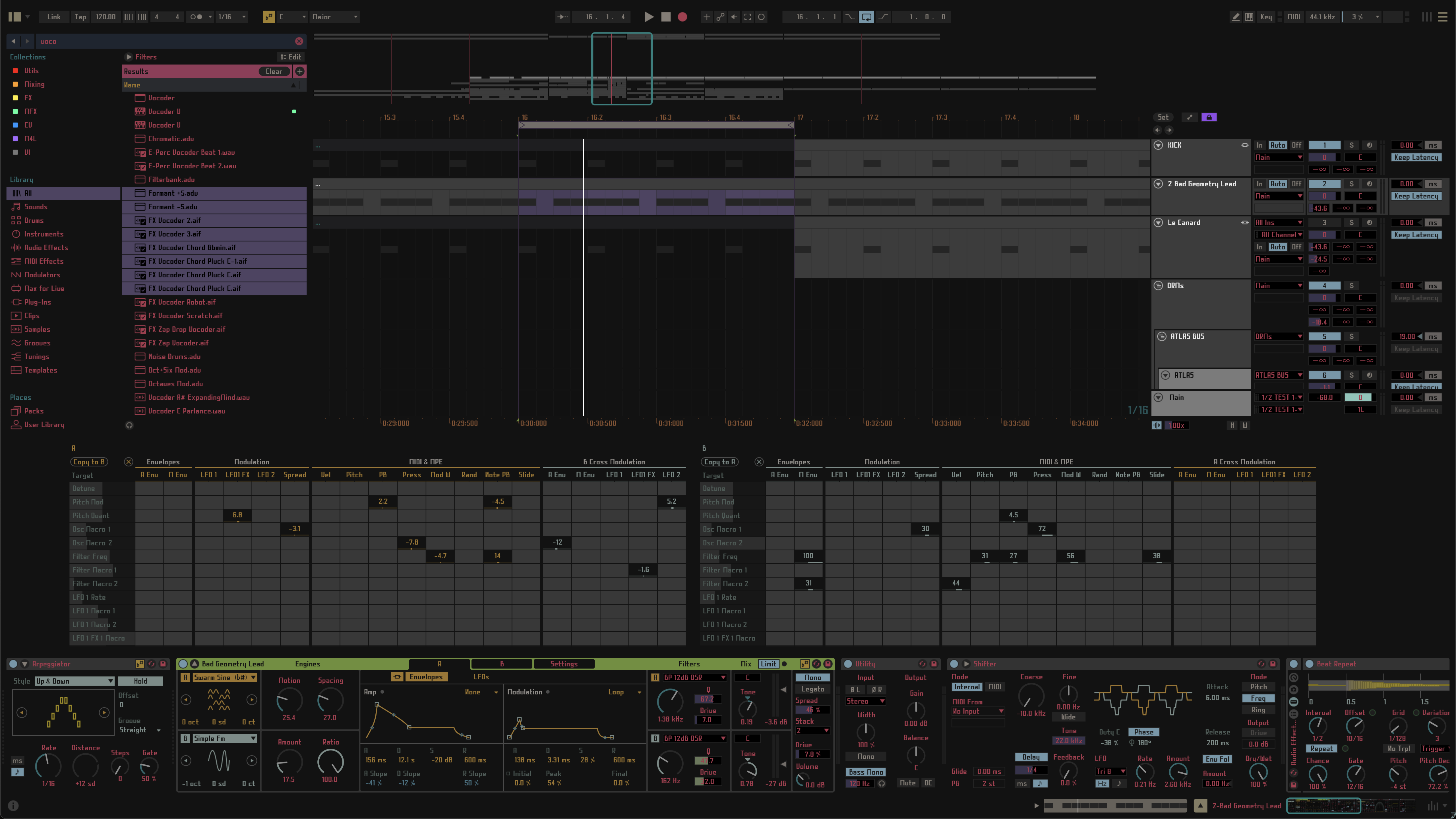
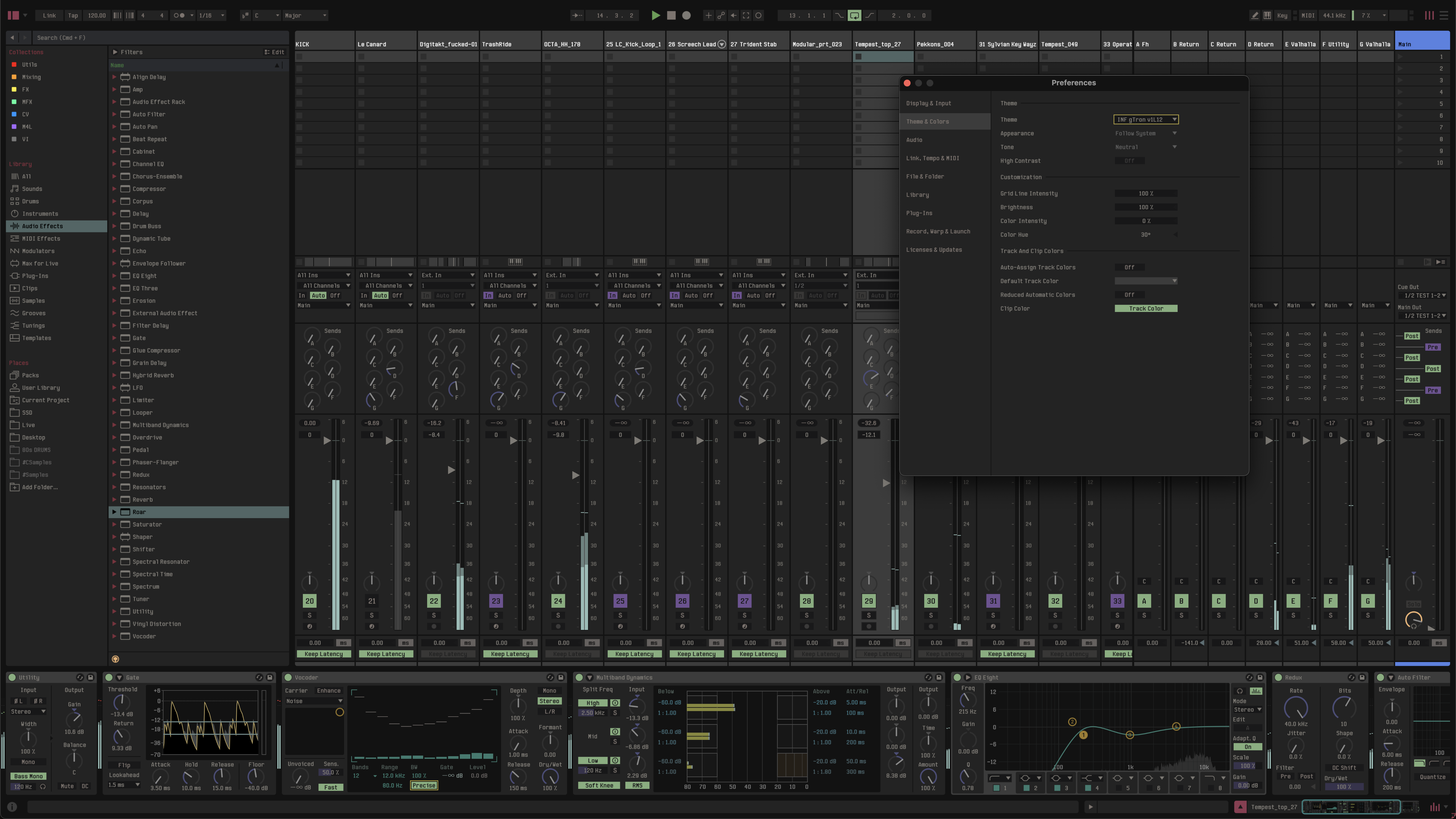
Okay, I loved these themes immediately when they were introduced, but I was surprised by how popular they were with CDM readers—this was one of the most popular stories of 2023. So, the only thing that made me sad about upgrading to Live 12 was losing compatibility with the themes—even with the numerous visual improvements Ableton added to the upgrade. These are the only themes I’ve found that excel in ultra-low light situations, particularly the new pitch-black, Knight Rider-slick RED|Light.
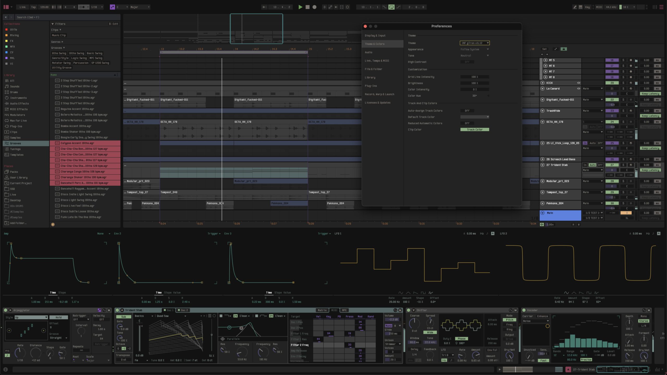
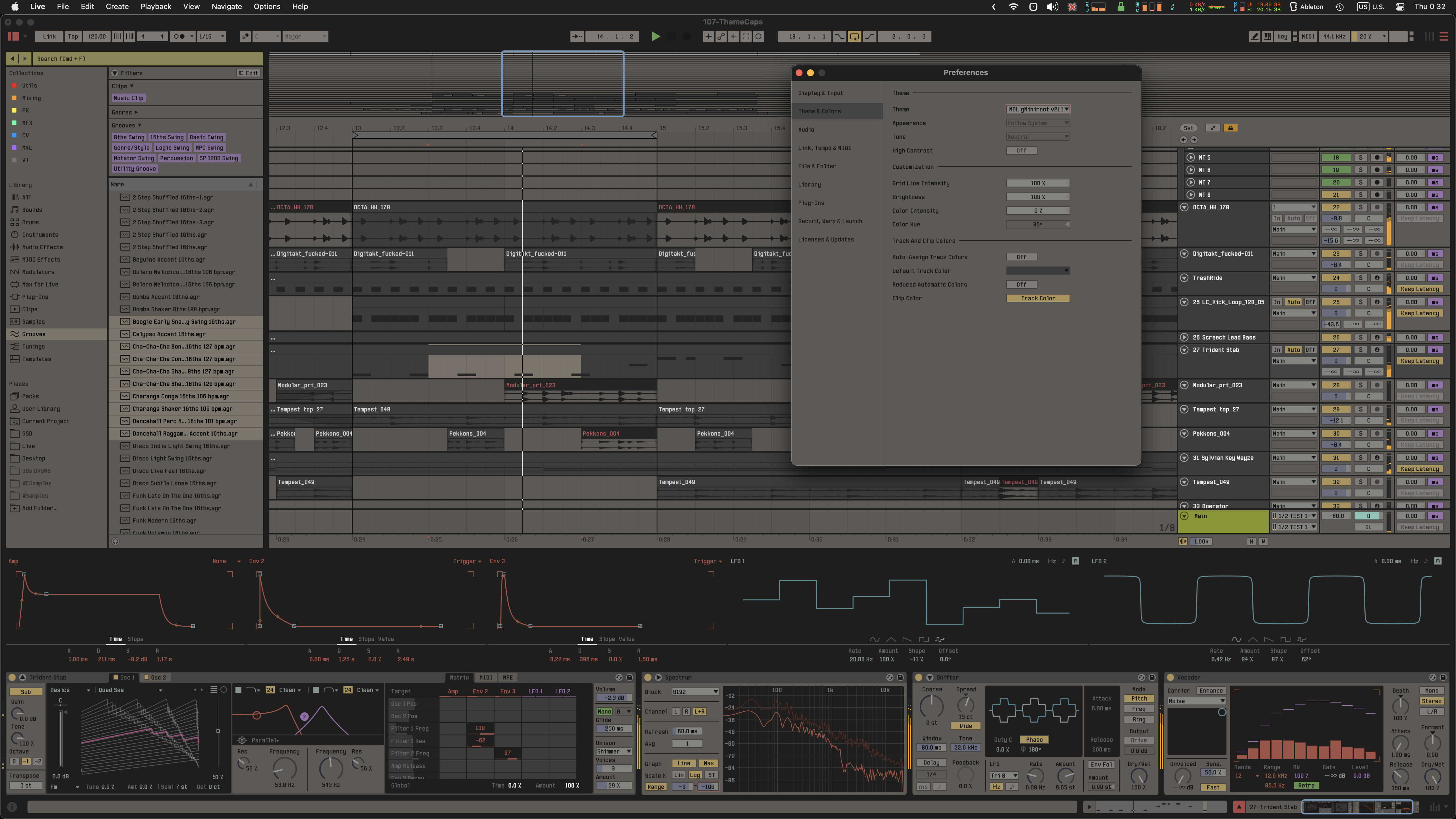
With updated RED|Light, INFRA|Light, and MID|Light themes from our friend Clem (aka DeafMan), you can add some of this sought-after UNIX luxury to the latest Live version – adding depth and nuance and squaring off some of the rounded corners. You even get updated licensed typefaces, allowing you to “dive deep into the soul of these ancient machines.”
It’s helpful to understand quickly how the themes and typefaces are intended to be used:
If you buy something from a CDM link, we may earn a commission.
- MID|Light contains various vibrant and mute color combinations on a black background for added depth, with authentic 90s workstation vibes
- INFRA|Light is all-dark for low-light studio environments (or anyone else preferring the dark look)
- RED|Light is ultra-dark, with this note: “When scotopic vision occurs, it is believed to enhance the brains’ auditory processing capacity“
You can grab the full collection for €29, or one pack for €13 each. Each download includes a lot – the font, 12 variations per pack, and all future updates for the associated Live release. This means Live 11 users will need to buy the themes again, but they look worth it – there was a ton of work supporting the new release.
These are the only themes I’ve found that excel in ultra-low light situations, particularly the new pitch-black, Knight Rider-slick RED|Light.
Type variants: MID|Light offers a choice of a more nostalgic ‘Type I’ option and a cleaner ‘Type II’ for legibility; INFRA|Light is designed for Type II. RED|Light has a unique Type III option with “a Latin-style version and an additional, stylized Cyrillic version that takes you right to the bridge of Cold War-era Soviet submarines.”) Of course, if you don’t like any of those, these themes still look great with the default Ableton font (and you can easily revert by backing it up).
It’s almost doing Clem a disservice to describe these as 90s UNIX graphics, as he’s really run with that aesthetic and created an ultramodern hybrid – like a parallel universe that wasn’t overrun by Jobs’ pivot to “lickable” UIs or Microsoft’s bright “hipster bathroom accessory” / “how many billable hours can we squeeze out of an icon?” approach.
Check the full background document, which includes a bunch of information plus installation instructions.

For more 90s SGI action, here’s a great look back by TechSpot. I never used these machines and even I get a kick out of the aesthetics:
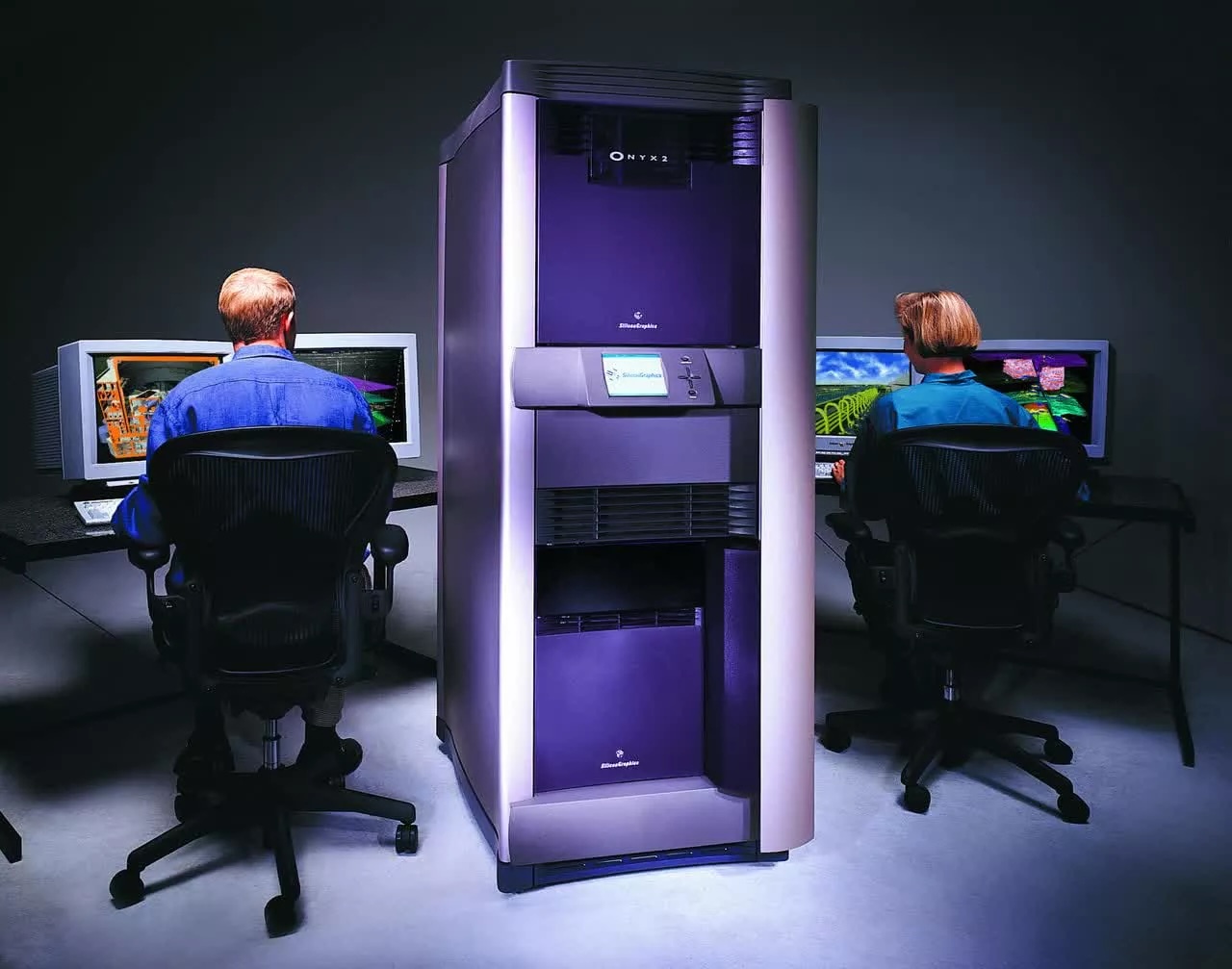
Silicon Graphics: Gone But Not Forgotten